

As the 2021 Iron Viz champion, I can assure you there is no better way to build efficiency in Tableau than by being a contestant in the world’s largest data visualization competition. You have to have a lean and mean workflow to complete a viz in just 20 minutes, and back in 2021 I incorporated every time-saving tip and trick I knew into my build. As a result, I created this winning viz about breakthrough artists. It has 14 individual sheets, 3 dashboard actions, a custom color palette, a Spotify playlist, and Pages interactivity. It was no easy task to cram my build into just 20 minutes, but the skills I learned throughout Iron Viz are things that I still do today in my everyday workflow
At the 2024 Tableau Conference (#Data24), I presented my favorite time-saving Tableau tips and tricks in a presentation titled “At the Speed of Iron Viz: Tips for Faster Builds.” That presentation can be viewed here, and a companion workbook is available on Tableau Public if you’d like to go through these tips on your own. Otherwise, keep reading for all the tips I shared in the presentation, plus a few bonus tips that I had to cut for time.
Table of Contents
Formatting

Workbook-level Formatting
Applying workbook level formatting is a great return on investment. You can set default fonts, sizes, and colors, and apply default settings to all line types in Tableau (e.g., grid lines, zero lines, axis lines, etc.) at the workbook level.
Go to “Format” –> “Workbook” and to apply universal formatting to text and lines.
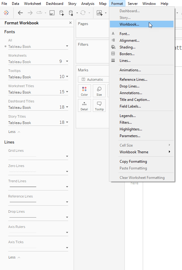
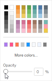
Pro Tip: If a line doesn’t have the option to turn it off, turn the color opacity to 0%
Sheet-level Formatting
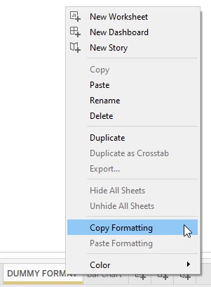
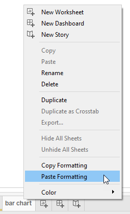
Format a sheet by right clicking in the workspace and selecting “Format”. Apply your formatting, then copy it by right clicking on the sheet name. Paste formatting by right clicking on another sheet and selecting “Paste formatting”
Default Number Formatting
20
You can apply default formatting to all dimensions and measures by right clicking on the field in the Data pane, and selecting “Default Properties” –> “Number Formatting”. Your fields will retain the default formatting throughout your workbook.
Pro Tip: Format multiple fields at one time by Ctrl clicking them.
Pro Tip: Use unicode characters as prefix and suffix values
Pill Formatting
If you need to swap out a pill that you have already formatted in Tableau, don’t drag and drop another pill on top of it because you will lose all your formatting and sorting (see gif). Instead, double click the pill and type your new field over it. By typing over a pill rather than dragging and dropping a field on top of it, you will preserve all your formatting.
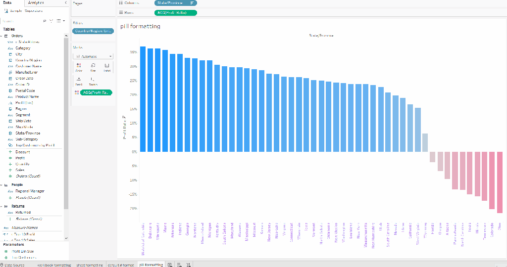
Pro Tip: This technique isn’t just for preserving headers. It works on pills that are on color, shape, tooltips, and anywhere you have applied pill-level formatting. Here’s an example using it on color:
Navigating the Workspace

Keyboard Shortcuts
Use Ctrl + Tab to quickly tab through all your worksheets. To go backward use Ctrl + Shift + Tab.
Use Ctrl + M to create a new sheet. This is especially helpful because the new sheet will appear next to the sheet you’re working on (rather than appearing at the end of the workbook).
Change the View
By default, Tableau shows your worksheets in a tabular format. You can change that by clicking on the filmstrip to see thumbnails of each sheet. You can also click the “waffle” to see all the sheets in your workbook.
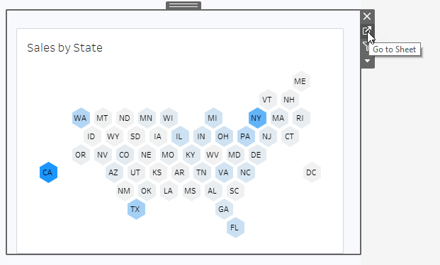
Jump between sheets and dashboards
When on a sheet, right click and select “Used In” to navigate to the dashboard it’s used in. When on the dashboard, use the “Go to Sheet” button to go back to the worksheet.

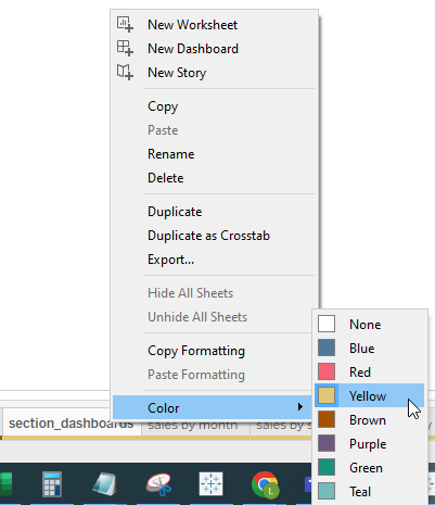
Color Code Tabs
Color code sheets and dashboards to easily identify which sheets are used in which dashboards. Right click a tab, select “Color”, and then select your color.

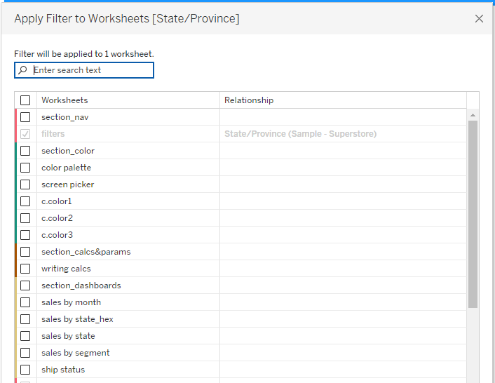
Filters
Color coding helps you stay organized, but is also handy when you apply a filter to selected sheets. The interface shows you the color of each tab, making it easy to apply filters to all the same colored tabs.
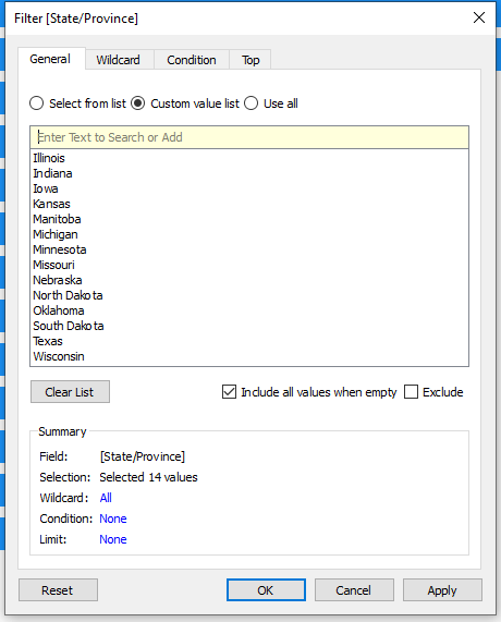
To select multiple items in a filter menu, Ctrl click to highlight multiple values, then hit the space bar. This selects all the items that are highlighted (note: this works almost anywhere there is a check box list in Tableau)
Copy/paste values from Excel into a Tableau filter using the “Custom Value List” option
When you have a filter applied to selected sheets, it can be a pain to remove it. Rather than removing it from each sheet, make it a data source filter, remove it from one sheet, and it will be removed from all sheets.
Adding Cards
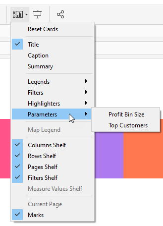
Use the “Show/Hide” card icon to add cards to your view. It’s much faster to go to one spot to grab all the cards you want (legends, filters, parameters, etc.) than jumping all over the workspace to grab each one.
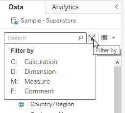
Dimensions and Measures
Use the “Search” functionality in the Data pane. Hit Ctrl + F to search for a field. Use the filter icon to filter by field type. This is especially useful to filter by calculated fields.
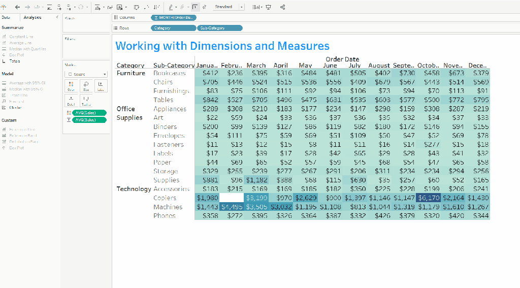
Right click and drag dimensions and measures into your view to get a pop-up asking how to format it. This is especially useful with dates and measures.
Bring multiple dimensions/measures into your view by holding Ctrl.
Duplicate a pill by holding Ctrl while you drag it.
Add totals to your view using the Analytics pane. You can add subtotals, column, and row totals by double clicking.
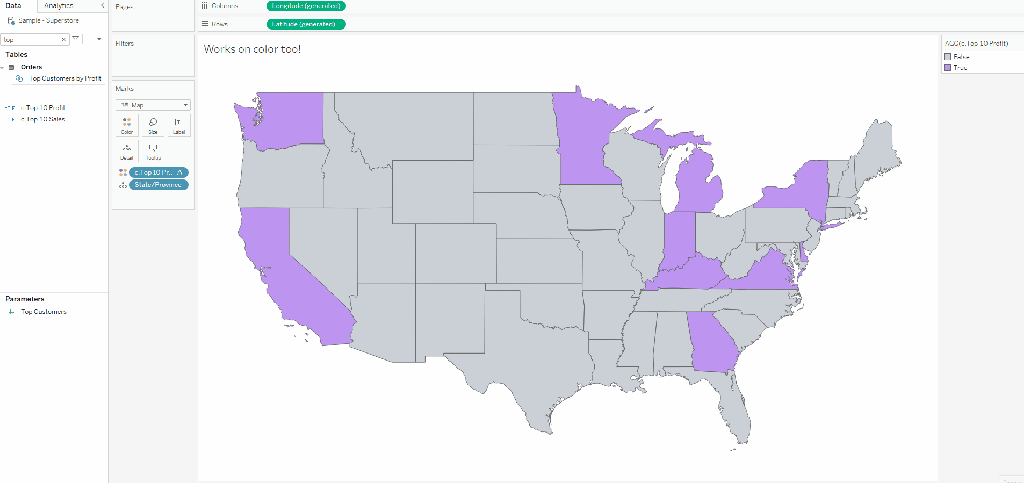
Working with Color

Custom Color Palettes
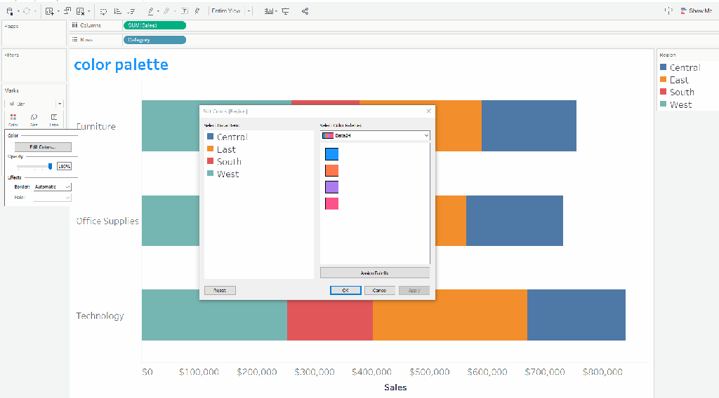
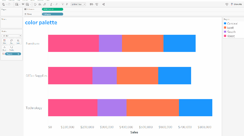
Save time by creating custom color palettes to your preferences file (located in your Tableau repository). You can use this tool created by Interworks to generate all the code you need. There is also a brand new tool created by Alex Waleczak that allows you manage your preferences file with a friendly user interface. Both are big time savers!
Pro Tip: Put your colors in the order you will assign them. This way you can use the “Assign Palette” button to assign colors with one click. Use the “Apply” button to apply the color palette without exiting the “Edit Color” dialog box.
Leverage Legends
You can use the color legend to
- Sort: just drag and drop
- Filter: right click on a value in the legend to keep only, exclude, or hide.
- Edit Aliases: right click a value and select “Edit Aliases”
- Edit colors: double click on a legend to go back to the “Edit Colors” dialog box.
Working with single colored charts
Tableau uses a different interface when you don’t have a field on the color shelf. When you edit colors this way:
- Use the “Pick Screen Color” button to use an eye dropper tool that even works outside of Tableau
- Add colors to custom colors by dragging them to one of the custom color rectangles. Tableau retains these custom colors until you replace them.

- Put a dummy field on color of single-colored charts.
- When you assign a color to a variable, Tableau retains that mapping wherever you use that field. Place the dummy variable on all charts using the same color so if you need to switch the color to something else, you only have to change the color on one chart.
- Bonus! You also have access to your color palettes if you have a field on the color shelf.
Calculations and Parameters

Writing calculated fields
- Use a hot key Alt + A + C to open the calculated field window
- Drag and drop dimensions, measures, and table calcs into your calculated field window.
Calculation not working? Troubleshoot it by dragging portions of your calculation on the label of your chart to see its output.

Apply your calculations before you commit to them. This creates the calculated field, but leaves the calculated field window open. This allows you to start using your calculation with the window open, so you can keep editing it and applying changes if need be.

Write multiple calculated fields in one calculated field window using “The Lindsay Poulter Maneuver.” For each calculation, include a commented line which will serve as the title of the calculated field that comes below it. Then highlight the commented line and the calculation, drag it to the data pane, and Tableau creates your field. Do this as many time as you have calculations, then close your calculated field window.
Pro Tip: Use this when you have similar calculations that are easy to swap out variables, and/or start a notepad of calculations you use often so you can copy them whenever you need them.

You can make quick LODs that fix one measure to one dimension just by Ctrl + Dragging a measures onto a dimension.

Use naming conventions for your calculated fields. This will group them together in the data pane and help you keep track of them. Some of my naming conventions:
- c.Name: Used for basic calculated fields.
- p.Name: Used for calculations that work with parameters
- mp.Name: Used for makepoint calculations
- tt.Name: Used for calculations created solely for tooltips
Creating Parameters
When you have a string parameter, you can quickly create it from a field by right clicking on the field, selecting “Create”-> “Parameter”.

You can also add values to a parameter by copy/pasting lists from Excel. Copy your list, click under “Display as”, then Ctrl + V to paste your list.
Dashboards

Copy/Paste
Copy/paste dashboard objects when you can. I use this most often with text and containers, but almost anything that isn’t a chart or drop-down menu can be copy/pasted. Just select the dashboard object and Ctrl + C to copy and Ctrl + V to paste. You can also use the menu drop down menu.

Tableau floats any object that you copy and paste. Quickly put it into tiled by holding Shift as you drag. This applies any time you want to temporarily float in a tiled dashboard (and vice versa).
Containers
Containers are easy to lose track of, so I always add a blank and add a border to my containers. This allows you to see the container more easily, and is especially helpful when you have nested containers because you can see if you’ve managed to get your container into another container. In the recording below, there is a green, black, and orange container. The color coding makes it possible to see when the green container is and is not nested within the orange.

Double click the grey tab on any dashboard object or chart to quickly select its parent container.
To get perfect spacing within a container, distribute contents evenly.

When you bring charts onto a dashboard, they often come with a lot of extra “junk” (i.e., all the cards that are displayed on that sheet). Add an extra container to your dashboard and Tableau will put that “junk” in there. Then you can select the container and delete all those cards in one click.

Naming your containers is helpful (especially when you have a floating dashboard!). Right click on cany container or dashboard object and select “Rename dashboard item”. You’ll see that name reflected in the dashboard pane.

Formatting
When you go to format your worksheets, you’ll need to navigate from the Dashboard to Layout pane. You can do this with the keyboard shortcut “T” to toggle back and forth between the two.
When formatting a worksheet, I do so from the bottom up on the layout pane. This allows me to quickly jump from one menu to the next without clicking out of the previous menu.

Swap Sheets
When you need to change out a chart on a dashboard, select the sheet you want to swap. In your Dashboard pane, all unused worksheets will have a double headed arrow symbolizing a swap sheet. Click this and it will bring in your new chart and retain all the formatting you applied to the original chart.

Time to QA
You may notice an issue on a worksheet once it’s already on your dashboard. Luckily, you don’t have to go back to a worksheet to modify calculations and tooltips. You can edit them right from your dashboard!
- Calculations: Select any sheet on your dashboard. Go to Analysis-> Edit Calculated field. This will bring up all the calculations available to edit.

- Tooltips: Select the sheet with the tooltip you want to edit. Go to Worksheet -> Tooltip

Wrap Up
There are a lot of tips here, and I wouldn’t recommend trying to implement them all into your next build. Pick a handful each week and start using them as you build. Over time, they’ll start to become muscle memory, and before you know it, you’ll be going at the speed of Iron Viz!
