
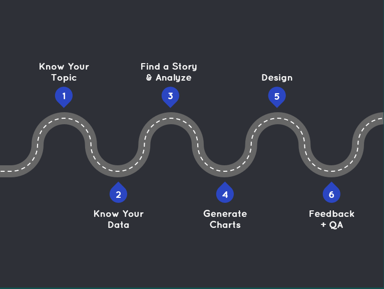
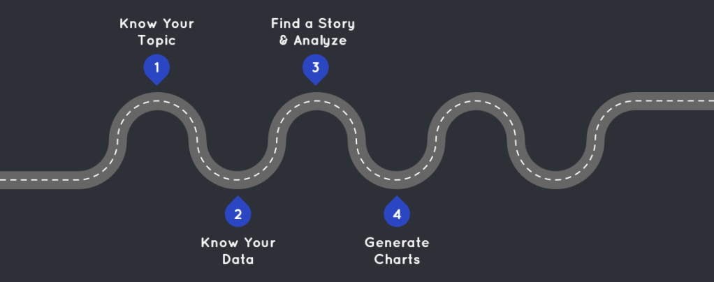
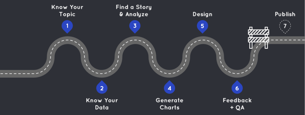
Last year, I gave a presentation at the San Diego Tableau User Group about how I go from a blank workbook to a finished viz. As I put the presentation together, I realized I go through the same six-step process each time, regardless of whether I’m creating a dashboard for work, fun, a Community Project, Iron Viz, or anything else.
Curious how I go from a blank slate to a polished viz? Read on to navigate my Road Map to a Viz.
1 – Know Your Topic
First and foremost, know your topic. This probably sounds obvious, but it’s an easy step to overlook when you’re eager to jump into your data. However, the more time you invest in familiarizing yourself with the topic, the better your exploration and analysis will be. You’ll know what questions to ask and which leads to follow in the data. I spend time reading about the history, current trends, and future directions of an industry. I also familiarize myself with the terminology, jargon, and acronyms so that I can sound like an expert (even if I’m not one).
Even if I’m dealing with a topic I’m already familiar with, I still invest time into research. I often create visualizations on topics I’m passionate about, but passion doesn’t equate to complete knowledge, so don’t skip this step! When I was working on my Mean Girls viz, I was tempted to jump right into the data. I am mildly obsessed with this movie and thought I knew all there was to know about it. However, I still spent time on the Fandom site and read articles about the movie’s debut, staying power, and fun facts. I learned some things, and this research inspired me to include “Fetch Facts” throughout the visualization. You never know what will spark inspiration or change your perspective on the data, so I’ll say it again: Never skip this step, no matter how well you think you know the subject!
2 – Know Your Data
Equally as important as knowing your topic, is knowing your data. Resist the urge to dive straight into anlysis; it’s crucial to know what you’re working with before you begin.
- Data Sources: You should understand how the data is collected, maintained, and governed (especially if it’s data you use at work). Is the data manually entered? How frequently is it collected or updated? Is there any data validation in place? Knowing these aspects of the data will help you better understand things during your analysis phase.
- Variables: If possible, get your hands on a data element dictionary to thoroughly understand your variables. Know how variables are defined and quantified, their data types, and the expected ranges for these variables. During Iron Viz, we were given data on the top songs being Shazamed each day. We were told the song rankings would go from 1 – 200. However, I found values far exceeding 200 in the data. I poked around, asked questions, and discovered that Shazam had altered the number of songs they tracked after an acquisition. Without knowing the expected range, I might have misinterpreted the data entirely.
- Tables: If you’re working with multiple tables, ensure you understand their relationships. Identify their primary and foreign keys and know the level of detail in each table. This knowledge will help you avoid incorrectly joining tables and working with inaccurate data.
3 – Find a Story and Analyze
Some may see this as two separate steps, but for me, analyzing data and discovering the story are intertwined. I can’t analyze my data without seeing a story, and I can’t find a story without analyzing my data.
I always begin by generating a list of questions I want to explore. These questions can be factual (e.g., how many X have done Y?), exploratory (e.g., is there a trend between X and Y?), or simply driven by curiosity. This list of questions guides my data exploration and analysis. I start with a question and follow interesting trends, paying particular attention to outliers, as they often reveal the most compelling stories. Here’s a sample list of questions I developed before analyzing the Iron Viz data:
- Does curiosity on Shazam correlate with YouTube views?
- What music genres are Shazamed the most in each country/region? Any interesting trends?
- Are there cities/region that catch onto music first? Does this predict global trends?
- How often do artists become popular outside their birth countries?
The question that led to my final Iron Viz was “Are there cities/regions that catch on to music first?” My thinking was it would be interesting to see if there were trendsetting cities when it came to new music. However, the data didn’t support this idea. Instead, I noticed certain artists were gaining popularity rapidly across various locations. By following this trend, I found my story in highlighting these breakthrough artists rather than focusing on the cities.
My list of questions is a jumping off point. Sometimes the answers to these questions don’t reveal anything interesting or insightful. That’s fine…just follow the data.
4 – Generate Charts
I like to think of this stage like trying on clothes. You may have an idea of what you want to wear, but you won’t know what looks best, highlights the right features, and feels right until you try it on. So the name of the game here is iteration. Try on as many clothes as possible (i.e., generate as many charts as possible), and see what looks best.
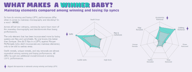
For my RuPaul’s Drag Race viz, I knew I needed a comparison chart to show how winning and losing lipsyncs differed. I tried on my favorite outfit first (a bar chart), but it was pretty drab and didn’t have much of an impact, I tried fancying it up, and tried a few other charts on for size before landing on the radar chart. It had the amount of pizazz I was looking for while still conveying my story.


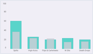
Sometimes you have your heart set on a complex chart, and who can blame you?! They can be eye catching and fun to experiment with, but a lot of times they aren’t the best choice for your data. Charts should support your data and your story rather than detract from them, and complex charts have a way of obfuscating the data. Here’s an example where I was tempted by the dark side of complex charts in my RuPaul viz. I wanted to show elements featured in each lip sync with this layered radial chart (this was made prior to landing on my final design, which is why the colors are so different):
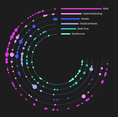
I made this chart then asked myself, “Which lipsync has the most elements?”…and I couldn’t answer it. If you can’t answer your own question, you’ve got the wrong chart.
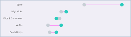
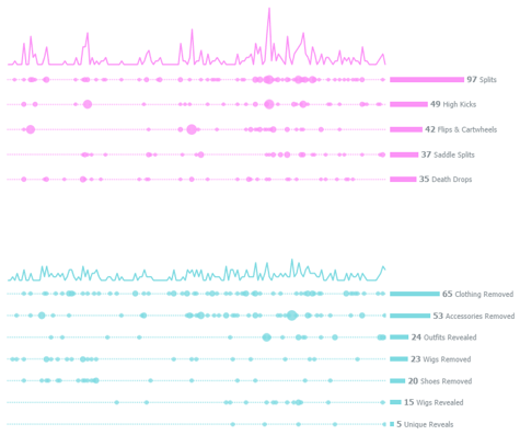
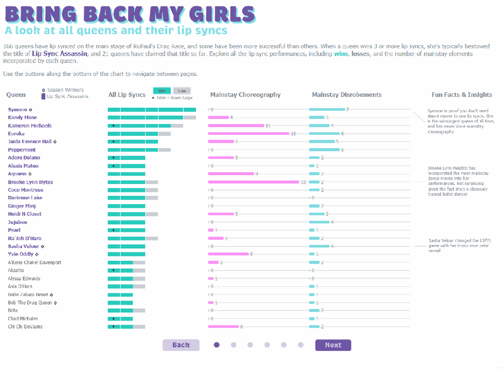
This chart was also wrong because it didn’t take into account the two categories I was showcasing: choreography and disrobing. I ended up changing direction and making the chart below, which is much simpler, but answers my questions and displays the data well. Simple charts done well are often the best choice to showcase your data and tell your story.
Please don’t take this to mean, “Complex charts are bad!” They aren’t. That layered radial I kicked to the curb for my RuPaul viz worked great in my Mean Girls viz to showcase the meanest girl. It works here because it answered the question “Who is the meanest girl?” It also shows clusters of meanness that each girl commits throughout the movie. So go ahead and use a complex chart, just make sure it supports your data and helps tell your story rather than detract from it.

5 – Design

Design is a huge topic and far beyond the scope of this blog post. For now, I’ll focus on the broad components of my design process.
Inspiration
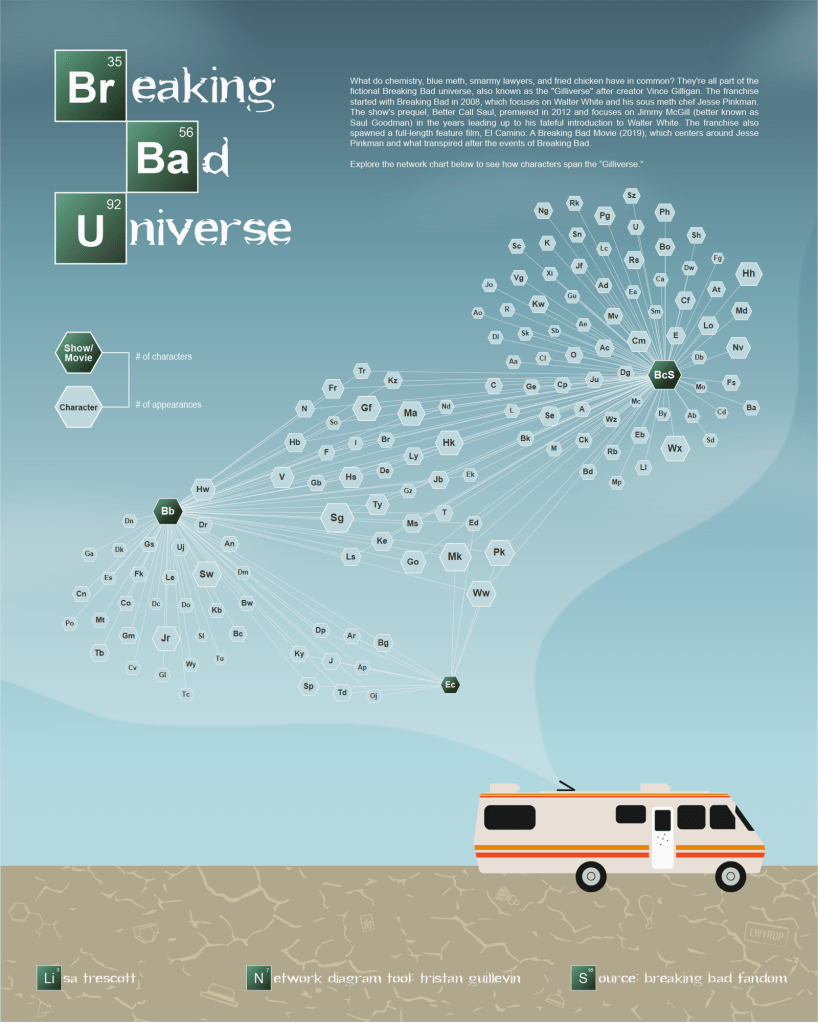
The first step in my design process is finding inspiration. I often start by browsing Pinterest and Behance for design concepts or styles I like. Once I find something I want to emulate, I steal like an artist. This means drawing inspiration from others’ work without directly copying it. Find something you like and put your own spin on it. For example. here are two images I used as inspiration for my Breaking Bad viz.

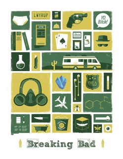
The image on the left inspired the color palette and the scene, and the image on the right inspired the flat iconography. Ultimately, they came together in my own design:
Wireframe
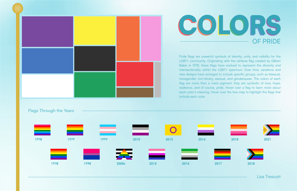
Whether you use paper and pencil, PowerPoint, Figma, or some other tool, it’s a good idea to plan out your viz. This doesn’t have to be long process; my wireframes are usually quick and dirty and done with paper and pencil. Here’s an example of a sketch I did when planning out my Colors of Pride viz:

Like I said: quick and dirty! This isn’t fancy and it isn’t something I spent a lot of time on. It was just a place to get my idea on the page before I started spending time on the real design.
That sketch turned into this:
Aesthetics
The aesthetic of your design is essentially how it looks. For me, that primarily encompasses color, font, layout, icons, and images. Each of these elements is a lesson unto itself, so here are the main things I keep in mind, and some resources I use for each:
- Color: Use it sparingly to draw attention to key things. Find a color palette that fits your topic and sets the tone. My favorite tool for creating color palettes is the Adobe Color Wheel. Make it color-blind friendly, and/or double encode (i.e., use another visual element on top of color, like a shape or line pattern).
- Font: Font is part of the aesthetic and functional design. Make sure it’s legible and establishes a clear font hierarchy.
- Layout: Design to a grid and align everything to something else on your viz. This creates a sense of organization. This applies even if you have a more free-form design.
- Icons: Maintain consistency by using icons from the same family, use uniform colors, line styles, and stroke widths. I usually design my own, but will often turn to the Noun Project and Hero Icons for free icons.
- Images: Use images that enhance rather than detract from the data. My favorite place to get free stock images are Unsplash and Pixabay
Function
Just as important to how your viz looks, you also need to think about how it works. Consider the user interface, navigation, and what kind of interactivity you will include.
Sometimes you have adequate functionality, but it could be improved upon. For my RuPaul’s Drag Race viz, I initially designed the “Bring Back My Girls” section as one large scrollable chart. It worked, but it felt a little bit clunky:
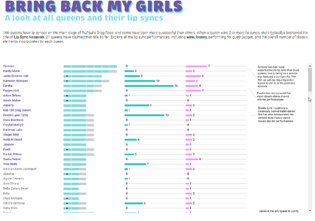
Luckily for me, I went to an Iron Viz feedback session where Chantilly Jaggernauth asked, “What if you make it a carousel?” What a great idea! And so, I changed the functionality from a scroll to a carousel, which made the user interface cleaner and more engaging.
Clutter
Clutter is the nemesis of effective data visualization! Every element on your chart or dashboard should have a clear purpose- whether for analysis, interpretation, design, or another specific reason. A good rule of thumb is to ask yourself, “If I take this away, can my user still understand it?” If the answer is “Yes,” then get rid of it.
6 – Feedback + QA
It’s good to get feedback throughout your build (especially if you’re stuck!), but always leave room at the end of your process to do a final round of feedback and QA. Fresh eyes will catch things that you’re too close to see.
One thing to keep in mind: you don’t have to accept all feedback. It’s your viz and a reflection of you and your work. If someone gives you a piece of feedback that you don’t agree with, don’t feel like you have to take it. However, if multiple people give you the same piece of feedback you don’t agree with, consider opening up to their perspective.
I try to get feedback from data viz experts as well as lay people. Both will bring something to the table, and it’s always helpful to have non-data viz experts weigh in to make sure things are intuitive for end users. If possible, I also try to get feedback from someone who knows the topic of my viz well.
A great place to get feedback is during Viz Office Hours. You can also reach out directly to folks in the Data Fam. They’re a very helpful bunch and odds are they will be willing to review your viz.
7 – Publish
My unofficial 7th step is publish it! It is so easy to hit a road block and feel like your viz isn’t perfect or it isn’t good enough. Newsflash: IT WILL NEVER BE PERFECT!
As Winston Churchill famously said, “Perfectionism is the enemy of progress,” and I often struggle with this myself. Recently, I let this viz sit for 4 months before I finally published it:

It was 90% done, and I abandoned it because it didn’t feel perfect. I only went back to the viz to grab a calculation I used in it, and when I opened the workbook I thought, “Why didn’t I finish and publish it?!” The answer: self doubt and perfectionism. So I silenced my inner critic, finished that last 10%, and published it. And you know what? I love it. Bonus: other people loved it too! It was featured in Tableau Public’s 2023 Viz Wrap and the Flerlage Twins named it one of their top 10 favorite vizzes of 2023.
This road block is very real and one of the hardest things to overcome, but putting your work out there and getting feedback will help you learn, grow, and get better. So what are you waiting for? Publish the darn thing!
I hope this process helps you on your next project. I can’t wait to see what you come up with! Happy vizzing!

Leave a comment