
Annyong!
Now the story of a Data+TV challenge, and the one author who couldn’t resist creating a viz. It’s Behind the Viz of Arrested Development.
When the call came out to create one of the inspiration vizzes for Tableau’s Data+TV challenge, I volunteered faster than you can say “Loose seal!” I immediately knew I wanted to do a deep dive on a single show rather than looking at a whole genre, specific actors, or relationships between shows. I started brainstorming a list of my favorite shows, and the one I kept coming back to was Arrested Development. It’s one of my all time favorites (at least the first 3 seasons are…more on that later), and there are so many running jokes and gags that I knew would be fun to incorporate. So I got to work creating a viz that brings me more joy than a Bluth doing a chicken dance.

Table of Contents
The Data
The Data+TV dataset is huge! The data is sourced from IMDb, and includes information on show and episode ratings, plot descriptions, actor details, awards, and more. I filtered the data by Arrested Development and saved it as a much smaller, more manageable dataset.
Get the full dataset here to create your own Data+TV viz!
The Design
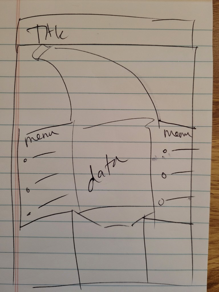
Two of the most iconic elements in the show are the Bluth Banana Stand and the Stair Car, so I knew I would incorporate them in the design in some capacity. I originally thought about using Lisa Rapp’s amazing show business viz as inspiration, and having the Stair Car “drive” through the viz. I also thought about putting all the data in the Banana Stand and having a menu the user could click through to display different charts. However, that didn’t leave a lot of space to showcase the data, nor did it leave anywhere to put the Stair Car. Here are the early sketches I did of these two ideas:
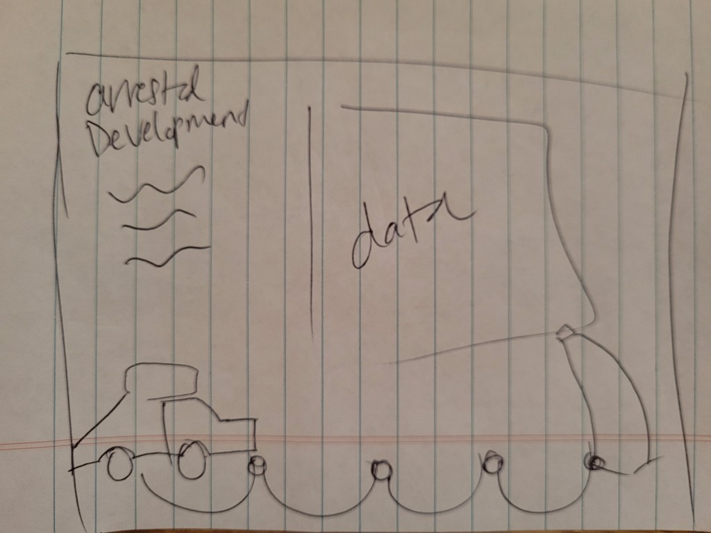
I started down the path of having the Stair Car drive through the viz, and created the Stair Car and Banana Stand graphics in Illustrator. However, these two elements felt miniature and I wanted them to be featured more prominently. I tried enlarging them and making it look more like a scene. I liked where this was going:

However, the viz felt as incomplete as one of Gob’s illusions, and it was lacking something in both design and storytelling (and magic). That’s when I remembered what Michael Bluth always says: “Family first”, and added the family tree to show which actors portrayed which characters.
And with that, things expanded and my first horizontal scrolling viz was born!
The orange background, while not a color I would typically use, was a no-brainer. It’s the color most associated with the show, and it really made the Stair Car and Banana Stand pop. I briefly thought about making it a sky-colored background, but I knew if I didn’t use the iconic orange I would have looked at my color choices and thought, “I’ve made a huge mistake,” so I held firm and comitted to the orange.
The opening credits of the show inspired the hand drawn elements and the font choice throughout the viz:
I used a calligraphy brush in Illustrator and drew the arrows and circles, and I found a font called FStop that looked strikingly similar to the font used in the title credits. With those main design choices in place, let’s turn to the charts that make up this viz.
The Charts
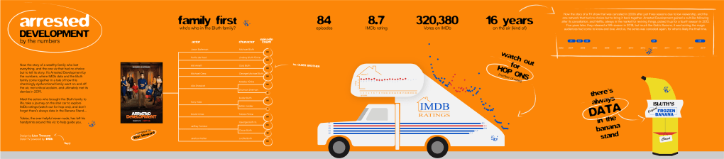
Family First
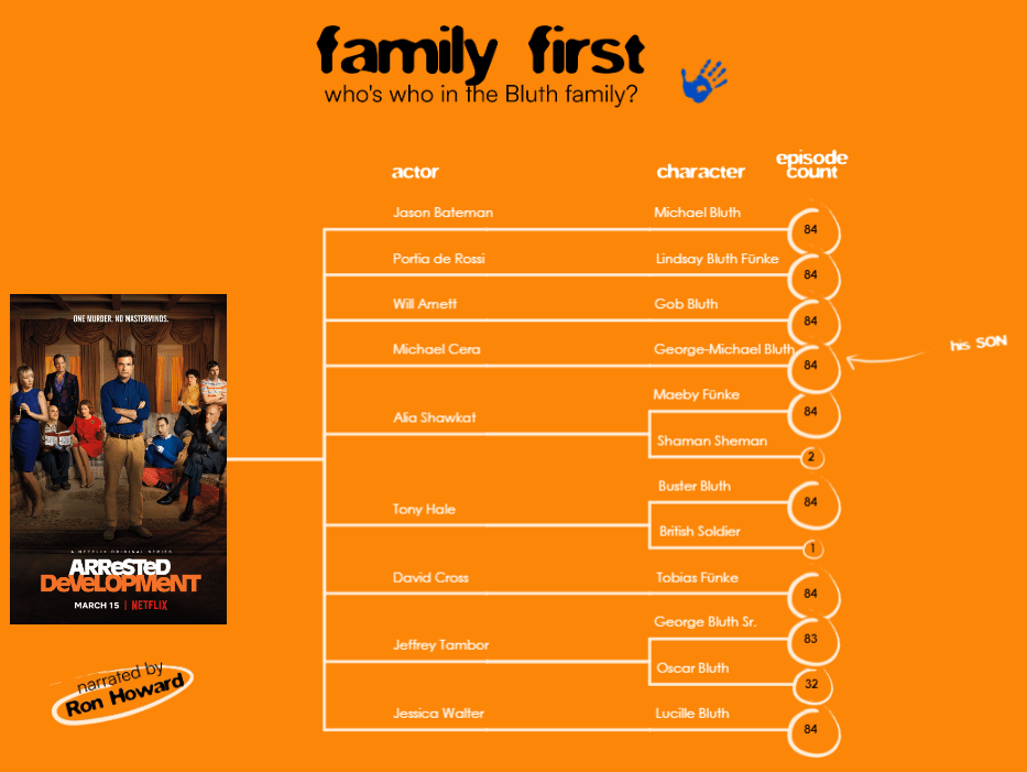
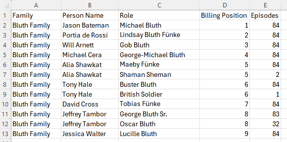
The Data+TV dataset includes the top 10 billed actors for each episode of a show, which conveniently aligned with the Bluth family dynamic; the top 9 billing spots are held by the 9 members of the Bluth family. Unfortunately, this meant I couldn’t showcase all the supporting characters and big-name guest stars. For example, Mae Whitman (her?), Charlize Theron (Mr.F), Ben Stiller (did someone say “Wonder”?), and Justin Grant Wade (Steve Holt!) weren’t included in the data for all the episodes in which they appeared, so I scrapped that data and focused just on the family.
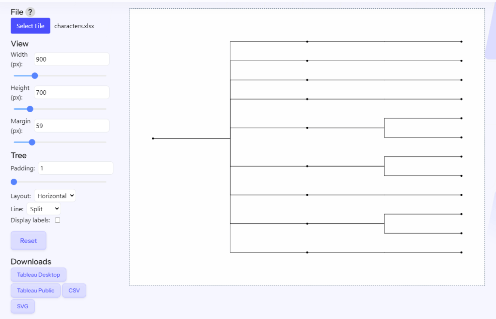
I used Tristan Guillevin’s AdvViz tool to create this chart, which makes it easy to create advanced chart types and download them directly to Tableau. You can also use the new Viz Extensions feature available in Tableau 2024.2; however, be advised these charts are not currently available on Tableau Public.
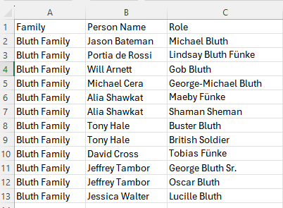
The tree generator needs a very simple dataset to show the links between the nodes. In my case, I had a column for family, actor, and roles.
To use the AdvViz tool, upload your file, use the panel on the left to adjust the settings and layout, then download to Tableau.
In order to add the episode counts to the character nodes, I related the following data to the tree data.
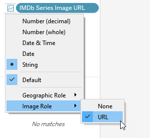
The IMDb data includes a variable called “IMDb Series Image URL”, which houses the URL for the image that IMDb uses for the show. I set that variable to use image role by right clicking it and selecting Image Role -> URL. This allows the variable to render as an image within Tableau. I put that variable on its own sheet and used it to represent the Bluth Family node of the tree.
To get my actor and character labels in the desired position, I wrote a few calculated fields.
c.Actor Node and c.Character Labels are added as map layers and use a transparent shape (i.e., a shape with no color or border). This allows me to use the shape mark to add my label.
c.Actor Node
if [Type]=’node’
AND [size]>0
then MAKEPOINT(-[Y Normalized],[X Normalized]-.15) END
c.Character Labels
if [Type]=’node’
AND [size]=0
then MAKEPOINT(-[Y Normalized],[X Normalized]-.24) END
c.Character Node is used to show the episode count. It’s a custom shape, with SUM(Episodes) on size.
c.Character Node
if [Type]=’node’
AND [size]=0
then MAKEPOINT(-[Y Normalized],[X Normalized]) END
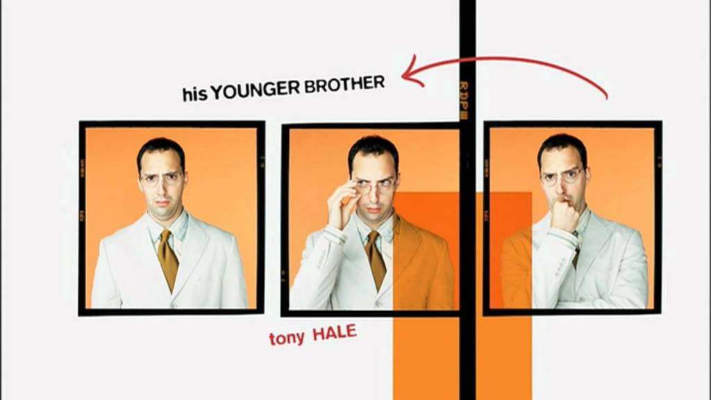
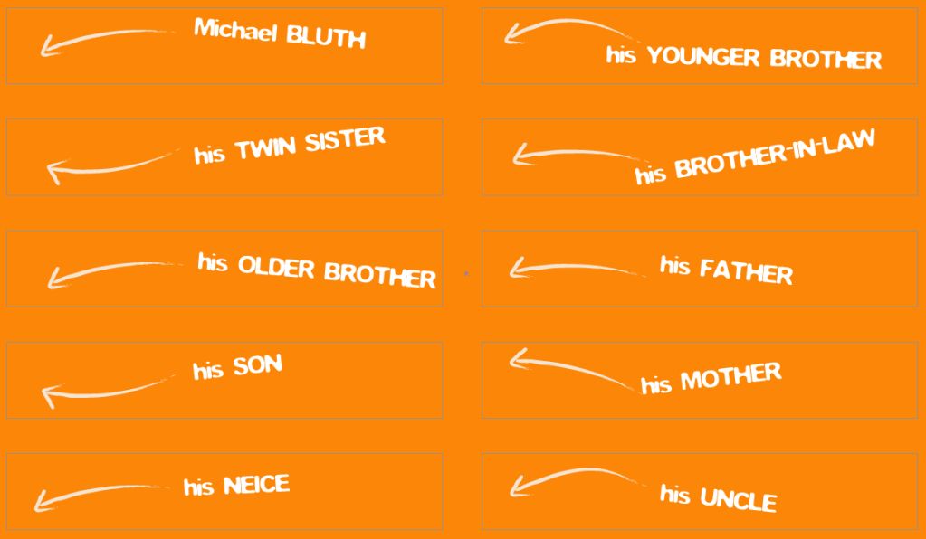
There’s functionality on the family tree such that when you hover over a character, their relationship to Michael Bluth is shown. I thought this would be a fun way to pay homage to the opening credits of the show.

To get this functionality, I created a new dataset with X and Y coordinates for each character.

I then made a new sheet (character labels) using those X and Y coordinates. I added “Role” to shape, and assigned the following custom shapes to each character:
I used a parameter and parameter action on the dashboard to get the character to change on hover.
With that finished, I turned my attention to the Stair Car.
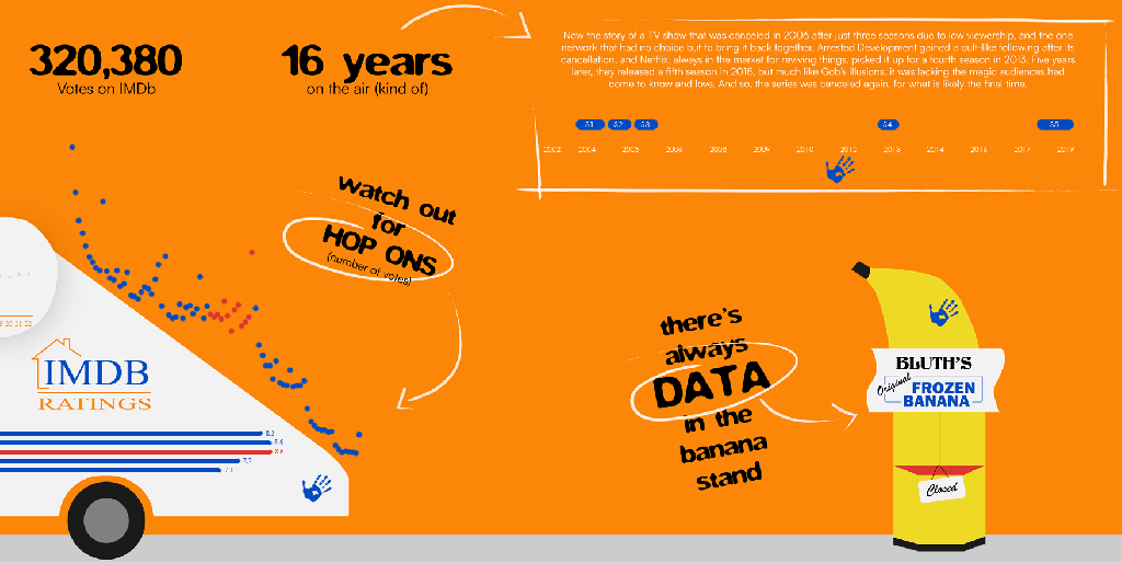
Stair Car

The Stair Car became the vessel for showcasing the IMDb data, and contains three main charts:
- IMDb season ratings: Bar charts placed on the side of the car to look like stripes.
- IMDb episode ratings: Dot chart placed in the Bluth Company logo (I liked the way the logo looked like an X and Y axis, so I played on that).
- IMDb episode votes: This is another dot chart placed on the stairs of the car. When I created this chart it mimicked the slope of the stair car (well, that was a freebie!), so it was only natural to make them the “hop ons”.
I won’t go into too much detail on these charts because they’re pretty straight forward, out of the box charts, but I want to mention a few techniques I used.
Assign a highlight pallete
I learned this one from Sarah Bartlett in the 2024 Tableau Tip Battle. When you click a mark in Tableau, it will mute the color of the other marks, and then you can use the color legend to assign that highlighted color palette!

I used this technique because the red and blue are both vivid colors, and when the marks overlapped, I found it was harsh on my eyes. Muting the unselected seasons made it easier to see the selected season and still retain the other episodes for comparison.
Remove highlight
Funnily enough, I wanted to remove the highlighted mark feature on the season bar chart. As mentioned above, when you click on a mark in Tableau, it mutes the color of the unselected marks. This isn’t the functionality I wanted when the user clicked on the season bar chart. Here’s what happens when you click on the bar chart:

To override this functionality, I used the filter technique that Brian Moore describes in detail here. It involves using a filter action to clear the selected season. Here’s the functionality after the filter action has been applied:

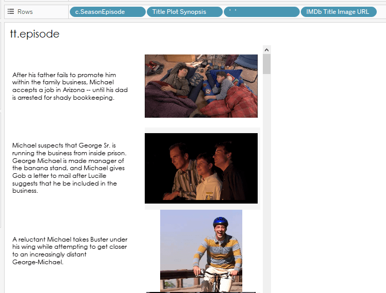
Viz in Tooltip

Both charts with episode-level data incorporate the same viz in tooltip. I did this to get the alignment I wanted for the episode’s plot description and image (which uses the image role feature described earlier). This uses a text mark to show the plot synopsis of the episode, and uses the IMDb Title Image URL with image role applied.
The Gantt Chart
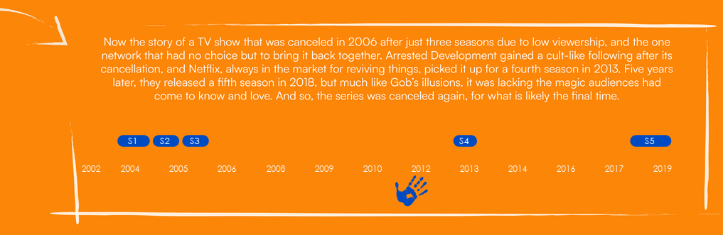
A big part of the Bluth’s story is the gap between the first three seasons and the last two. Despite the cult following Arrested Development has garnered since it originally aired, its beginnings’s were rockier than Tobias’ acting career. There were early threats of cancellation, the number of episodes per season was slashed, and it was cancelled after the third season. It was almost a decade later that it was picked up by Netflix.
I used a rounded Gantt chart to show the wide gaps between seasons. The secret to a rounded Gantt chart is, it’s not actually a Gantt chart…it’s a line chart! Yes, much like Gene Parmesean, this chart is a master of disguise.
I took the season start and end years and converted them from dates to whole numbers. I did this by duplicating the Season Start/End Date variables and changing the data type to a whole number. I used those 2 duplicated variables as measure values, and put measure names on path to connect them with a line.
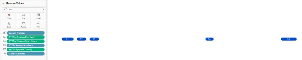
With line charts, Tableau will only label the points it’s connecting, but I wanted my label to be in the middle of each line. To get the label placement where I wanted, I created the following calculated field:
c.Midpoint Label
[c.Season Start Date (copy)]
+
(([c.Season End Date (copy)]-[c.Season Start Date (copy)])/2)
I added c.Midpoint Label to Columns and created a dual axis chart.
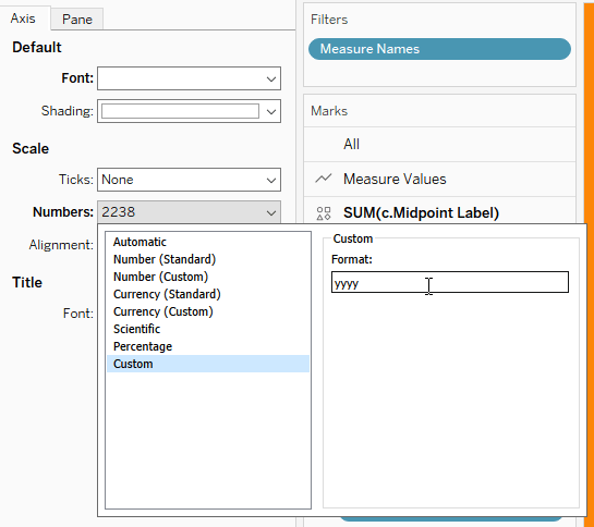
Lastly, because I changed the data type to a number, the axis didn’t make much sense:
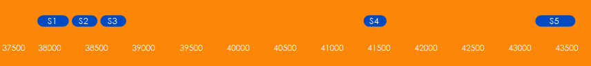
I needed to format the axis to look like a year rather than a whole number. To do that, I added some custom number formatting to the axis.
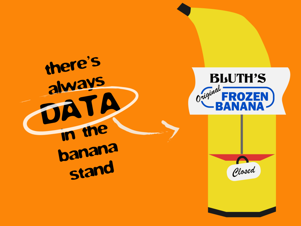
The Banana Stand
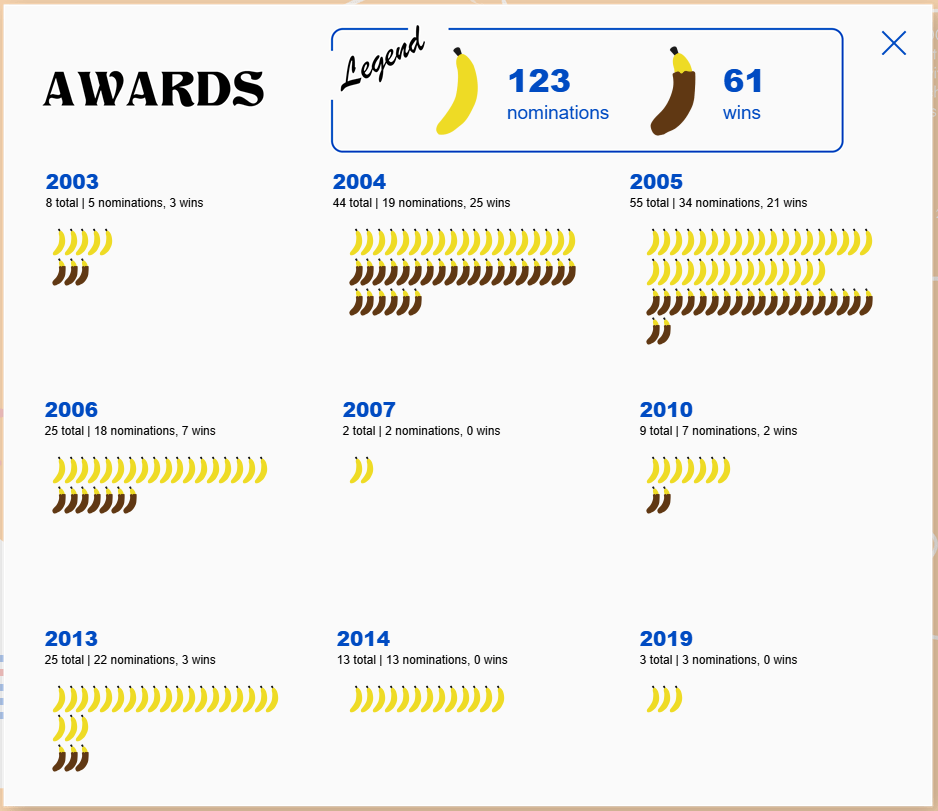
As all the Bluths know, there’s always money in the Banana Stand, and I thought it would bring some fun interactivity if end users could open the Banana Stand for a surprise.
I wanted the data inside to look somewhat like a Banana Stand menu, so I created custom shapes of dipped and undipped bananas to showcase the wins and nominations the show received each year. Setting this chart up was far more complex than I originally anticipated. I started off by using the INDEX() function, but I couldn’t get the level of control I wanted over the placement of the bananas. Formatting the titles for each year also became a bit of a snag when I was using INDEX(), so I scrapped it and went in a different direction.
First I created X and Y coordinates for the award year titles, which are used in a MAKEPOINT() function.
c.Award X
CASE [Award Year (Series)]
WHEN 2003 THEN 1
WHEN 2004 THEN 2
WHEN 2005 THEN 3
WHEN 2006 THEN 1
WHEN 2007 THEN 2
WHEN 2010 THEN 3
WHEN 2013 THEN 1
WHEN 2014 THEN 2
WHEN 2019 THEN 3
END
c.Award Y
CASE [Award Year (Series)]
WHEN 2003 THEN 3
WHEN 2004 THEN 3
WHEN 2005 THEN 3
WHEN 2006 THEN 2
WHEN 2007 THEN 2
WHEN 2010 THEN 2
WHEN 2013 THEN 1
WHEN 2014 THEN 1
WHEN 2019 THEN 1
END
mp.Year Label
MAKEPOINT([c.Award X]+.2,[c.Award Y]+.5)
The banana placement required logic based on how many bananas were in each row and column for the nominations and wins each year (see the calculation comments below). This was a bit of a headache and there were many times I kept revisiting the INDEX() function, but that route presented its own issues. I stuck it out and got the bananas where I wanted them in the end. And that’s why you always leave a note persevere in the face of complexity!
Note: I added “Award Row Number” to my data so I had a value to work with in these calculations.
Each row has a max of 19 bananas in it, so you’ll see logic throughout the calculations that determines where the count of bananas is less than 20.
c.Banana X
IF { FIXED [Award Year (Series)], [tt.Award Winner]:COUNT([Is Award Winner (Series)])}
<20 THEN
[c.Award X]+(INT([c.Award Row Number])/25)
ELSEIF
{ FIXED [Award Year (Series)], [tt.Award Winner]:COUNT([Is Award Winner (Series)])}
=20 THEN
(IF INT([c.Award Row Number])<20 THEN
[c.Award X]+(INT([c.Award Row Number])/25)
ELSEIF
INT([c.Award Row Number])>=20 THEN
[c.Award X]+((INT([c.Award Row Number])-19)/25)
END)
END
c.Banana Y
//rows for banana awards
//less than 20 awards for noms and wins, line up 2 rows of bananas – wins right under noms)
IF [c.Noms by Year Count] <20 AND [c.Wins by Year Count ] <20
THEN
[c.Award Y]+ IIF([Is Award Winner (Series)]=TRUE,.17,.3)
//if nominations and wins both excede 20, then 2 rows for each
ELSEIF [c.Noms by Year Count]>=20 AND [c.Wins by Year Count ]>=20
THEN
if [Is Award Winner (Series)]=FALSE and INT([c.Award Row Number])<20 THEN [c.Award Y]+.3 ELSEIF [Is Award Winner (Series)]=FALSE and INT([c.Award Row Number])>=20 THEN [c.Award Y]+.17
ELSEIF
{ FIXED [Award Year (Series)]:COUNT(IF [Is Award Winner (Series)]=TRUE THEN [Is Award Winner (Series)] END)}>=20
THEN IIF(INT([c.Award Row Number])<20, [c.Award Y]+.04, [c.Award Y]-.09)
END
//if nominations excede 20 and wins do not, then 2 rows for noms, 1 row for wins
ELSEIF [c.Noms by Year Count]>=20 AND [c.Wins by Year Count ]<20 THEN if [Is Award Winner (Series)]=FALSE and INT([c.Award Row Number])<20 THEN [c.Award Y]+.3 ELSEIF [Is Award Winner (Series)]=FALSE and INT([c.Award Row Number])>=20 THEN [c.Award Y]+.17
ELSE [c.Award Y]+.04
END
//if nominations don’t excede 20, then 1 row for noms
ELSEIF [c.Noms by Year Count] <20 AND [c.Wins by Year Count ]<20 THEN if [Is Award Winner (Series)]=FALSE THEN (IF INT([c.Award Row Number])<20 THEN [c.Award Y]+.3 END) ELSEIF [Is Award Winner (Series)]=TRUE THEN (IF INT([c.Award Row Number])<20 THEN [c.Award Y]+.17 ELSEIF INT([c.Award Row Number])>=20 THEN [c.Award Y]+.04
END)
END
//if nominations and wins don’t excede 20, then 1 row for noms
ELSEIF [c.Noms by Year Count] <20 //AND [c.Wins by Year Count ]<20 THEN if [Is Award Winner (Series)]=FALSE THEN (IF INT([c.Award Row Number])<20 THEN [c.Award Y]+.3 END) ELSEIF [Is Award Winner (Series)]=TRUE THEN (IF INT([c.Award Row Number])<20 THEN [c.Award Y]+.17 ELSEIF INT([c.Award Row Number])>=20 THEN [c.Award Y]+.04
END)
END
END
mp.Banana
MAKEPOINT([c.Banana X],[c.Banana Y])
Now, let’s open and close the Banana Stand!
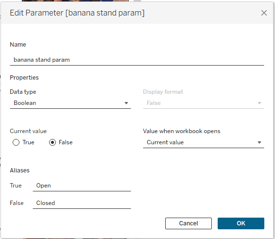
To get this interactivity, I used my favorite combination of features in Tableau: parameter actions and dynamic zone visibility (DZV). First, I created a parameter to show and hide the data in the Banana Stand.
Then I created two calculated fields to work with the parameter and control DZV.
p.Banana Closed
[banana stand param]=FALSE
p.Banana Open
[banana stand param]=TRUE
I created two sheets: “open banana” and “close banana”. Both are set to shape marks, with “open banana” set as a transparent shape, and “close banana” set as an “X”.
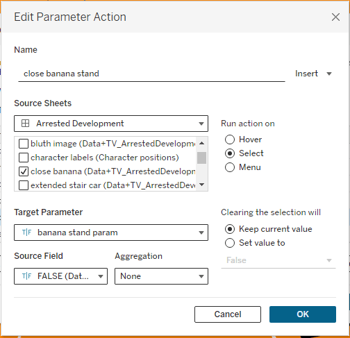
I overlayed “open banana” on top of the image of the Banana Stand, then set up a parameter action. When I set up a parameter action, I like to think about it in layman’s terms. So what the parameter action below is saying is, “When the user clicks (i.e., run action) on the open banana sheet (i.e., source sheet), send TRUE (i.e., source field) to the banana stand param (i.e., target parameter).”

When the banana stand param is set to true, the p.Banana Open calculation will return TRUE, effectively opening the Banana Stand. Anything I want to show when the Banana Stand is open will need to have DZV controlled by p.Banana Open. You apply DZV in the Layout Pane and select “Control visibility using value”.
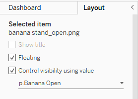
I have applied DZV controlled by p.Banana Open to:
- Blank object that covers the whole viz (this is what adds the white out effect of the background)
- Background image of the award menu
- Banana awards sheet
- Award BANanas sheet
- Close banana sheet
- Image of an open Banana Stand
To close the Banana Stand, I have another parameter action set up on the “close banana” sheet. Just like before, let’s think about this in layman’s terms: When the user clicks on the close banana sheet, send FALSE to the banana stand param.
When the banana stand param is set to FALSE, p.Banana Close will return TRUE. Anything we want to show when the Banana Stand is closed will need to have DZV applied and controlled by p.Banana Close. In this case, the only thing that should show when the stand is closed is the image of the closed Banana Stand.
Tobias’ Handprints
And now a word from Tobias…
Ah, greetings, fellow Arrested Development aficionados! It is I, Tobias Fünke, here to regale you with the tale of the blue handprints that have quite literally left their mark upon this viz. In a stroke of sheer genius, these handprints are utilized to offer you, dear reader, both instructions and insights throughout this visual extravaganza.
Imagine, if you will, my hands guiding —nay, leading you— through the labyrinthine of intricacies of this visualization. With each print, a nugget of wisdom or a pearl of clarity bestowed upon you, transforming your experience from the mundane to the sublime.
To bring this vision to life, Lisa employed a most exquisite set of Photoshop brushes, meticulously crafting each handprint to ensure that every smudge, every streak, and every fingerprint bore the unmistakable hallmark of me, Tobias Fünke. The prints were then imported to Tableau as custom shapes and utilized as beacons to illuminate your path to enlightment.
On the next Arrested Development…
…Lisa continues her adventures in data visualization, and shares more tips and insights on her vizzes.
From adding hop ons to the Stair Car, to navigating banana placement, to writing in the distinctive style of Tobia Fünke, this project was a labor of love for a show that’s given me countless laughs. I had a lot of fun creating this, and it even inspired me to do a rewatch of the show.
I hope you’ve enjoyed all the Arrested Development Easter eggs throughout the viz and this blog post. Thanks for reading, and don’t forget to check out the final viz. It’s hotter than a Cornballer!

Leave a comment