
Get in, loser, we’re talking about Mean Girls.
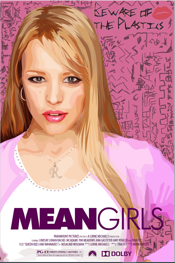
Mean Girls is one of my favorite movies. It came out during my first year in college, so my high school experience was fresh and relatable. However, even now, 20+ years after graduating high school, I still love this movie. I watch it every October 3rd, I own a Burn Book notebook, and I quote the movie constantly (it seems like there is always an opportunity to yell, “She doesn’t even go here!” in my day-to-day life). When I took an Illustrator class a few years ago, we had an assignment to create a movie poster featuring one of the movie’s characters. Of course I chose Mean Girls and made this:
You might say the limit does not exist when it comes to how much I love this movie. Unfortunately, it was my love for Mean Girls that made it difficult to create this viz. I’m a big proponent of “viz what you love,” but I find when I love a topic too much, I get in my head. My passion can often bring an internal pressure to do the topic justice, and that was definitely the case with this viz.
I had the idea for a Mean Girls data Burn Book back in July 2021, but this viz didn’t come to fruition until January 2024. So why the delay?
- July 2021: I had the idea for this viz and collected all the data.
- August 2021: I found out I was an Iron Viz finalist and all side projects ceased.
- Sept 2021: Iron Viz was life.
- Oct-Nov 2021: Viz fatigue. Iron Viz took a lot out of me, and I had a bit of viz paralysis for a while.
- Nov 2021: Iron Viz airs and surprise…I’m also pregnant!
- Dec 2021 – May 2022: Pregnant and getting ready for our new arrival.
- May 2022 – Present: I’m not like a regular mom, I’m a cool mom…with no free time. I basically only viz for fun while my child is sleeping.
I periodically went back to this viz over these 2+ years. I’d do a little bit of work on it, decide it wasn’t quite right, then abandon it for a month or two. That cycle repeated until, inspired by the release of Tableau’s Data+Movies challenge and the new Mean Girls movie musical, I hunkered down and did the damn thang (did you just say thang?).
I couldn’t be happier or prouder with the finished product, and the cherry on top of this passion project is it was featured on IMDb in their Data + Movies gallery. I don’t know what to say except, that is so fetch!
So let’s dive in, go behind the viz, and see how it (finally) came together.


The Design
Plain and simple, I wanted to make this look like the Burn Book. It’s an iconic prop from the movie, and it was the only way I ever envisioned displaying this data. While I loved this idea, it was a challenge for me. I’m all about details, clean lines, and uniform spacing and alignment. The Burn Book is not that. It’s scribbles and ink stains and uneven scissor cuts:
I embraced as much chaos as I could in the design. I channeled my teenage-self doodling on a notebook and went all in on creating a messy viz.
The Fonts
I started off by finding hand-written fonts that looked like they could belong to one of The Plastics. I ended up using a combination of three different fonts on the main pages of the Burn Book.
The front cover uses an additional font called Scribble that I used to write “BY THE NUMBERS”. The “MEAN GIRLS” title is cobbled together with several different fonts, plus a few hand-drawn letters.
The Background Images
One of my favorite places to source free stock images is unsplash.com, and I used two images for this viz:
- Crumpled paper: This is used on all the main pages of the Burn Book.
- Grunge texture: This is overlayed on the cover to give it a bit of grunginess.
The Scribbles
To achieve the look of the scribbles on the cover, I used a combination of different Photoshop brushes:
- Inktober: I relied heavily on the “Classic Ballpoint Pen” brush
- Coy Dreamer: I used several different brush packages created by Coy Dreamer
- Doodle Brushes: by Jamie Haxby
- Runny Inkers: by Kyle T. Webster
To get the lip print in the middle of the book, I used these Photoshop brushes.
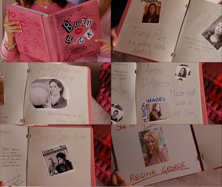
The Yearbook Photos
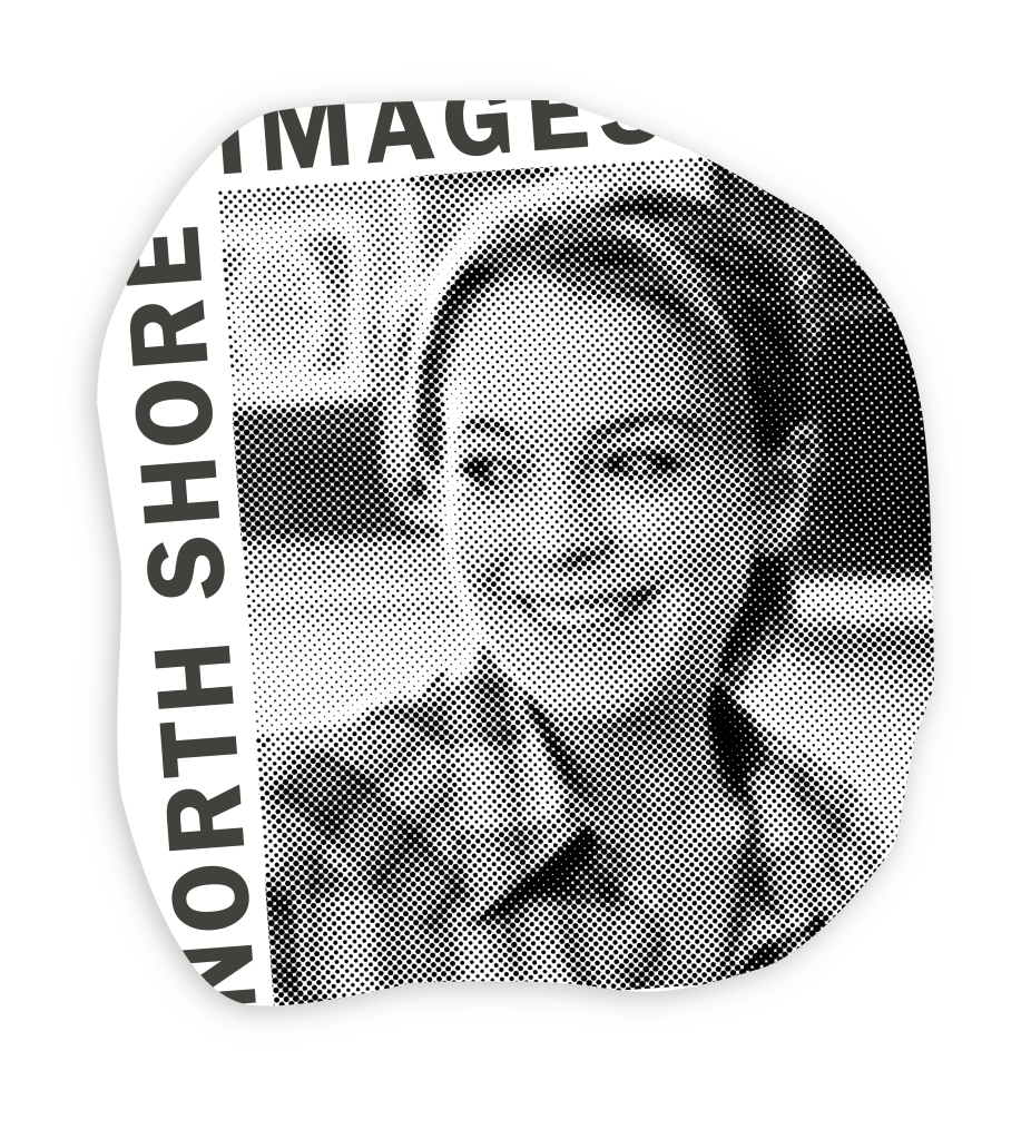
Whenever I used a picture of a character, I wanted to make it look like the picture had been cut out of the North Shore High School yearbook. I used Amber D’Lessio’s Burn Book page as inspiration.
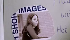
It appears to says “NORTH SHORE” along the left-hand side, and “IMAGES” across the top, so I added the same text to the sides of each character’s picture.
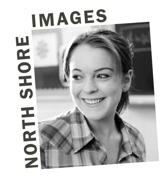
I then added a Neon Glow and Color Halftone effect in Illustrator to give the photo a yearbook quality style.
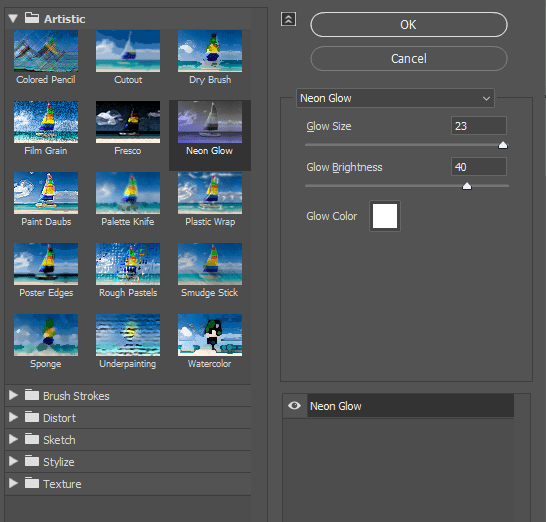
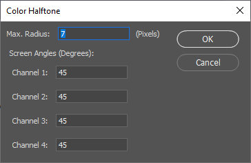
These two effects gave the dot pixel look that is inherent in yearbooks.
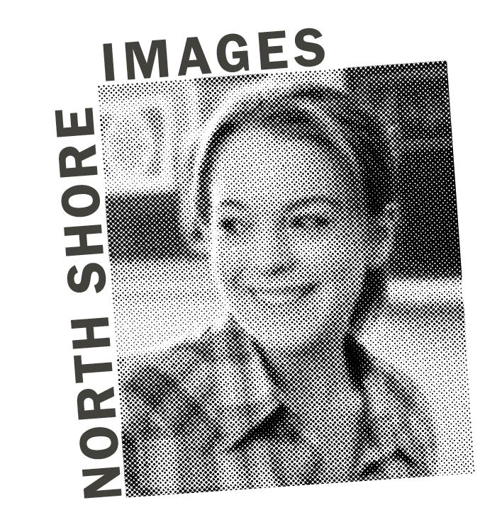
To make the picture look like it had been cut out of a yearbook, I drew a chaotic line around the picture and applied it as a clipping mask. Lastly, I added a drop-shadow to make it look as though the picture was slightly pulling away from the page.
The Pages
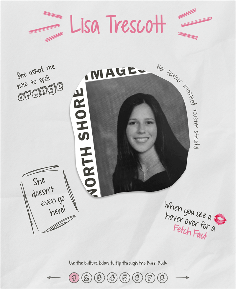
01 – Lisa Trescott
The intro Burn Book page featuring my yearbook photo (yup, that’s me in my senior year of high school), serves primarily as an instructional page. It alerts the user to hover over the lip prints to get a fetch fact, and explains the navigation buttons at the bottom.
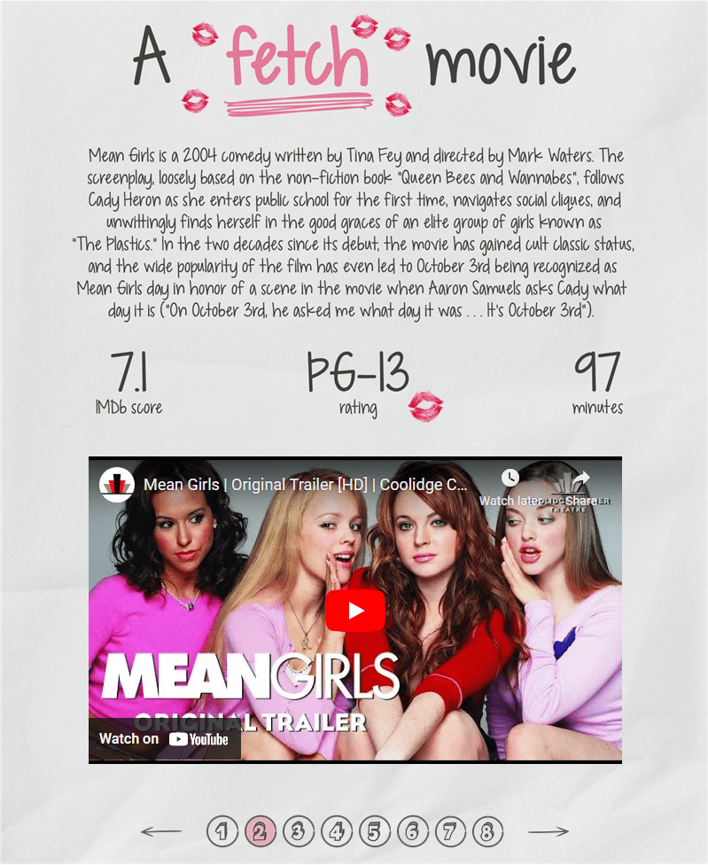
02 – A fetch movie
Data: Tableau and IMDb’s Data + Movies dataset
Because there are only a handful of fonts that render on Tableau Public, this page is mostly created in Illustrator with a few transparent vizzes overlayed to get tooltips.
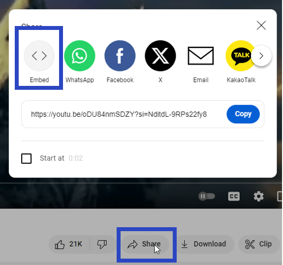
The main component I want to focus on is the embedded YouTube video. You can embed any YouTube video in Tableau as a Web Page if you have an embed code. In YouTube, navigate to a video, click on “Share” beneath the video, then choose “Embed”:
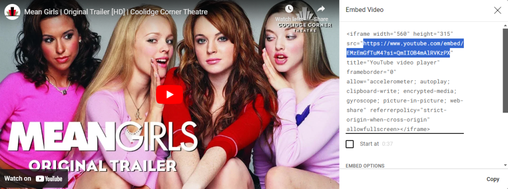
That will give you a pop up that looks like the screenshot below. You only want the link inside the double quotes. Copy that code, add a “Web Page” object to your Tableau dashboard, and paste the code.
Note: sometimes the video won’t display if you’re working on Tableau Desktop, but will work once the workbook is published.
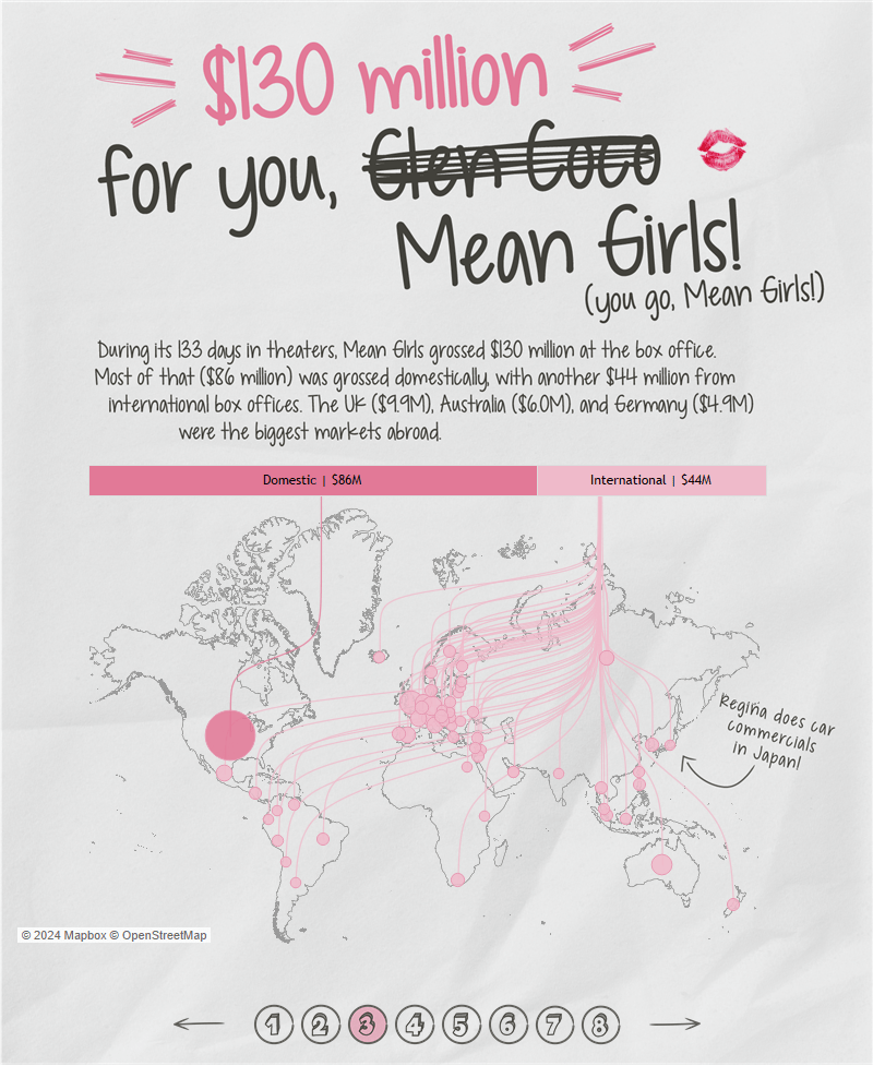
03 – $130 million for you, Mean Girls

Data: Box Office Mojo
To my knowledge, this chart type using curvy lines on a map was first done in Tableau by Wendy Shijia in her Inside the Noah’s Ark for Plants viz. Christian Felix brought this chart type into the limelight when he used it in his winning 2020 Iron Viz: The Air We Breathe.
Luckily for me, Wendy wrote a blog post outlining exactly how to create this chart, so I won’t reinvent the wheel. Check out her blog here for an excellent tutorial!
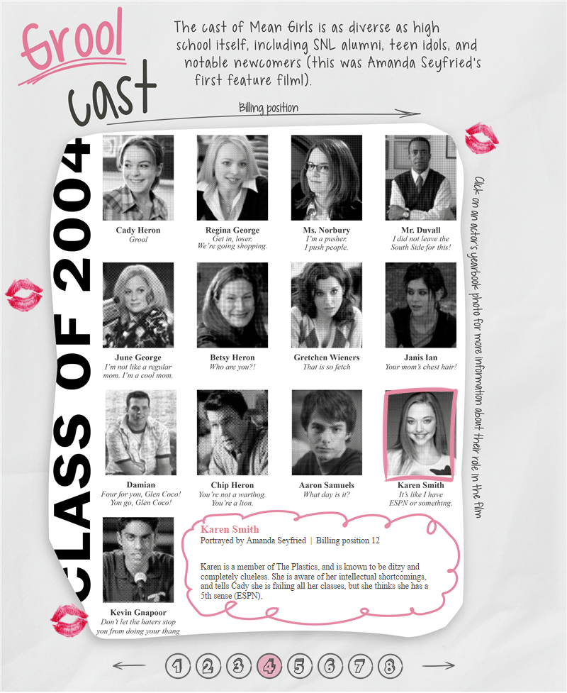
04 – Grool cast
Data: Tableau and IMDb’s Data + Movies dataset
To introduce the main cast of the movie, I wanted to make it look like a whole page was torn from a yearbook. I created the yearbook page using the same techniques I described for the yearbook photos, but instead of creating a single photo, I laid out all the photos to look like a yearbook page.
I created X and Y coordinates for each character based on their billing position (can you believe Amanda Seyfried was 12th in billing?!).
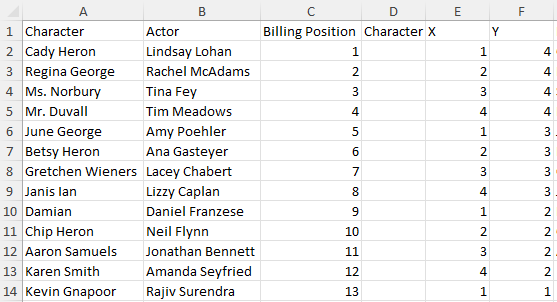
I used the X and Y coordinates to place a mark where each character is shown on the yearbook page. I used a parameter (Actor Param) and calculated field (p.Actor) to flag when an actor was selected. I placed p.Actor on shape and assigned a transparent shape (i.e., a shape with no fill or stroke) to FALSE, and a pink frame to TRUE. I used a parameter action on the Burn Book page to allow the end user to click on an actor/character to select them.
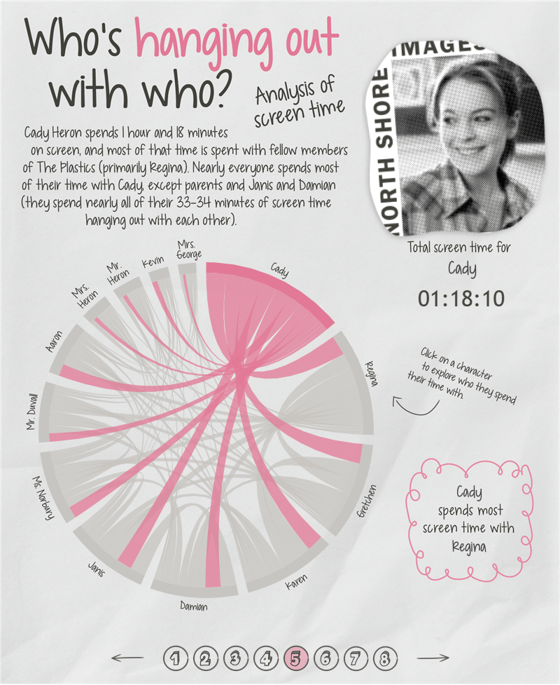
05 – Who’s hanging out with who?
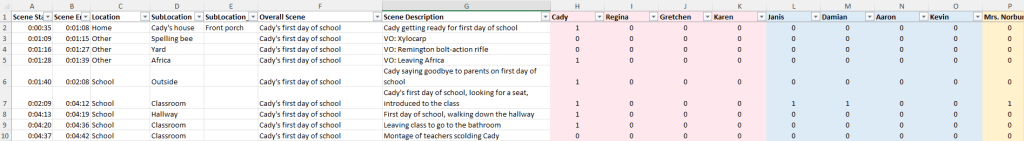
Data: Hand-collected. I tracked which characters appeared in each scene, then clocked the time for the whole scene. Here’s a screen shot of what my data looked like.
I used Tristan Guillevin’s AdvViz tool to create the chord diagram showing how much time characters spend on screen with each other. You need a file with the following three columns to use with the chord diagram tool:
- Source: Main character
- Target: Character with whom the source character is on screen
- Value: Time spent on screen together
Here is what my data looked like:

I played around with the padding, size, and margins of Tristan’s tool until I was pleased, then downloaded it as a Tableau workbook. First thing I did was make a parameter to select a character (Character Param). In order to have the color turn pink when a character was selected, I used the following calculated field:
Color
This field returns TRUE if the character parameter equals the source field or the target field.
IF [Character Param]=[source_field]
THEN TRUE
ELSEIF [Character Param]=[target_field]
THEN TRUE
END
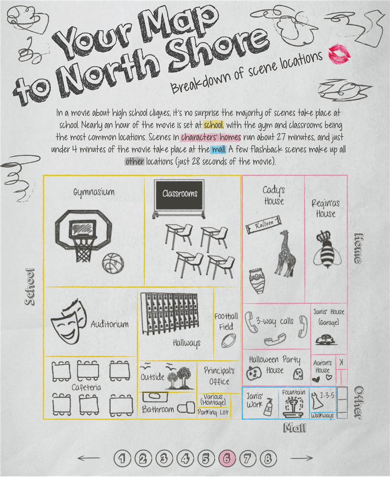
06 – Your Map to North Shore
Data: Hand-collected. This viz uses the same data as shown above for characters’ time on screen.
In the movie, Janis Ian gives Cady a map to North Shore to help her navigate all the cliques at school. Even though it’s not part of the Burn Book in the movie, I knew that map needed to be in this viz somewhere. I found the perfect place when deciding how to visualize scene location data. I set out to mimic the look of Janis’ map:

I created the tree map in Tableau, then recreated it on a background image in Illustrator. I added all the doodles with a combination of Photoshop brushes and hand-drawn icons in Illustrator. Back in Tableau, I turned the color opacity on the heat map down to 0% and overlayed it on top of the background image. This allowed me to use the tooltips from the Tableau tree map, but visually show the map I created in Illustrator.
07 – The meanest girl
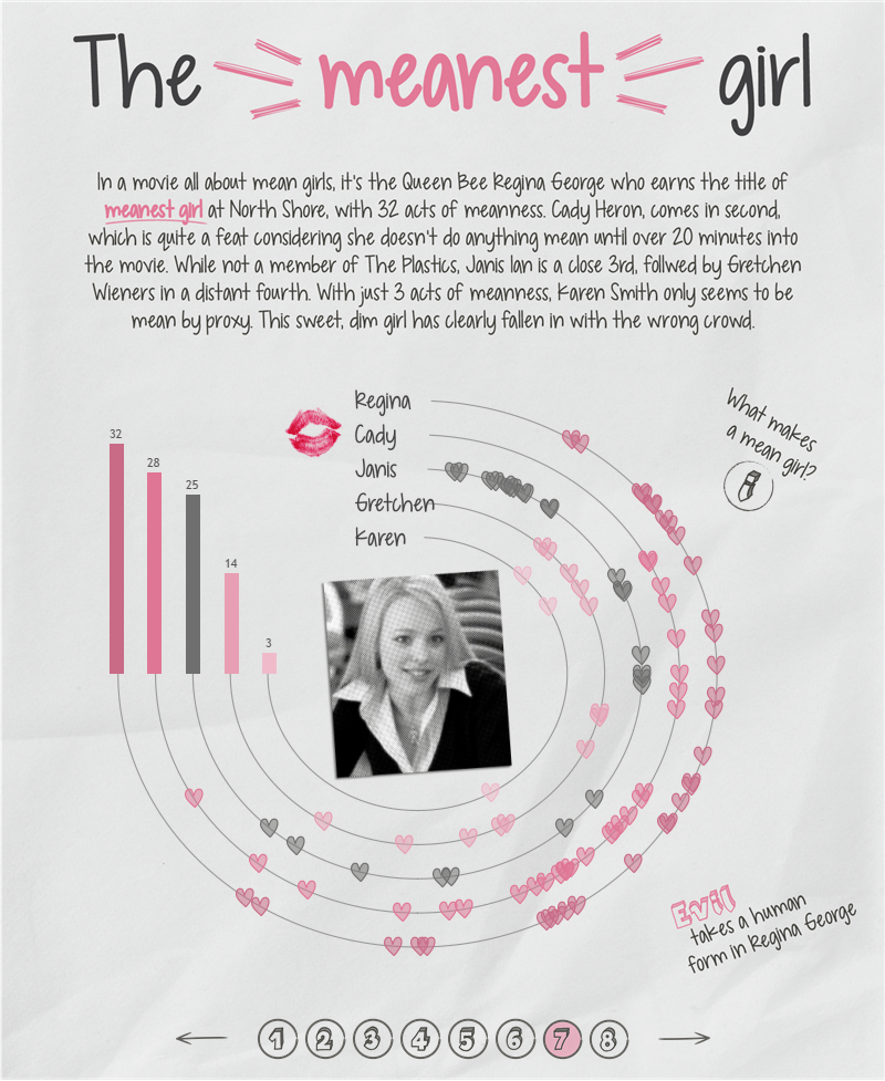
Data: Hand-collected. I quantified what makes an action “mean” and marked the time when each girl did something mean. The info icon on the viz shows you how I quantified being mean:

Here’s a snapshot of what my final data looked like:

I mentioned in a previous blog post that any time I create radials, I use Ken Flerlage’s blog post about using trig in Tableau. No exception here! I used Ken’s blog to work out all the radial calculations:
Radius
This puts each character a different distance away from the center of the cirlce. I put the characters in descending order by their mean acts.
CASE [Character]
WHEN ‘Regina’ THEN 20
WHEN ‘Cady’ THEN 17.5
WHEN ‘Janis’ THEN 15
WHEN ‘Gretchen’ THEN 12.5
WHEN ‘Karen’ THEN 10
END
Point Spacing
This determines the spacing between each point/event. I used the number of seconds in the movie as the number of points. I only wanted the circle to go to 270 degrees. Therefore, I divided 270 by 5811 (i.e., the number of seconds in the movie) to get all the points on the circle.
270/5811
Angle
I suggest looking at Ken’s blog post to understand what the angle is, but essentially we’re finding the angle of a triangle that sits inside the circle and dictates where a point will fall on the circle.
([Second])*[Point Spacing]
Angle in Radians
Tableau doesn’t like degrees and makes you turn your degrees into radians in order to use them.
RADIANS([Angle])
X
The X coordinate is the sine of the angle times the radius (again, Ken’s blog explains all the trig here).
SIN([Angle in Radians])*[Radius]
Y
The Y coordinate is the cosine of the angle times the radius (you guessed it! Read Ken’s blog for the trig).
COS([Angle in Radians])*[Radius]
Now I have the X and Y coordinates representing every second of the movie. I chose to use them in a MAKEPOINT() function in order to create several map layers.
mp.Line
This creates a point for every second in the movie. It is used to make the “background” line that all the hearts are placed on.
MAKEPOINT([X],[Y])
mp.Event
This creates a point for each mean act that happens. I created a new X coordinate that only shows if a mean act is associated with that time point (X_Event = IF NOT ISNULL([Mean Event]) THEN [X] END), then used that in a MAKEPOINT() function.
MAKEPOINT([X_Event],[Y])
mp.Start
This puts a point at the start of each character’s line for their name. The X coordinate is hard coded as -1.5 in order to allow room at the start of the line to fit each characters name.
MAKEPOINT(-1.5, [Radius])
There are 4 map layers on the final chart:
- mp.Line
- Mark Type = Line
- Uses mp.Line to connect all the points on the circle
- mp.Event
- Mark Type = Shape
- Uses mp.Event to show hearts whenever there is a mean act
- mp.Start
- Mark Type = Shape
- Uses mp.Start to put the characters names at the start of each line
- Note: Each name is actually a custom shape. This is to get around the fact that Tableau only renders a handful of fonts.
- mp.Center
- Mark Type = Shape
- Uses a mp.Center to put the characters photo in the center of the circle.
- Calculation = MAKEPOINT(0,0)
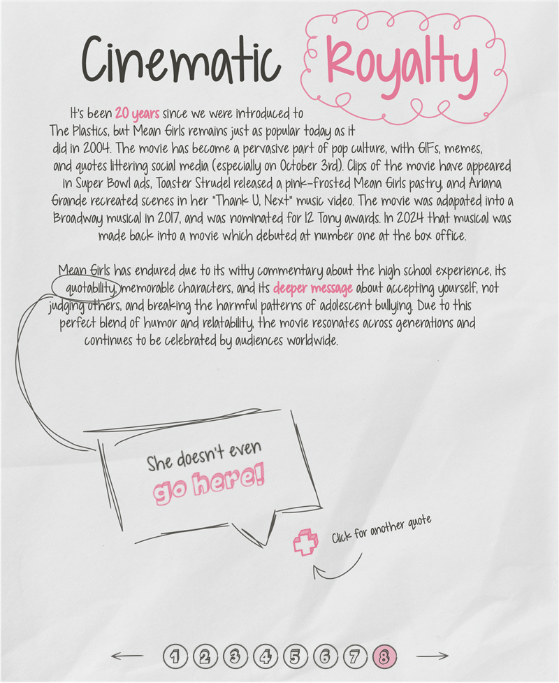
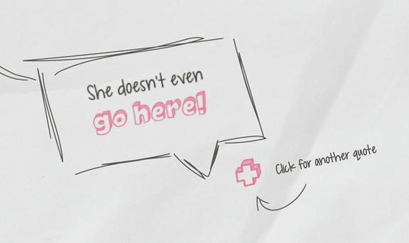
08 – Cinematic Royalty
This page serves as a wrap up to the viz and a place to feature all my favorite quotes from the movie. When you click the plus icon, a new quote from the movie is displayed. To achieve this, I made a simple dataset assigning numeric values to each quote:

Then I created a parameter (Quote Param). It’s set up as an integer with values 1 through 11 to correspond to the number of quotes:
I set up a sheet with a plus icon as a shape mark. When a user clicks on the plus sign, it needs to send the value of the next quote to the parameter in order to display the next quote, so I created the following calculated field:
p.Next Quote
This calculation is used with a parameter action on the dashboard in order to feed the next quote # to the Quote Param.
IF INT([Quote#])=11
THEN 1
ELSE INT([Quote#])+1
END
Note: The “next quote” sheet is filtered to only retain the selected quote.
On the Burn Book page, I set up a parameter action so that when the user clicks (Run aciton on Select) on next quote (Source Sheet), it will send p.Next Quote (Source Field) to the Quote Param (Target Param).
Now the user can click the plus button and be delighted by the most unforgettable quotes from the movie.
God, Mr. Duvall, can you wrap it up?
As I close this chapter of the Burn Book, I have an even deeper appreciation for Mean Girls. Beyond its endlessly quotable lines like “On Wednesdays, we wear pink” and “You can’t sit with us,” there is a deeper message about the complexities of high school dynamics, friendship, and self-acceptance. It’s a movie I know I’ll keep coming back to, no matter what stage of life I’m in, and being able to view it through the lens of data was such a grool experience. This has been my biggest passion project in Tableau yet, and I hope you enjoyed going behind the scenes with me!

Leave a comment