

Pie charts tend to spark debate in the data visualization world. The controversy stems from how our brains interpret visual data (specifically, the size of angles). Unlike length or position, which we process more intuitively, estimating angles and comparing slices within a pie chart isn’t something we’re naturally good at. This limitation can make pie charts less precise for certain types of data analysis.
That said, pie charts still have their place. While I don’t use them all the time, there are situations where they excel. When you want to convey simple proportions, create an eye-catching visual, or highlight a single dominant category, a well-designed pie chart can be highly effective.
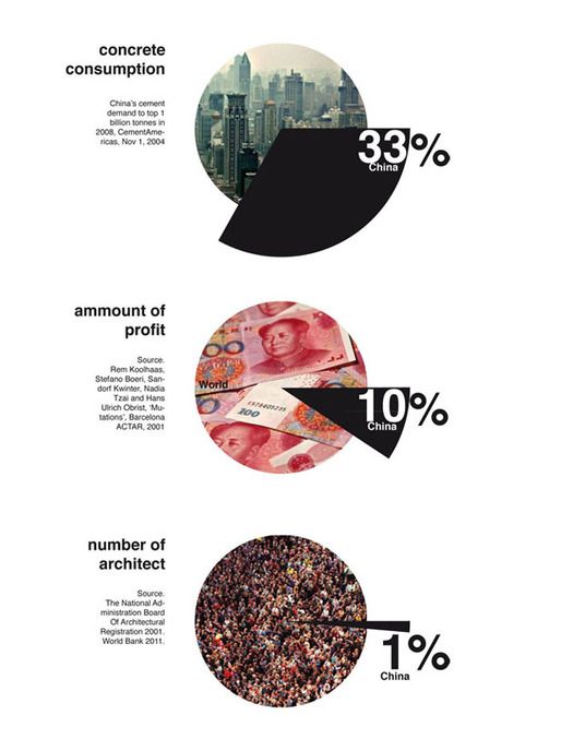
I came across these pie charts on Pinterest, and loved their infographic feel! Their clean design, vibrant colors, and bold font made them stand out, and what really caught my attention was how they used images as backgrounds for the pies. This design brings such fun visual interest, and is a clever way to add context and capture the viewer’s attention.
Naturally, I was inspired to recreate them in Tableau! You can access my finished workbook here.
In this post, I’ll guide you through the process of building three different styles of picture-perfect pies using map layers in Tableau:
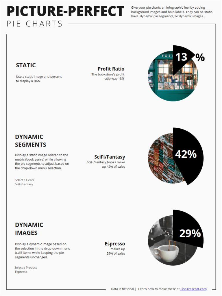
- Static: As the name implies, this is completely static. The background image doesn’t change, the pie segment doesn’t move, and the label stays in one place.
- Dynamic Segments: This displays a static image related to a metric (in this case, book genre) while allowing the pie segments to adjust based on the selection.
- Dynamic Images: This displays a dynamic image corresponding to the selected item from a drop-down menu (in this case, café item), while keeping the pie segments and label unchanged.
Let’s Build It!
I used many of the techniques discussed in Shreya Arya’s blog post about building custom donut charts with map layers. Her tutorial is fantastic, so check it out if you’re looking to make some fun graphic donut charts!
Find Images
Start by finding images to use as your backgrounds. I created fictional data for a bookstore and its café, so I set out to find images that fit that theme using Unsplash.com and Pixabay.com.
Here are the links to the images I used:
- Bookstore (by Said Camlica)
- Book stack (by Annie Spratt)
- Coffee (by acekreations)
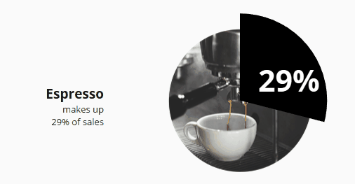
- Espresso (by Nicolas Horn)
- Tea (by StockSnap)
- Pastry (by Honey Fangs)
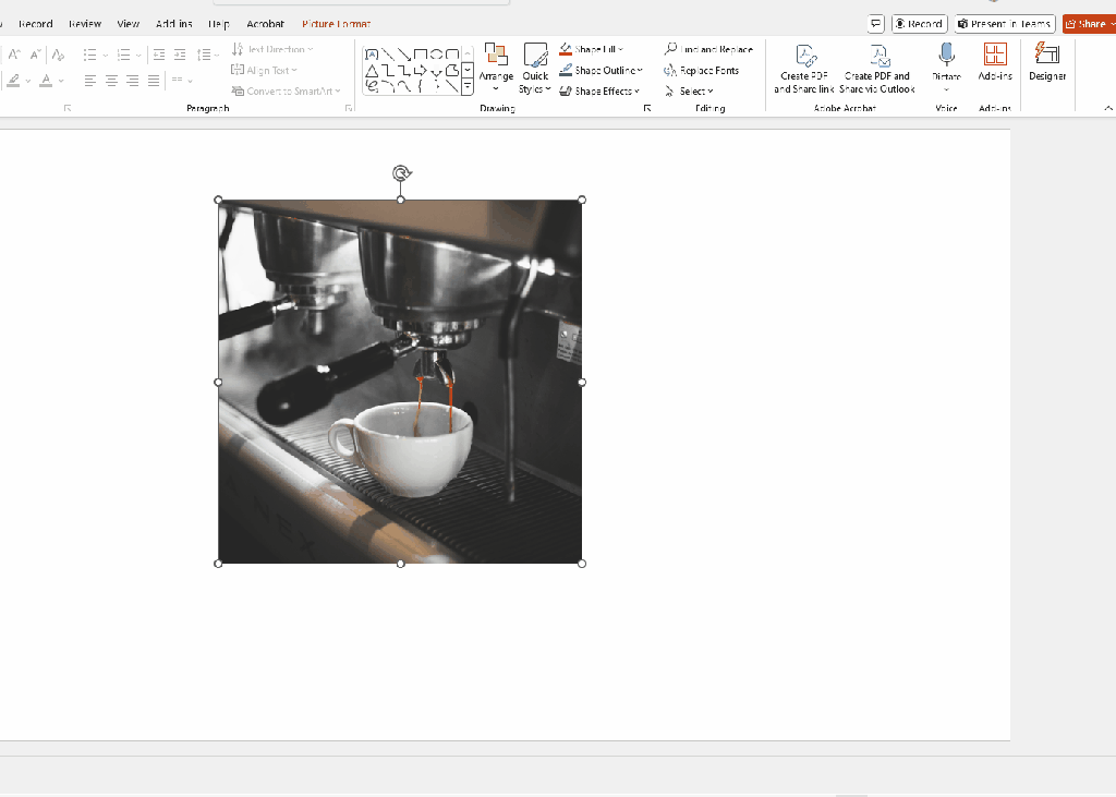
Crop Images to Circles
You don’t need any fancy design tools to crop an image to a circle. You can do this in PowerPoint quite easily by cropping to a shape. Once you’re done, right click your image and select “Save as picture”.
Tip: Make sure all your images are the same size (especially if you’re using the dynamic background style)!
Map It!
We’ll be using map layers to make these charts in Tableau, so we’ll create coordinates for Tableau to “map” using the MAKEPOINT() function. MAKEPOINT() does exactly what it sounds like it does – it makes a point. All you have to do is specify the X and Y coordinates, in this case 0, 0, to create the following calculation:
mp.Center
MAKEPOINT(0,0)
Add mp.Center to your view, and you’ll see a map. Drag it onto your view again as a map layer, then swap the X and Y axis.
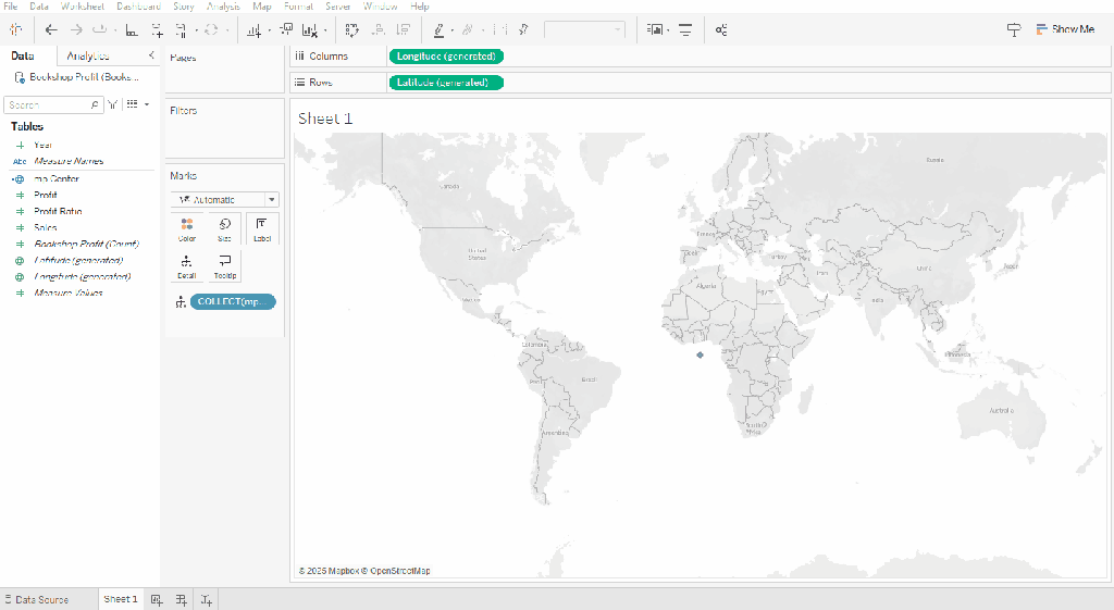
Tada! Now you have traditional X and Y coordinates rather than a map.
Now it’s time to add your background image. Go to Map -> Background Images -> Select your data source.
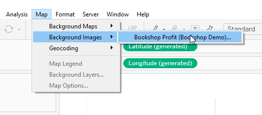
Select “Add Image”
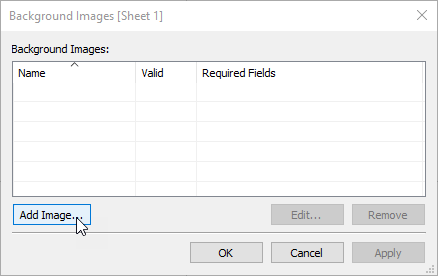
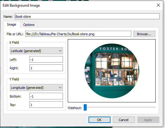
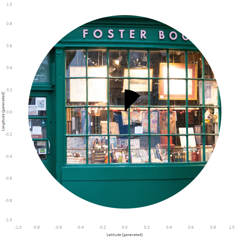
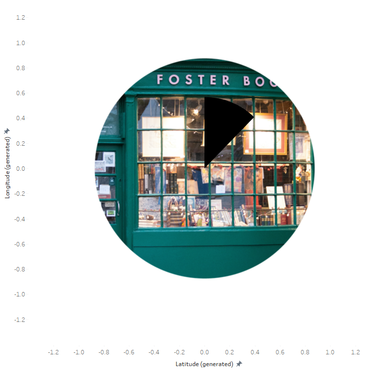
Select the image you want to use and map the X and Y coordinates. These coordinates will dictate where your image is plotted. I used -1 and 1 for both the X (Latitude) and Y (Longitude).
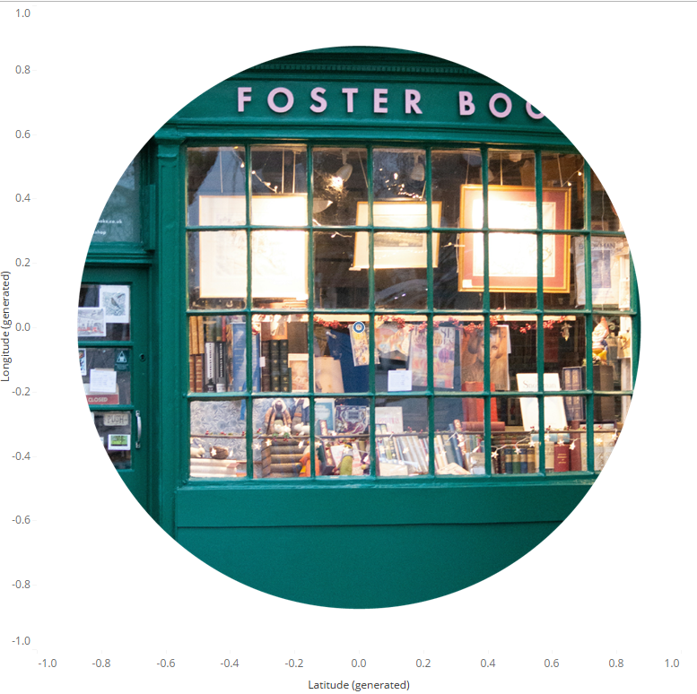
You’ll notice, the image is plotted between -1 and 1 on both the X and Y axis:
Make it Dynamic!
If you’re creating a Static or Dynamic Segment pie chart, you’re done adding your background image. If you’re creating a Dynamic Background pie chart, you’ll need to do the following additional steps:
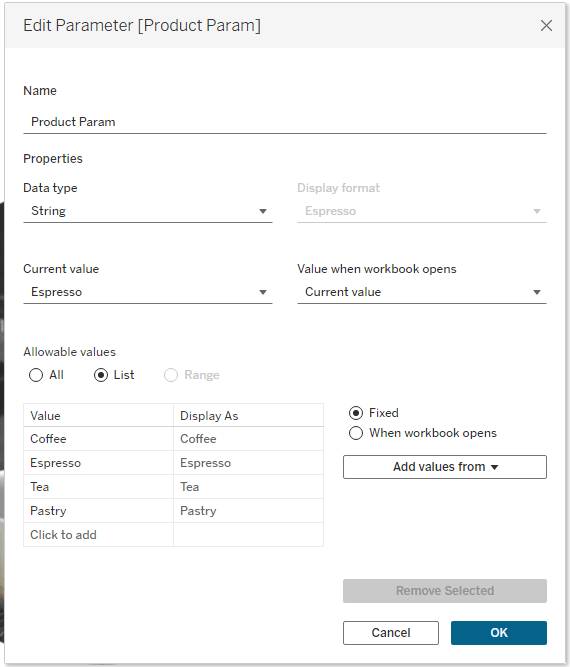
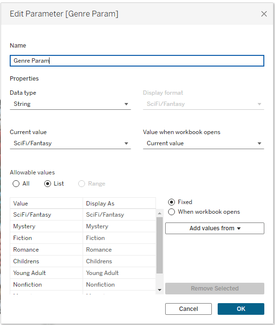
- Create a Parameter: Build a parameter (Product Param in my workbook) based on the metric for which you want to change the background.
- Create a Calculated Field: This calculation will reference the parameter.

- Add your Background Images: Follow all the steps outlined above to add each background image. Make them dynamically change by selecting “Options” and “Add” under “Only Show When”. Select the calculated field you created above (p.Product Image), and select the corresponding value.
- Note: only the value currently selected by the parameter will be available to choose. You will need to change the parameter between mapping each value to its image.

Create a Pie Chart
Now it’s time to create your pie chart. This process is slightly different for each pie style, so let’s talk about the static style first.
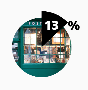
Static
Pie Layer
This pie chart shows profit ratio (Sales / Profit). Profit Ratio makes up the black, visible portion of the pie, the following calculated field makes up the transparent portion:
1-Profit Ratio
1-[Profit Ratio]
Filter your view by Measure Names and select Profit Ratio and 1-Profit Ratio. Use one of your mp.Center layers and change the mark type to Pie, max out the size, add Measure Names to color, add Measure Values to angle.

These are obviously not the colors you want, but before formatting them, you need to add a transparent hex code to your custom color palettes. Find out all the information you need to do that in this Flerlage Twins blog post.
Ok let’s format!
- Remove the border and halo from the pie chart.
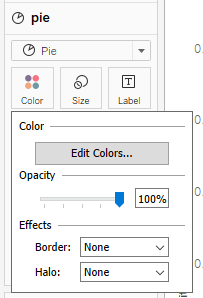
- Assign black to Profit Ratio and transparent white to 1-Profit Ratio.
- Sort the segments so Profit Ratio is first.
You should have something that looks like this.
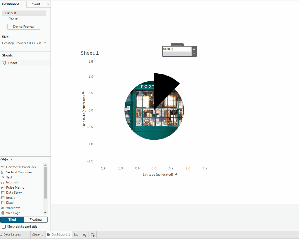
Notice that even with size maxed out, the pie segment is still fairly small. To help with that, add MIN(1) to size and you’ll see the pie segment grow. I also changed my axis ranges to -1.4 to 1.4.
The pie segment still won’t look large enough on the sheet, but once you put it on a dashboard it will take up more space. BONUS! Because you have a Measure on size, you can change the size directly from your dashboard using the size legend:
Label Layers
Let’s add the label. On this chart, I made a separate label for the number and the percent. This allowed me to put the number inside the pie segment and the percent just outside of it (this is helpful to do on a smaller pie segment). I made two calculated fields:
mp.Label
MAKEPOINT(.0, .35)
mp.Percent Label
MAKEPOINT(.70, .65)
Add both calculations as map layers. Change the mark type to shape, and assign a transparent shape (i.e., a shape with no fill or stroke). We’re using a transparent shape because we need a mark label we can edit, but we don’t actually want to see a mark.
Make the following calculated field for the numeric label:
Profit Ratio Label Format
[Profit Ratio]*100
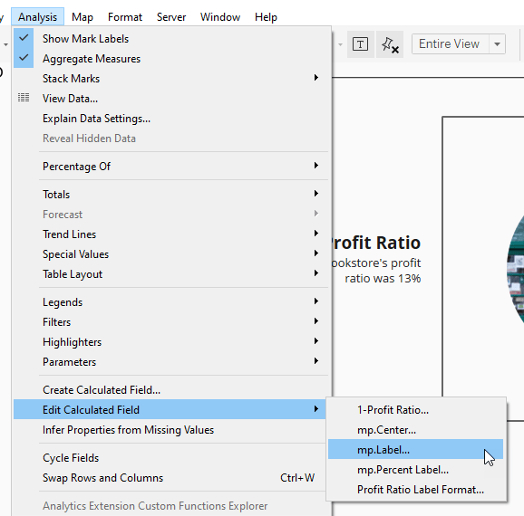
Note: You may need to play around with the coordinates used in mp.Label and mp.Percent Label to get everything in the right position. Tip: Do it from the dashboard! These charts render differently on a sheet compared to a dashboard, so do yourself a favor and edit the calculations on your dashboard rather than your sheet. On the dashboard, go to Analysis -> Edit Calculated Field, and then modify your calculation from there. As you make changes to the coordinates, click “Apply” to see how your changes impact the label placement.
Tooltip Layer
I used mp.Center to add a transparent shape layer that sits on top of everything. This layer acts as a tooltip and blocks out all the layers beneath so the user doesn’t get these odd highlighting effects when they hover over the pie:
That’s it for a static pie. Let’s talk about making the pie segments dynamic.
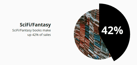
Dynamic Segments
For this pie chart, you’ll need a parameter for whatever dimension your pie segments represent. In my case, that was Genre:
Create the following calculated field (this will return TRUE when the Genre equals the value selected in the Genre Param):
p.Genre
[Genre]=[Genre Param]
Pie Layer
On the pie layer, add Genre to Detail, p.Genre to Color, and Sales to Angle.
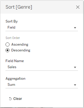
On the Detail shelf, sort Genre by right clicking and select “Sort”. Make the following selections to put the segments in descending order by Sales:
Edit your colors and assign black to TRUE and transparent white to FALSE (this uses the same technique outlined under the Static Pie chart).
Label Layer
Next, create a calculated field that will display the rate for the selected genre.
p.Rate
SUM(IF [p.Genre]=TRUE
THEN [Sales]
END)
/
TOTAL(SUM([Sales]))
Create a calculated field for your label placement. Similar to the static style, you may need to tweak these coordinates to put your label in an appropriate position.
mp.Label
MAKEPOINT(0,.15)
I added mp.Label as a map layer twice. The first acts as the white text label, while the second acts as a drop-shadow. You may not need to do this on your pie chart depending on what your background image looks like. I found the white text hard to read on the image I selected, so I added the drop-shadow layer (which uses a slightly larger font size than the label layer).
Dynamic Images
The steps for creating this pie chart are nearly identical to that of Dynamic Segments. The main differences are:
- There is nothing on the Detail shelf of this pie, so the pie segments stay in one place.
- The label changes color. This uses one of my favorite hacks! Create your label layer using a transparent shape. Create the following calculated field:
p.Label Color
IF [p.Rate]<.2 THEN ‘black’
ELSE ‘white’
END
Add p.Label Color to Color and assign black and white accordingly. On the Label shelf, select “Match Mark Labels.”
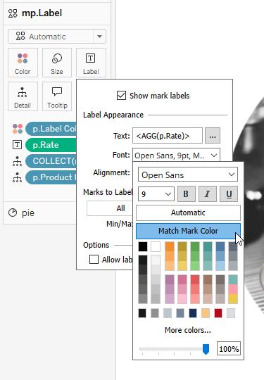
Because this shape is transparent, it doesn’t pick up the color on the Color shelf, but the mark labels do:


Wrap Up
And there you have it: picture-perfect pie charts that bring an infographic touch to your vizzes! While I wouldn’t suggest using all three styles in the same dashboard or viz (you don’t want to overwhelm your audience), they’re a great way to add a bit of extra flair to your next project.

Leave a comment