
Slick, well-designed UI can turn a good dashboard into a showstopper, but let’s be real, Tableau’s defaults don’t always bring the wow factor. Sometimes, you need that extra spark to make your dashboards truly shine. That’s where custom UI elements come in!
In this blog, we’ll explore how you can design beyond Tableau’s defaults and add custom UI elements to your dashboards. I’ve put some of my favorite elements into this workbook for you to download and follow along.

The Process
All elements in the provided dashboard (except Buttons and Alerts) are built using the same approach and follow a consistent set of steps. The process involves creating a parameter, designing a sheet that visually represents a UI element, using the parameter to control functionality in your dashboard, and applying parameter actions to enable interactivity (plus a little hack to clean up the interface).
- Create a parameter for your UI element
- This parameter will serve as the backbone for the interactivity of your UI element and will be controlled with a parameter action in step 4.
- Create a sheet that looks like a UI element
- This is my favorite step because it lets you unleash your creativity! Take time to understand your UI element and explore different design styles. In Tableau, experiment with various mark types (shapes, bars, circles, etc.) to craft the look you want within a sheet. You can draw inspiration from the styles in my workbook or create your own designs.
- Use your parameter in your workbook
- Parameters can be used in various ways to control aspects of your charts and dashboards. They can be used as filters, to control dynamic zones, change the top N, swap sheets and metrics, and more. However you implement it, you’ll need to use the parameter from Step 1 somewhere in your workbook.
- Add parameter action(s) to your dashboards
- Parameter actions enable users to change parameters by interacting with a viz rather than using the default inputs provided by Tableau. The action you create here will allow your user to click on the sheet you created in Step 2 to control your parameter.
- Apply a filter action to remove highlighting
- By default, Tableau highlights selected marks when a user clicks on them, which is distracting and can lead to a bad user experience when it comes to custom UI elements. A filter action removes unwanted highlighting and creates a more seamless interface.
- For more information about this hack, check out Brian Moore’s blog describing the “Filter Technique”, along with 2 other methods for disabling this feature in Tableau.
Now that you know the main process, let’s dive into the creation of each element!
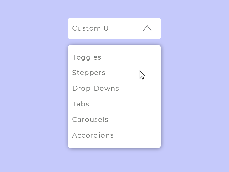
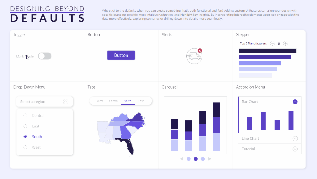
UI Examples
Click on each example to access a tutorial on that element.
1. Toggles
Use Cases: Toggles are great when you want to turn something on and off in your dashboards (benchmarks, annotations, dark mode, etc.). You can also use toggles to switch between two things (views, color palettes, time periods, metrics).
How To:
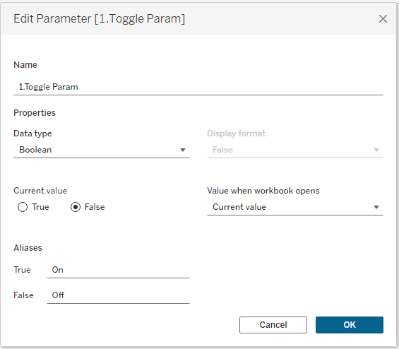
1. Create a parameter for your UI element. Make a Boolean parameter for your toggle, where TRUE indicates it’s on and FALSE indicates it’s off.
2. Create a sheet that looks like a UI element. Add MIN(0) to your sheet and change the mark type to shape. The following calculation will be used on Shape to change the toggle between On and Off. It will also be used as the Source Field on the parameter action you build in Step 4:
p.Toggle Shape
IIF([1.Toggle Param]=TRUE,FALSE,TRUE)
//this calc is saying: when the toggle param = TRUE, then switch it to FALSE when the user clicks on the toggle. when the toggle param = FALSE, then switch it to TRUE when the user clicks on it
Create two shapes to reflect “On” and “Off.” Add them to your Tableau repository and assign them to p.Toggle Shape. Note that they will be assigned “backwards” (i.e., FALSE will look like ON and TRUE will look like OFF). This is because p.Toggle Shape is coded so it will send the opposite value to the parameter via the parameter action in step 4.


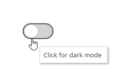
When you hover over a shape in Tableau, you will get a black outline around the shape:
This isn’t a very clean aesthetic, but there’s a simple way to get rid of it: overlay a transparent shape! Add MIN(0) to Columns again and make a dual axis chart. Set the second MIN(0) mark to a transparent shape, and now there’s no black outline on hover:
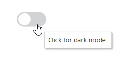
Note: Make sure p.Toggle Shape is on the Detail of your transparent shape mark (otherwise it won’t work with the parameter action in step 4).
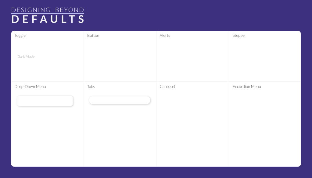
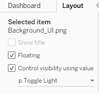
3. Use your parameter in your workbook. In my workbook, I used the toggle to control dynamic zone visibility (DZV). I have a light and dark version of my background image:
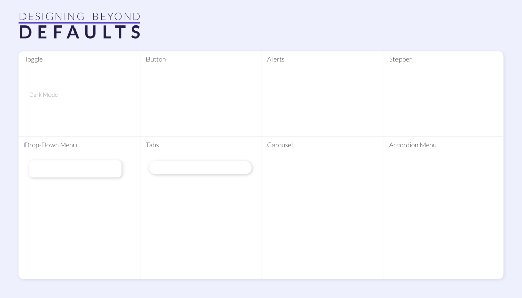
The light background has DZV controlled by the following field:
p.Toggle Light
[1.Toggle Param]=FALSE
The dark background has DZV controlled by the following field:
p.Toggle Dark
[1.Toggle Param]=TRUE

4. Add a parameter action to your dashboard: Set up a parameter action that sends p.Toggle Shape (Source Field) to the Toggle Parameter (Target Parameter) when the user clicks on (Run action) the Toggle sheet (Source Sheet):

5. Apply a filter action to remove highlighting: When a user clicks on a mark, Tableau highlights it by default. This creates a situation where the user has to click the toggle twice to make it work:

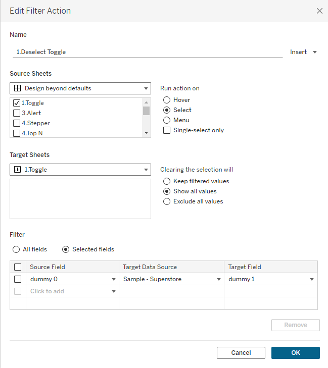
We can override this behavior with a filter action. Create two dummy calculations. It doesn’t matter what value you put in these calculations as long as they are different. I typically use dummy 0 and dummy 1:
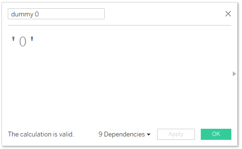

Add the two dummy calculations to the Detail shelf of your toggle sheet. On the dashboard add a filter action where the Toggle sheet filters itself along the selected fields of dummy 0 and dummy 1. Make sure to select “Show all values” uner “Clearing the selection will” (if you don’t select this, your toggle will disappear when the user clicks it).
This hack overrides the dafult highlighting and allows for a single click of the toggle:

That’s a wrap on Toggles! With just one click, users can easily toggle between two things, all without cluttering up your dashboard.They’re the switch that can flip your dashboard experience from good to great!
2. Buttons

Use cases: You can use buttons for navigation, downloading a dashboard, external links, resetting filters, and showing/hiding dashboard objects.
How To: Note: Buttons do not follow the same 5 step process outlined at the beginning of this blog.
Navigation and Download buttons are available in the Objects Pane of your dashboard. Simply drag them onto your dashboard, choose an icon, set their functionality, and you’re good to go.

If you want to link to an external website, you can also use an image as a button. Add the image to your dashboard and enter the URL in the designated field. Since you can’t add tooltips to images for instructions, I recommend using a familiar icon (like a link or external navigation symbol) so the icon’s function is intuitive.

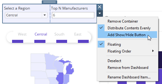
You can also add show/hide buttons to toggle visibility of containers, charts, text, or anything else. I typically use this feature to create collapsable filter panels on my dashboards. To add a show/hide button, open the menu for the object you want to selectively show and select the “Add Show/Hide Button” option. From there, you can customize the button’s appearance to match your design.
I typically design my own buttons to maintain a consistent look across my dashboard. However, if you’re looking for a quick solution, there are plenty of high-quality, free icon libraries available. Here are a few of my favorites:
That’s a wrap on Buttons! Buttons are a powerful way to enhance navigation and user interaction. Keep usability in mind, choose intuitive icons, and keep their design consistent across your dashboard.
3. Alerts
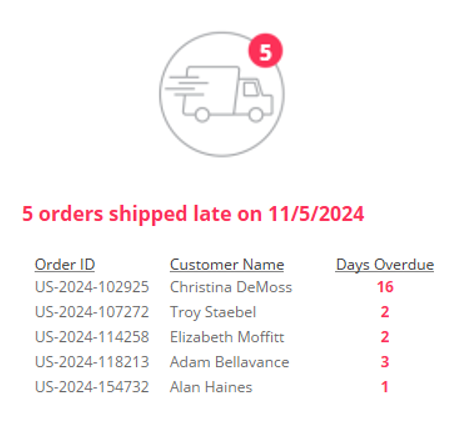
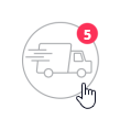
Use Cases: Alerts can be used to draw a user’s focus to issues that warrant their attention or impact the data. For instance, you can alert them the data hasn’t been refereshed for a certain number of days, orders are shipping late, sales are plummeting, etc.
How To: Note: Alerts do not follow the same 5 step process outlined at the beginning of this blog.
- Create an icon to use as your alert. I created a shipping icon and placed it in the bottom left of my art board in Illustrator. I then placed my alert bubble in the center of the board.
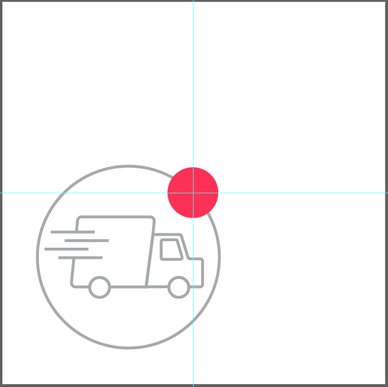
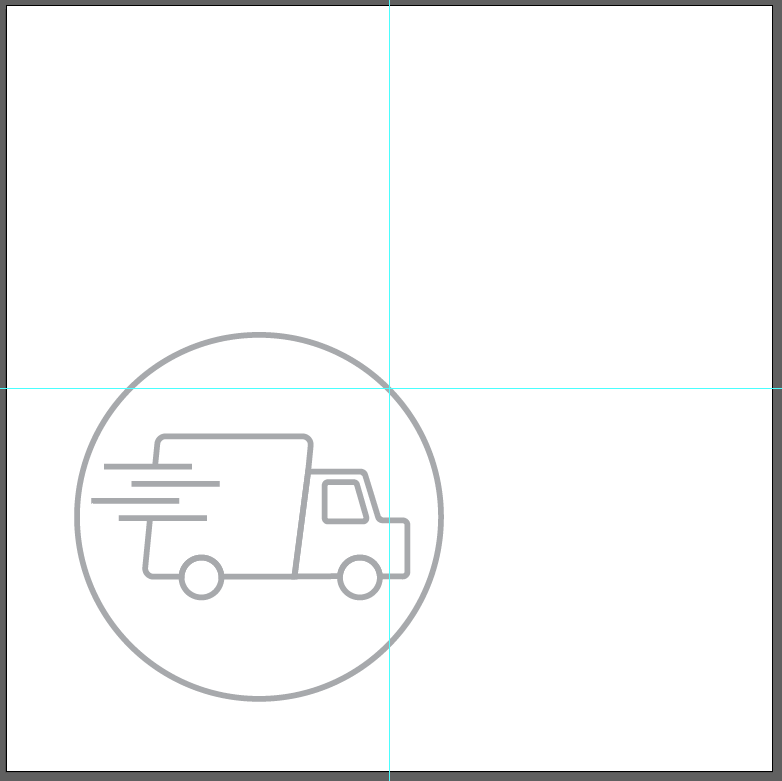
- I created the same icon without the alert bubble:
By creating your icons this way, it ensures the red alert bubble is at (0,0) when it’s used in Tableau, making it easy to align your mark label within that bubble:
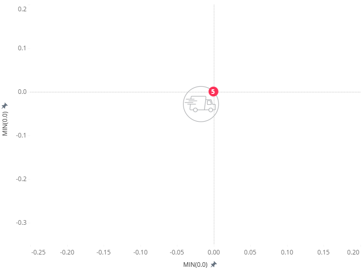
To build the sheet shown above:
- Add MIN(0.0) to Columns and Rows to force a mark at (0,0).
- Change the mark type to a Shape.
- Create a calculated field that will flag an issue that needs attention.
- Assign the shape as appropriate (i.e., TRUE = Alert shape, FALSE = No Alert shape).
- Add a value to Label to indicate how many issues require attention.
- Note: I added MIN(0.0) to Columns twice to make a dual axis chart. The second MIN(0.0) mark is set as a transparent shape in order to block this highlighting effect on the alert
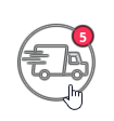
- The layered transparent shape acts as a barrier for the shape underneath and doesn’t allow it to be highlighted:
That’s a wrap on Alerts! Whether it’s tracking key metrics or flagging important information, adding alerts help keep insights actionable and your users informed.
4. Stepper
Use Cases: Steppers incrementally adjust your metric, so you can use them to add/subtract to a top N, adjust a benchmark, add days/months/years to a timeperiod, etc. This blog explains how to use a stepper to add/subtract from a Top N filter.
How To:
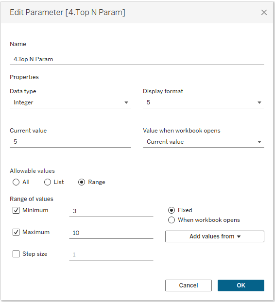
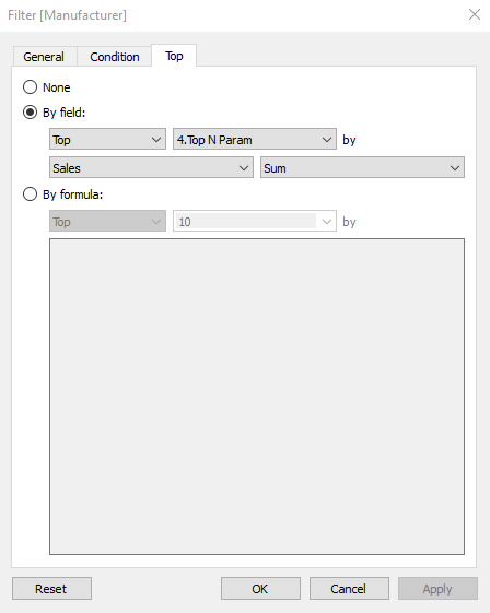
1. Create a parameter for your UI element: Start by creating an integer parameter that will serve as a Top N filter. Set Minimum and Maximum values to define an appropriate range based on your use case (my example uses a range of 3 to 10). This ensures users can adjust the filter within a controlled limit that best fits the data.
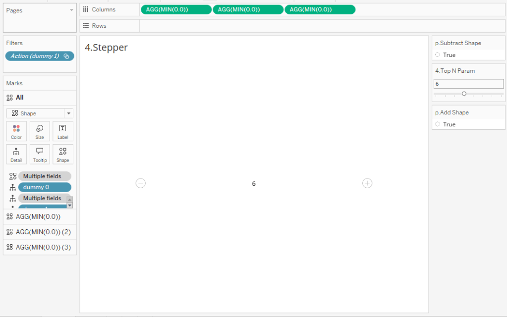
2. Create a sheet that looks like a UI element. The stepper I created has the selected value in the center and a plus (+) and minus (-) icons on either side. To enhance the user experience, the (+) and (-) icons automatically disappear when the minimum or maximum value is reached, signaling that no further adjustments can be made. To create this as a sheet in Tableau:
- Add MIN(0) to your sheet 3 times and change the mark type to Shape.
- Create the following calculations:
p.Add Shape
IIF([4.Top N Param]=10,FALSE,TRUE)
//this field will return FALSE when the parameter is at its maximum value of 10; otherwise it will return TRUE
p.Subtract Shape
IIF([4.Top N Param]=3,FALSE,TRUE)
//this field will return FALSE when the parameter is at its minimum value of 3; otherwise it will return TRUE
p.Add
[4.Top N Param]+1
p.Subtract
[4.Top N Param]-1
- Right-hand mark (+):
- Add p.Add Shape to Shape
- TRUE = “+” shape
- FALSE = transparent shape
- Add p.Add to Detail
- Add p.Add Shape to Shape
- Left-hand mark (-):
- Add p.Subtract to Shape
- TRUE = “-” icon
- FALSE = transparent shape
- Add p.Subtract to Detail
- Add p.Subtract to Shape
Note: These are the shapes I used for (-) and (+):


- Center mark (Top N Value)
- Use a transparent shape on Shape
- Add Top N Parameter to Label
At this point, your sheet should resemble a stepper control, with the “+” and “-” buttons dynamically appearing or disappearing based on the parameter’s limits:
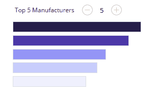
3. Use your parameter in your workbook. Use the Top N Parameter as a filter on another sheet. In my case, I used it on a bar chart for the top N manufacturers:
4. Add parameter actions to your dashboard. You will need 2 actions for this UI elements:
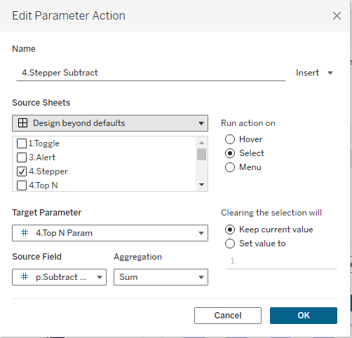
- Increase the Top N Value (+ Button): This will add 1 to the Top N when the user clicks on the “+” icon. It sends p.Add (Source Field) to Top N Param (Target Parameter) when the user clicks (Run action) on the Stepper sheet (Source sheet).

- Decrease the Top N Value (- Button): This will subtract 1 from the Top N when the user clicks on the “-” icon. It sends p.Subtract (Source Field) to Top N Param (Target Parameter) when the user clicks (Run action) on the Stepper sheet (Source sheet).
5. Add a filter action to remove Tableau’s default highlighting. Follow the same steps as you did for the Toggle switch to add a filter that removes Tableau’s default highlighting:

That’s a wrap on Steppers! With just a click of the “+” or “-” button, users can easily adjust values in a sleek, intuitive way. So go ahead, step up your dashboard game and give your users an experience that’s both functional and fun!
5. Drop-down Menu

Use Cases: Drop-downs are commonly used in dashboards for filtering or selecting parameter values. While Tableau offers default drop-down menus, they’re lacking in customization options. To provide a more tailored experience for users, I prefer designing my own drop-down menus.
How To:
1. Create a parameter for your UI element: To build a custom drop-down menu, you’ll need to create two parameters:
- Parameter 1 – Open/Close List: Create a Boolean parameter where TRUE means the list is shown and FALSE means the list is hidden.

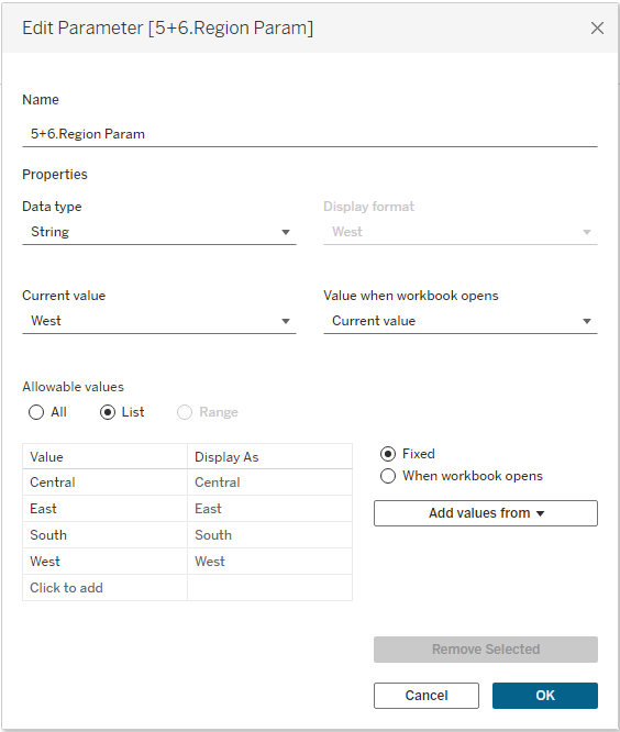
- Parameter 2 – List Values: Create a parameter that will hold the values of your list (in my example I used Region).
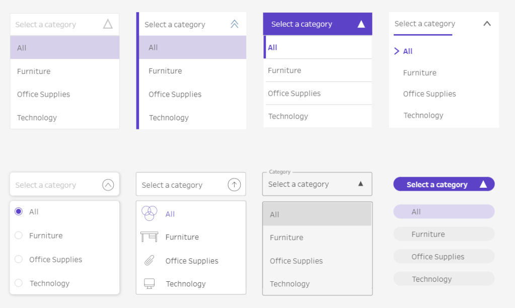
2. Create a sheet that looks like a UI element: For drop-down menus, we’ll create 2 sheets (one for the header that opens the list, and one for the list itself). In this blog, I’ll follow the design I created in this workbook, but keep in mind I also have another dashboard on Tableau Public with 8 different custom drop-down menu designs. So feel free to get creative with your designs!
- Sheet 1 – Header (Open/Close List): This sheet will serve as the clickable header that opens and closes the drop-down list.
- Create a dual axis chart using MIN(1.0) and MIN(.9).
- MIN(1.0) = Bar
- Add MIN(1.0) to Columns and set the mark type to Bar
- Add “Select a region” (or your desired label) to Label
- Change the color to white (or any color that works with your design) and remove the border
- Add p.Drop Down Shape to Detail (calculation described below; this field will be used as the Source Field in the parameter action in step 4, so it needs to be on both marks)
- MIN(.9) = Shape
- Add MIN(.9) to Columns and set the mark type to Shape
- Add the calculation below to Shape and assign up/down arrows to TRUE or FALSE to indicate whether the list is opened or closed. This calculation will also be used as the Source Field in the parameter action (as described in step 4), so it needs to be on both marks.
- MIN(1.0) = Bar
- Create a dual axis chart using MIN(1.0) and MIN(.9).
p.Drop Down Shape
IIF([5.Drop Down Param]=TRUE,FALSE,TRUE)
//This calc is saying: when the Drop Down Param = TRUE, then switch it to FALSE when the user clicks. When the Drop Down Param = FALSE, then switch it to TRUE when the user clicks on it
Note: These are the shapes I used for up and down arrows:
- Sheet 2 – List (Values in the Drop-down): This sheet will display the values of your list (e.g., the Regions). It will only be shown when the Open/Close List parameter is set to TRUE.
- Add MIN(0.0) to Columns
- Add Region to Rows and hide the header
- Add Region to Label
- Add FALSE to Detail (this will be used with the parameter action in step 4 to close the list)
- Modify your axis to go from -.05 to 1
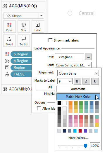
- Change the mark type to a shape and put the following calculated field on Shape and Color:
p.Region
[Region]=[5+6.Region Param]
Note: These are the shapes I used for selected and unselected regions:


I assigned my colors as purple and light grey to indicate selected and unselected, respectively. Then I applied “Match Mark Color” to match my text color to my color palette.
3. Use your parameter in your workbook: Now it’s time to use the 2 parameters we created:
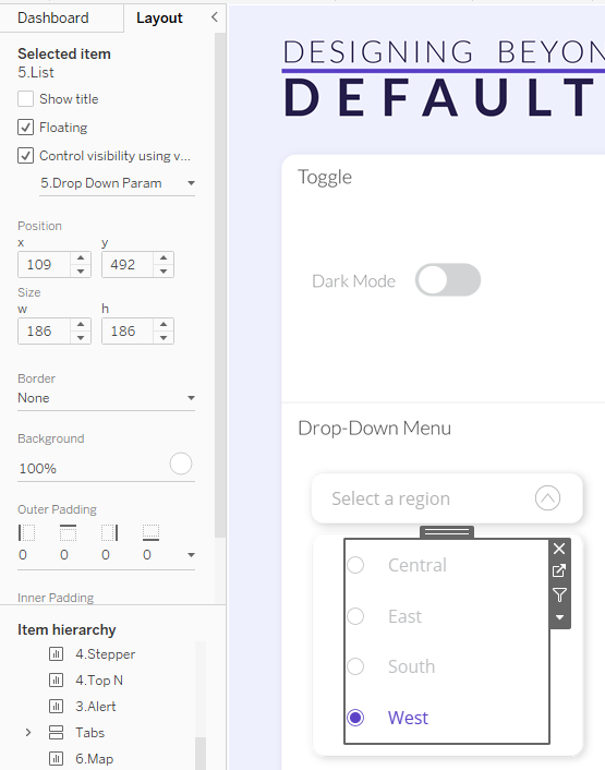
- Parameter 1 – Drop Down Parameter to Open/Close List: This parameter controls the dynamic visibility of the drop-down list and an image layered behind the list. When set to TRUE, the list will appear, and when set to FALSE, the list will be hidden. Add dynamic zone visibility to the list and image in the Layout pane:
- Parameter 2 -Region Parameter to select List Values: In my workbook, the region parameter filters the map to retain the selected region, so I added p.Region = TRUE to the filter of my map.
4. Add parameter action(s) to your dashboards: Create three parameter actions to control the interaction between the header and list:
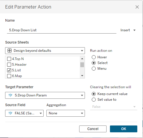
- Parameter 1 – Open/Close List: Create a parameter action that sends p.Drop Down Shape (Source Field) to the Drop Down Parameter (Target Parameter) when the user clicks (Run action) the Header sheet (Source Sheet). This action will toggle the visibility of the list by switching the value of the Drop Down Parameter between TRUE and FALSE.

- Parameter 2 – Select List Value: Add a parameter action that sends the selected Region (Source Field) to the Region Parameter (Target Parameter) when the user clicks (Run action) on the List sheet (Source Sheet). This will filter the map based on the selected region.

- Parameter 3 – Close the List: Once the user selects a region, the drop-down list should automatically close. To achieve this, add a parameter action that sends FALSE (Source Field) to the Drop Down Parameter (Target Paramter) when the user clicks (Run action) the List sheet (Source Sheet).
5. Apply a filter action to remove highlighting: Follow the same steps as you did for the Toggle switch to add a filter that removes Tableau’s default highlighting.

That’s a wrap on drop-down menus! Your drop-down menu is now fully interactive, allowing users to open/close the list, select a value, and automatically close the list once a selection is made.
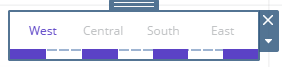
6. Tabs
Use Cases: Tabs are a nice alternative to drop-down menus because they allow users to see all available options at once. Tabs also reduce the need for extra clicks, making the overall experience smoother. You can use them to filter, change chart types, swap sheets, etc.
How To:
1. Create a parameter for your UI element: Tabs also utilize the Region Parameter that we created for the Drop-Down Menu list.
2. Create a sheet that looks like a UI element: To create a tab-style sheet:
- Add Region to Columns
- Change the mark type to a Shape
- Assign a transparent shape. This ensures there are no visible borders or highlights when users hover over each region.
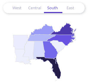
- Add p.Region (described in the Drop-Down Menu section) to Color. It will look like nothing happened, but that’s because the shape is transparent and doesn’t inherit color properties.
- Select “Match Mark Labels” so your text will match your color palette. Even though the transparent shape doesn’t inherit color, the mark labels do. This ensures the text color will change based on the selected region.
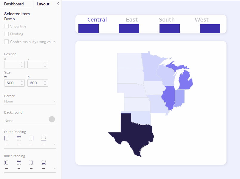
3. Use your parameter in your workbook: The Region Parameter will serve two functions.
- Filter the Map: As previously discussed in the Drop-Down Menu section, the Region parameter filters the map to display only the data for the selected region.
- Show/Hide Tab Underlines: The Region Parameter will also control the visibility of blank objects that act as underlines beneath each tab. These underlines will appear or disappear based on the selected region, giving users a visual cue for which tab (region) is currently active.
- On your dashboard, create a container with 7 blank objects.
- Color every other blank object the color you want your underline to be (e.g., purple). These will visually represent the active region when it’s selected.
- For each region, create a calculation that returns TRUE/FALSE based on whether the region is selected
- p.Central: [5+6.Region Param]=’Central’
- p.East: [5+6.Region Param]=’East’
- p.South: [5+6.Region Param]=’South’
- p.West: [5+6.Region Param]=’West’
- For each colored object (underline), apply Dynamic Zone Visibility to control its visibility based on the region selection. Use the calculations you created above to control each region’s underline. I also edited the height of my container to be 6 pixels in the GIF below.
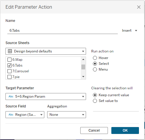
4. Add parameter action(s) to your dashboards: Add a parameter action that sends the selected Region (Source Field) to the Region Parameter (Target Parameter) when the user clicks (Run action) on the Tabs sheet (Source Sheet). This will filter the map based on the selected region.
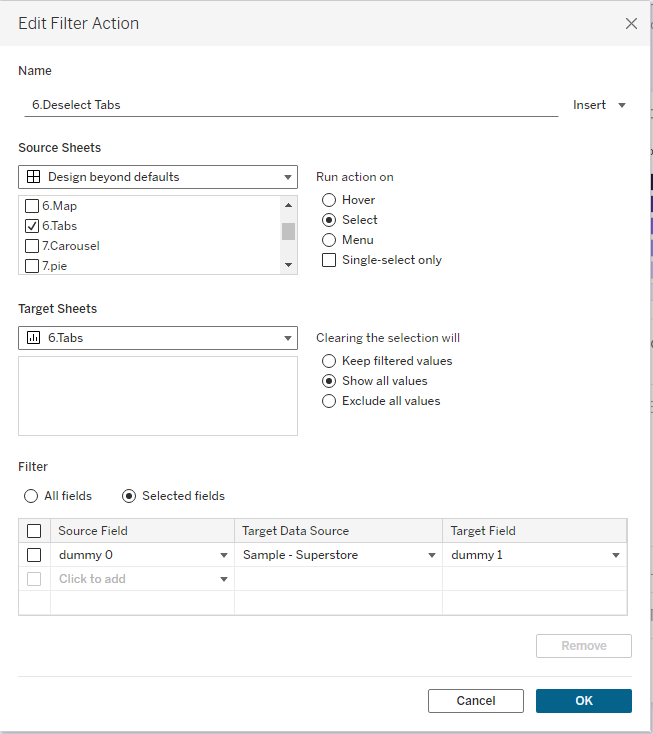
5. Apply a filter action to remove highlighting: Follow the same steps as you did for the Toggle switch to add a filter that removes Tableau’s default highlighting.
That’s a wrap on Tabs! Tabs are a simple yet powerful alternative to drop-down menus, giving users easy access to all their options at once. Whether you’re filtering, changing chart types, or swapping sheets, tabs make navigation seamless and visually appealing.
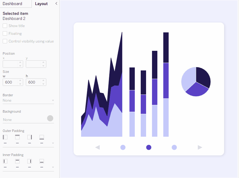
7. Carousel

Use Cases: Carousels are useful for presenting multiple charts in a compact space. You can use them to cycle through KPI cards, metrics, charts, etc. You could even use them to walk users through an analysis or process.
How To:
1. Create a parameter for your UI element: Create an integer parameter that contains a list of values corresponding to the number of sections in your carousel. My carousel has 3 sections, so I have a list of allowable values of 1, 2, and 3:

2. Create a sheet that looks like a UI element. We’ll use circle and arrow marks to create a sheet that looks like a carousel.
- Add MIN(0), MIN(1), MIN(2), MIN(3), and MIN(0) to Columns
- Note: I’m using MIN of 1, 2, 3, so those values will be available to use as Source Fields in my parameter action in step 4.
- Set all mark types to Shape and assign shapes as follows:
- MIN(0) = Left Arrow
- MIN(1) = Circle
- MIN(2) = Circle
- MIN(3) = Circle
- MIN(0) = Right Arrow
- Edit the axis of MIN(2) and MIN(3) to not include 0. This will force the circles to the center of their respective axis and create alignment among all marks.
- Create the following calculated fields to control the color based on the Carousel Parameter. These calculated fields return TRUE/FALSE based on the value of the Carousel Parameter.
- p.Carousel 1: [7.Carousel Param]=1
- p.Carousel 2: [7.Carousel Param]=2
- p.Carousel 3: [7.Carousel Param]=3
- Assign colors for TRUE and FALSE values for each calculated field (e.g., dark purple for TRUE, light purple for FALSE) to indicate which section is active and which are not.
- On the right arrow, add the following calculation to Detail:
p.Carousel add
IF [7.Carousel Param]=3 THEN 1
ELSE [7.Carousel Param]+1
END
//this calculation checks to see if the parameter is at its max value (3). If it is, it circles back to section 1. Otherwise, it adds 1 to the Carousel Param.
//If you have more than 3 sections in your carousel, you’ll need to modify the value of 3 to your max value
- On the left arrow, add the following calculation to Detail:
p.Carousel subtract
IF [7.Carousel Param]=1 THEN 3
ELSE [7.Carousel Param]-1
END
//this calculation checks to see if the parameter is at its min value (1). If it is, it circles back to section 3. Otherwise, it subtracts 1 from the Carousel Param.
//If you have more than 3 sections in your carousel, you’ll need to modify the value of 3 in this calculation
3. Use your parameter in your workbook. The carousel parameter will control dynamic zone visibility.
- Put all your “zones” into a single container.
- For each zone, use Dynamic Zone Visibility to control whether it’s shown or hidden based on the value of the carousel parameter.
- For the zone you want to show when the first section of the carousel is selected, apply p.Carousel 1 as the condition for the Dynamic Zone Visibility.
- For the second section, apply p.Carousel 2.
- For the third section, apply p.Carousel 3.
4. Add parameter action(s) to your dashboards. To enable the carousel functionality, you need to set up parameter actions that will allow users to navigate through the different sections and interact with the arrows. There will be a total of 5 parameter actions: three for each section and one for each arrow.
- Parameter 1 – Section 1: This parameter will send MIN(1) (Source Field) to the Carousel Parameter (Target Parameter) when the user clicks (Run action) the Carousel sheet (or the circle representing Section 1; Source Sheet).
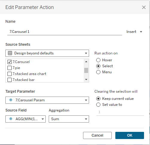
- Parameter 2 – Section 2: This parameter will send MIN(2) (Source Field) to the Carousel Parameter (Target Parameter) when the user clicks (Run action) the Carousel sheet (or the circle representing Section 2; Source Sheet).

- Parameter 3 – Section 3: This parameter will send MIN(3) (Source Field) to the Carousel Parameter (Target Parameter) when the user clicks (Run action) the Carousel sheet (or the circle representing Section 3; Source Sheet).
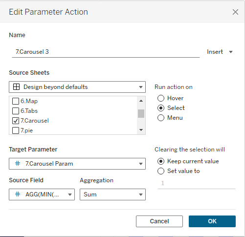
- Parameter 4 – Right Arrow: This parameter will send Carousel add (Source Field) to the Carousel Param (Target Parameter) when the user clicks (Run action) the Carousel sheet (or the arrow representing the right arrow; Source Sheet).

- Parameter 5 – Left Arrow: This parameter will send Carousel subtract (Source Field) to the Carousel Param (Target Parameter) when the user clicks (Run action) the Carousel sheet (or the arrow representing the left arrow; Source Sheet).

5. Add a filter action to remove Tableau’s default highlighting. Follow the same steps as you did for the Toggle switch to add a filter that removes Tableau’s default highlighting:

That’s a wrap on Carousels! By using carousels, you can keep your dashboard clean and compact while still providing users with the flexibility to view different types of information in a dynamic and interactive way.
8. Accordion Menu
Use Cases: Similar to carousels, accordion menus are great for organizing and displaying information efficiently on a dashboard without overwhelming the user.
How To: I have another workbook and blog post dedicated to accordion menus. Check out the links below to learn more:
UI Resources
Want to get better at enhancing the UI of your dashboards? Here are some of my favorite resources to support you on your UI journey
- Learn UI Design: New to UI design? There’s a “Start Here” section of the blog, as well as a section devoted to beginners.
- UI Goodies: This is a giant repository of design resources and tools. It’s a great place to find inspiration.
- UI Color Tool: This is my favorite tool for creating custom color scales for UI design. You can also add secondary and tertiary colors for more expansive color palettes.
Wrap Up
Now you have a whole toolkit of custom UI elements to make your Tableau dashboards truly stand out! Whether you’re using tabs, toggles, steppers, or carousels, these interactive features will not only enhance the user experience but also make your dashboards more dynamic and engaging. So, get creative, have fun with it, and go forth and conquer the world of custom UI in dashboards!
 Lisa Trescott
Leave a comment