
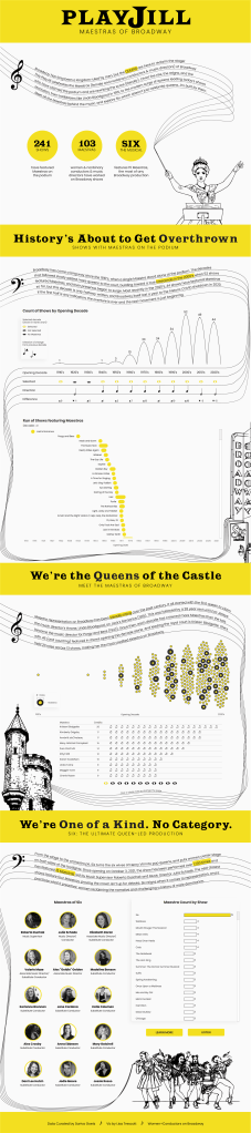
When Steve Wexler first asked for my help vetting the data for the Women+ Conductors on Broadway project, I felt incredibly honored to be included and to be working alongside amazing collaborators like Serena Roberts and Kevin Flerlage. The dataset, curated by Sariva Goetz, is a record of the women and nonbinary conductors and music directors who have stepped onto Broadway podiums over the past century. It’s a story of progress, representation, and persistence.
Needless to say, I was inspired. I knew I wanted to create something that celebrated that journey and highlighted the people behind it. The result is a visualization that I’m incredibly proud to add to my portfolio.
Exploring the Data
I planned to highlight two core elements in the data: the shows that have featured Maestras and the Maestras themselves. But as I dug into the data, one show immediately jumped out: Six: The Musical. Six has featured more women and nonbinary conductors than any other Broadway production by far, making it a massive outlier in the dataset.
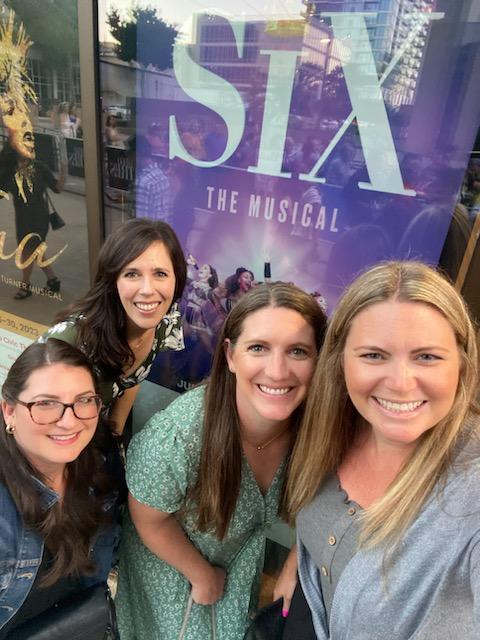
This show caught my attention for another reason too. I’ll admit, I’m not exactly a Broadway buff, but Six is actually one of the few shows in this dataset that I’ve seen. I went with some of my girlfriends when the show came to San Diego, and it was such a fun and empowering experience. I loved the music and I loved the story. Six is all about women reclaiming their narrative and challenging a history shaped by male voices, which made it the perfect anchor for the viz, and it ended up shaping both the storytelling and the design of PLAYJILL.
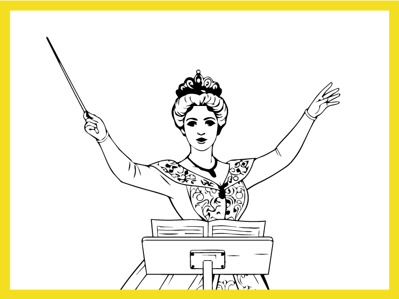
Turning Maestras into Queens
Six features the six wives of Henry VIII reimagined as pop queens, reclaiming and rewriting the narratives history assigned to them. That theme was the perfect mirror for the story of this data, so it felt only fitting that this viz should crown the Maestras as the queens they are.
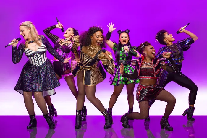
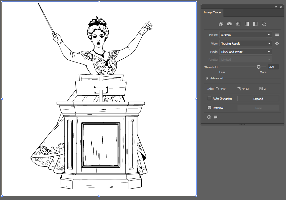
Once that idea clicked, the design took shape. I started by creating the visuals, and instead of building everything from scratch in Illustrator (which would have taken hours), I used Google Gemini to generate pencil-style sketches of a Broadway conductor as a queen, a Broadway sign, and a castle. I also used an image from SIX to help inspire the sketch of the queens.
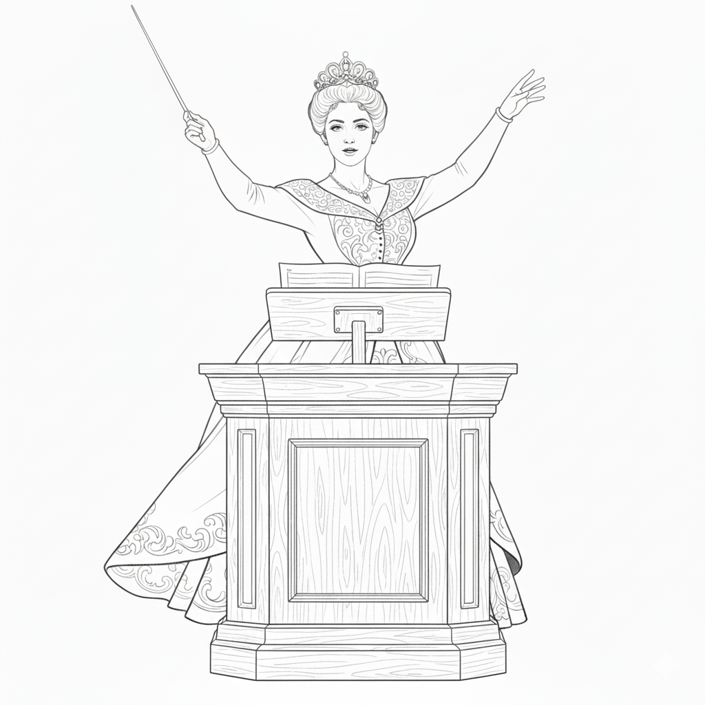
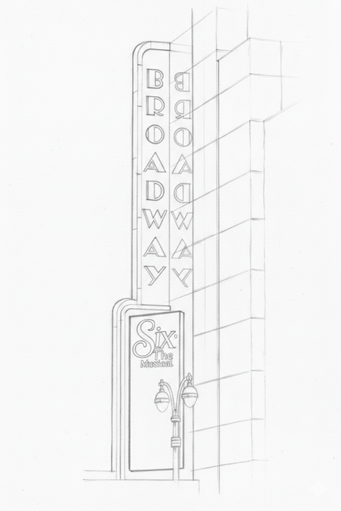
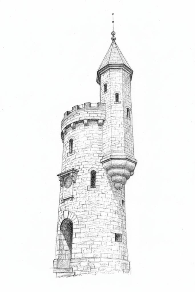
I brought the images into Adobe Illustrator and used the Image Trace feature to convert them into vectors. From there, I simplified the paths and adjusted the line weights to enhance the sketch effect and make the illustrations cleaner and more consistent for use in the viz.
Because the project centers on conductors and music directors, I also wanted the design to draw on sheet music for inspiration. The five lines of a musical staff appear throughout the viz, subtly framing sections and guiding the eye across the layout.
Finally, I anchored the story using quotes from Six. Each section draws on a lyric from the show to frame the narrative in the data: the rise of Maestras across Broadway history, the conductors behind the music, and the spotlight on Six itself. The title of the viz also plays on the theme of reclaiming the narrative. Broadway programs are called Playbills, so why not rewrite that too? PLAYJILL became the perfect title, and a small but intentional nod to flipping the script.
Charting the Maestras’ Reign
I structured the viz to move from broad to specific, letting the story unfold in layers. It starts with the Broadway shows themselves, giving a high-level view of where Maestras have appeared across productions and decades. The next section shifts focus to the Maestras themselves. The viz concludes by zooming all the way in on Six: The Musical.
History’s About to Get Overthrown: The Shows
Jump Plot
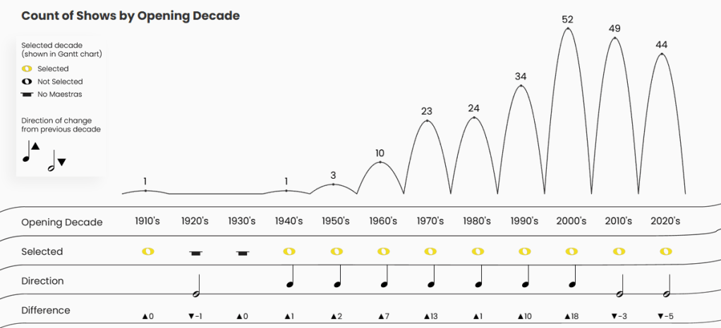
When I started thinking about how to show the Broadway shows and the rise in Maestras over the last century, I wanted something that felt musical. Ultimately, I landed on a jump plot because it reminded me of slurs and ties on sheet music (i.e., the curved lines on sheet music that connect notes and give music its flow). I placed it above a sheet music-inspired table to help drive that imagery home.
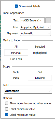
I had never built a jump plot before, so I used this wonderful tutorial by Erica Hughes. One thing I had to figure out beyond the tutoral was the labels. I wanted them at the max points of each curve, so on the Label card, I selected “Min/Max” and checked “Label maximum value”.
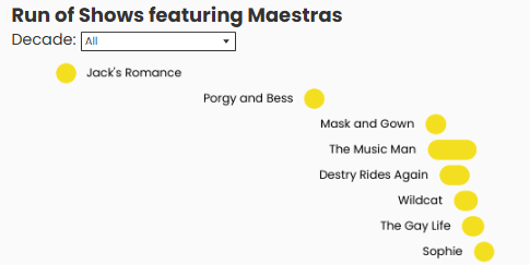
However, there was an issue with the 1930’s and 40s, since no maestras were featured in those decades:
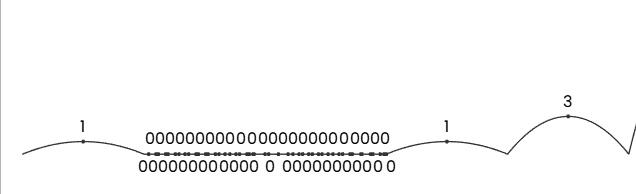
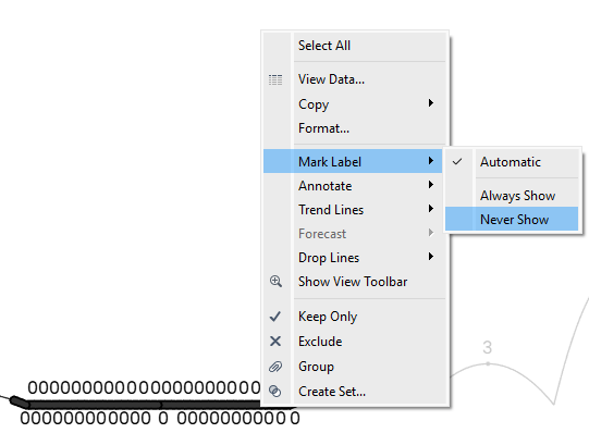
My solution was to hide the mark labels for those decades. I highlighted all the points for the 1930’s and 1940s, right clicked, chose “Mark Label”, and “Never Show.” Problem solved!
Gantt
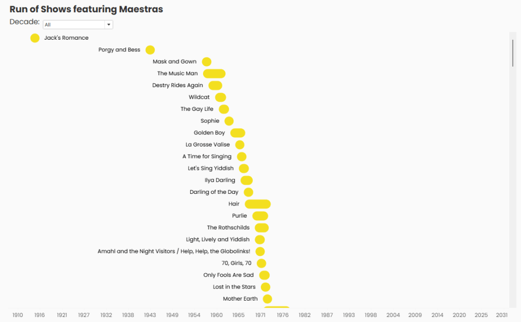
To show the run of all the shows that feature Maestras, I created a rounded Gantt chart. I also used this chart in my Arrested Development viz, and explain how to create one in this blog post.
Again, I had to get fancy with the labels. If I used “Automatic” labeling, the labels looked great until the 1980s, where the shows started switching sides or colliding with the Gantt bars. And by the time you reached the 2020’s, things started getting really messy:
Aligning all the labels to the left or to the right also created spacing issues for the shows at the beginning and end of the timeline. To fix this, I created two calculated fields to use on the “Label” card of each chart on the dual axis. The label for Jack’s Romance was right aligned, while the label for all other shows was left aligned.
Label_Jack’s Romance
IIF([Show Id]=’S0103′, [Show],”)
Label_All
IIF([Show Id]=’S0103′,”,[Show])
This created much cleaner labels that were easy to read:
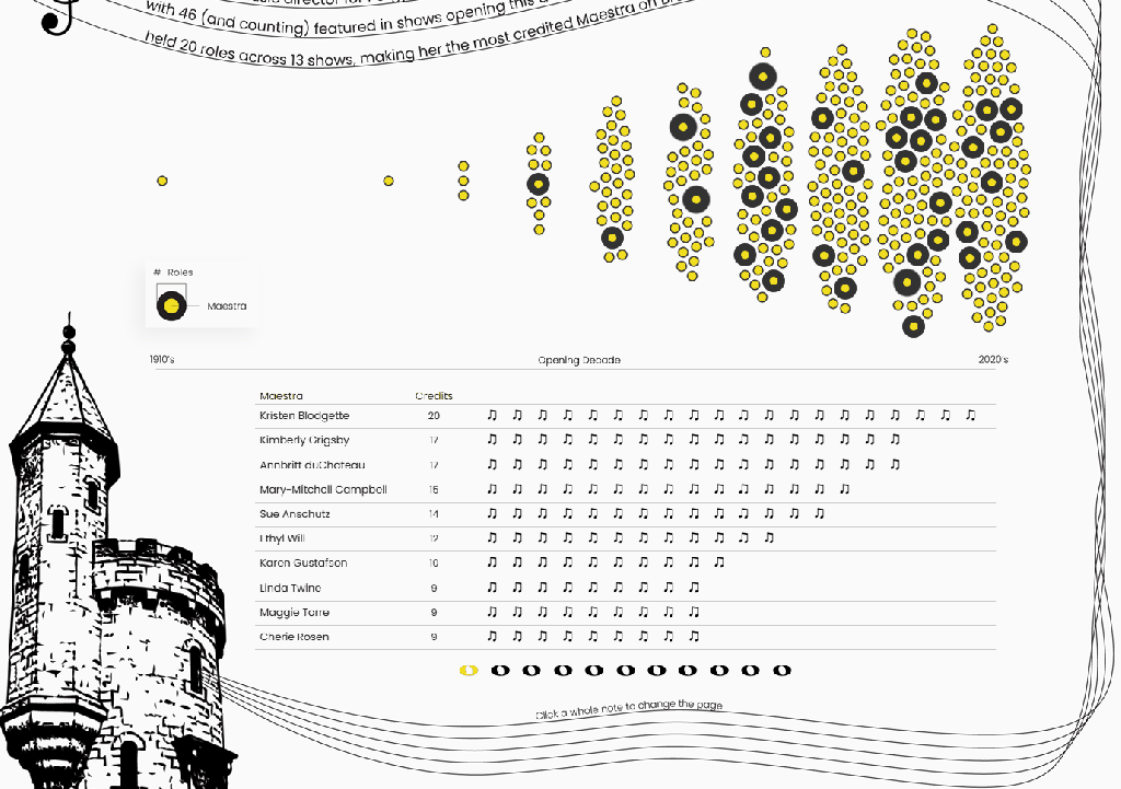
We’re the Queens of the Castle: The Maestras
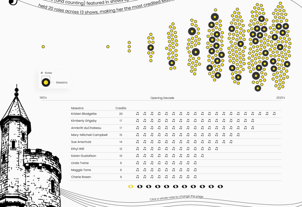
To showcase the queens and the roles they’ve held over time, I created a beeswarm chart using LaDataViz’s AdvViz tool, paired with a unit chart to show the individual roles in more detail.
Instead of making the unit chart a long vertical scroll, I designed it as a carousel, allowing users to move through the maestras using pages. This keeps the layout compact while still letting viewers explore. To learn how to create your own carousel, check out this blog post.
The two charts are also linked through hover actions. When a user hovers over a maestra in the beeswarm chart, the unit chart automatically jumps to that queen’s page and highlights their roles.
To achieve this functionality, I created an integer parameter for the pages, with allowable values of “All”.
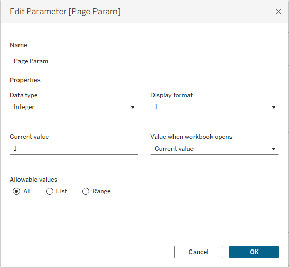
I added the Page field to the Detail shelf in the beeswarm chart so each Maestra is associated with the correct page in the unit chart. The unit chart itself is filtered to only display the page selected in the Page Parameter.
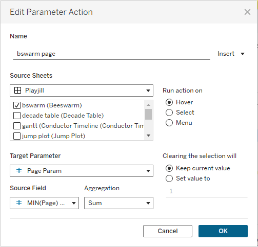
On the dashboard, I then created a parameter action on the beeswarm that runs on hover. When a user hovers over a maestra in the beeswarm, the action updates the Page Param to that maestra’s corresponding page, which automatically updates the unit chart to display and highlight her roles.
We’re One of a Kind. No Category: Spotlight on Six
Because Six features such a large number of maestras compared to other shows in the dataset, it felt important to make the individuals themselves more visible. By incorporating their photos, it helps connect the roles to the real maestras who have conducted the show, and celebrates the individuals who have helped make Six such a standout when it comes to representation.

To create this chart, I manually assigned X and Y coordinates to each Maestra so I could arrange them in the layout. I used each maestra’s photo as a custom shape and added each Maestra’s name and role to the label to gave it the look of a standard Playbill
A Story Still Being Written
One of the most inspiring parts of this data is that the story isn’t finished. Representation has steadily increased decade by decade, with more women and nonbinary conductors appearing in Broadway productions than ever before. The momentum is real, and the future of Broadway’s orchestra pits looks very different from its past.
The winner of the Women+ Conductors on Broadway challenge, Hafida Belayd, created The Baton’s Legacy, which is a stunning piece of data art that beautifully highlights the maestras and their stories. This project is also very much a living dataset. As Sariva Goetz continues to research and document maestras on Broadway, the data will keep growing, and with it, the story of representation behind the music stand.
Be sure to follow the journey as the dataset evolves and more stories come to light. The score is still being written, and the next generation of Maestras is stepping up to the podium.

Leave a comment