
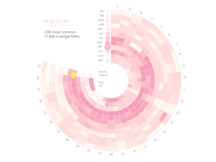
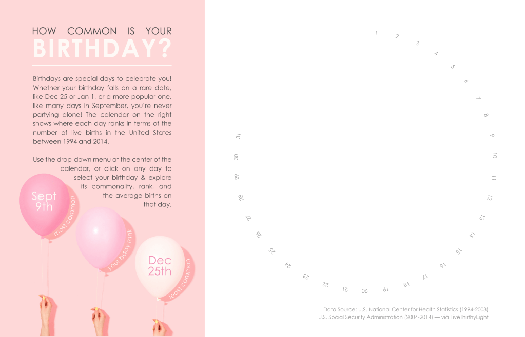
I co-lead the California Community Colleges Tableau User Group (CCC TUG), and for our first birthday we challenged our members to create a viz showcasing the popularity of our TUG’s birthday (August 30). We provided them with this classic Makeover Monday dataset (2021, week 26), which features US births from 1994 to 2014. Although I was ineligible to enter or win the challenge due to my leadership role, I still wanted to create a viz to discuss during our meeting.
Inspired by an image of pink balloons, I created this viz full of fun birth-day-ta.

Let’s unwrap this and see how it came together!
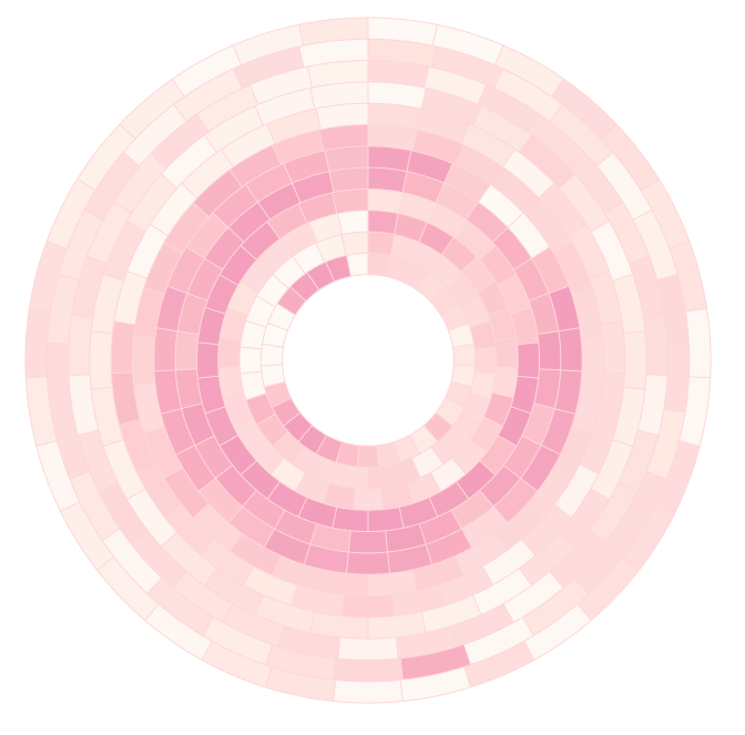
Radial Sunburst Calendar
I played with several charts when exploring and analyzing this data, but I kept returning to the heat map of the original Makeover Monday viz. I liked the way it showcased the data and displayed clear trends and outliers, but I wanted to give it some birthday flare. When I came across this radial calendar by Marek Martuszewski on Behance, I knew it would give the data the festive touch I was looking for.
The first thing I did was check to see if anyone had already tackled something like this in Tableau (why reinvent the wheel—or radial sunburst calendar—if you don’t have to?), and low-and-behold, someone had! Check out this viz by Lindsay Betzendahl exploring her sleep data:
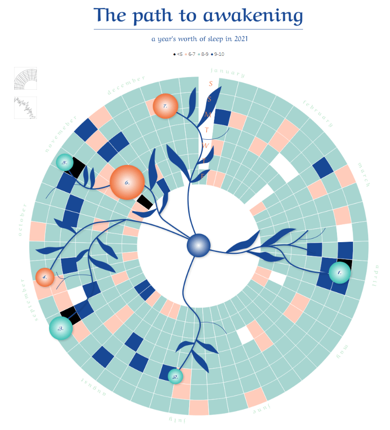
Not only did Lindsay create this stunning viz, she created a template and wrote a blog about it. I followed her instructions for preparing my data and using her template, but I had to make a few modifications for my viz:
- Lindsay’s calendar uses days of the week for the levels, but I wanted to use the months of the year. This meant I needed to change the “Parent” column in her data to “Month” (column C).
- Her calendar has 7 levels corresponding to the days of the week. I needed 12 levels to correspond to months of the year (column B).
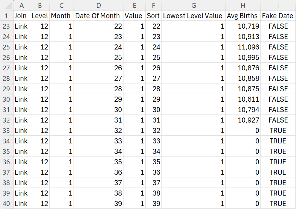
- Lindsay’s calendar uses all 360 degrees of the circle, but I only wanted to use about 270ish. To get around this, I added fake dates to each month, then hid those dates on the viz (column I).
Here’s a snapshot of my final data:
I downloaded her template, swapped out the data, and got this fun, unintentional art:

Not the result I was looking for, but I’m sharing this 1. because it looks cool, and 2. to shed light on the fact that building these vizzes is not always a seamless process. There’s usually a bit of trial and error going on behind the scenes that you don’t see when you’re on Tableau Public looking at a polished viz. So if you find yourself in this position, don’t fret. Appreciate the art you created, ask for help if you need it, and keep on vizzing!
In this case, I had replaced references using the wrong variable, so once that was fixed, I had my radial sunburst calendar ready to go!
Overlay
I wanted to add several elements to this sunburst chart, such as the month labels, the balloon indicating which date was selected, and information about the selected birthday. To do this all on one sheet, I used several map layers, then overlayed that sheet on top of the calendar. Why not add the map layers to the same sheet as the sunburst calendar? Because the sunburst calendar uses table calculations, and table calaculations don’t play well with map layers.
For my overlay chart, I needed X and Y coordinates that corresponded to the same points on the sunburst diagram. That meant I needed some trigonometry for radial calculations. Every single time I create radials in Tableau, I reread this blog by Ken Flerlage. Every. Single. Time. It walks through the basics and shows you the calculations you need in Tableau, which are:
Radius
This sets the distance between each month and the center of the circle. Luckily, each month already has a number that represents it (e.g., Jan = 1, Feb = 2, etc.), so I just needed to subtract the month from a static number to stagger the levels in line with the sunburst chart. I played around with the static number and found 16.5 was perfect for creating alignment with the sunburst chart.
16.5-[Month]
Point Spacing
This spacing dictates where each day of the month is going to fall around the circle. If we needed 31 points for 31 days per month, we would use 360/31. However, remember how I added fake dates to put a gap in my chart? We have to account for those here. I ended up with 39 days in each month.
360/39
Note: Not all months have 31 days, so whether you’re adding a space in your calendar or not, you’ll need to pad out the months that have less than 31 days. If you don’t, you’ll end with misaligned days like this:
Angle
I suggest looking at Ken’s blog post to understand what the angle is, but essentially we’re finding the angle of a triangle that sits inside the circle and dictates where a point will fall on the circle.
The circle starts at the 3 o’clock position, but I wanted it to start at 12 o’clock. Typically, I would use Ken’s calculation and subtract 90 (i.e., one quarter of a circle) from my points; however, I needed my points slightly offset so they fell into the middle of the polygons on the sunburst charts. Through trial and error, I found that 88.2 was the magic number to put the points right where I needed them. My calculation ended up being:
([Date Of Month]-88.2)*[c.Point Spacing]
Angle in Radians
Tableau doesn’t like degrees and makes you turn your degrees into radians before you can use them.
RADIANS([c.Angle])
X
Our X coordinate is the sine of the angle multiplied by the radius (again, Ken’s blog explains all the trig here).
SIN([c.Angle in Radians])*[c.Radius]
Y
Our Y coordinate is the cosine of the angle multiplied by the radius (you guessed it! Read Ken’s blog to understand the trig that goes into this).
COS([c.Angle in Radians])*[c.Radius]
Phew! The trig is done. From here I used the X and Y coordinates in MAKEPOINT() calculations to create variables to use as map layers:
mp.Day
Used to create points for each birthday going around the circle.
MAKEPOINT([c.X],[c.Y])
mp.Start Label
For the month labels/bubbles at the start of each month, I used another MAKEPOINT() calculation. In this case, I needed to offset the bubbles slightly from the 12 o’clock position (X = -.7), and I used the radius as the Y coordinate:
MAKEPOINT(-.7,-[c.Radius])
mp.Date Label:
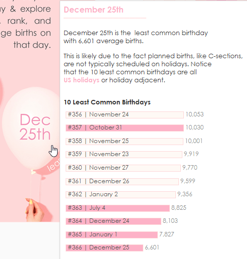
I utilized the gap in this chart to show details for the selected birthday. I used one final MAKEPOINT() calculation to place the label in the appropriate position:
MAKEPOINT(-11,-11.75)
I ended up with 4 map layers:
- Bday info
- Layer created with mp.Date Label
- Mark type = Shape
- I used a transparent shape (i.e., a shape with no fill or stroke color) to get an invisible mark whose label I could format.
- Month start
- Layer created with mp.Start Label
- Mark type = Circle
- Month Rank is used on size and color
- Balloon
- Layer created with mp.Day
- Mark type = Shape
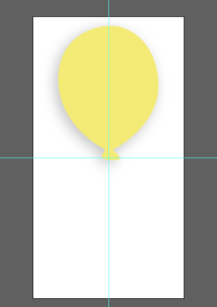
- I used a parameter to allow the user to select their birthday, which is incorporated into a calculated field (p.Bday) placed on shape.
- True = Balloon
- False = Transparent Shape
- When you use a shape, Tableau places the midpoint of that shape on your data point. To get the bottom of the balloon to rest on my data point, I added space to the bottom of the shape. Here’s a screenshot of my artboard in Illustrator:
Note that the balloon layer is disabled. I did this to avoid the black outline that pops up when a user hovers over it:
- Transparent
- Layer created with mp.Day
- Mark type = Shape
- This layer is in place beacuse I’ve deactivated the balloon layer. It’s a transparent shape that works with a parameter action to allow the user to click a date to select it.
When it came to positioning the overlay on the sunburst chart, I changed my Transparent layer to use a colored circle. This allowed me to easily see if the overlay was aligned properly with the sunburst chart:

Once I had the viz in place, I changed the circles back to transparent shapes and no one’s the wiser!

The Design
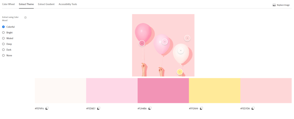
Throughout the creation of this viz, I envisioned it as an aerial view of a birthday cake. That’s one reason I left a gap in the left-hand corner of the chart (to resemble a missing slice of cake). But when I went in search of an image of a birthday cake to use as a background, I instead came across this image by Shamblen Studios on Unsplash:

As soon as I saw it, I knew my design was changing from the original concept. I liked the way the balloons were staggered (almost like a chart), and I thought it would be fun to integrate them into the viz to showcase my BANs. I was also drawn to the color palette. The muted pink with a tiny pop of yellow perfectly evoked a pink frosted birthday cake, so I used the Adobe Color Wheel and its “Extract Theme” feature to pull the color palette from the image.
With my colors nailed down, I turned to the broader design. I used one of my favorite layouts for when I have a non-scrollable viz:
- Left-hand side = title and introduction
- Right-hand side = the viz
I also implemented a design motif to bring some cohesion to the viz. A design motif just means there is a recurring thematic element (e.g., a symbol, pattern, shape, etc.). In this case, I used an underline throughout (you’ll see it in the title, under the selected birthday, and in all the tooltips):


Last but not least, let’s talk about the text. I often put all my static text on a background image due to formatting limitations in Tableau. For instance, line spacing, block justification, typing on a path, and text wrapping aren’t things you can do in Tableau, but they are easily achieved in other design tools (like my tool of choice, Adobe Illustrator).
You’ll notice the background image has all the text for my title and intro, as well as the day labels for my radial:
I added the background image to my viz, placed my charts, and that was a wrap! I had a blast creating this viz, especially playing with Lindsay’s sunburst template and using map layers. But it’s the pink color palette that truly makes me feel like a kid unwrapping gifts on their birthday. It fills me with joy and makes me crave a slice of cake every time I see it! Thanks for digging into this one with me, and I hope it helps you uncover sweet insights and inspiration for your future vizzes.

Leave a reply to Behind the Viz: Mean Girls – Lisa Trescott Cancel reply