
It should be pretty obvious at this point that I’m not a huge fan of Tableau’s default UI. There’s nothing necessarily wrong with it…it just doesn’t pack much wow factor. So I often find myself getting creative with Tableau’s mark types, parameters, and dynamic zone visibility to create more customized UI.
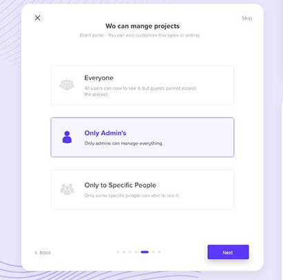
I posted this viz a while back to showcase my favorite custom UI elements:
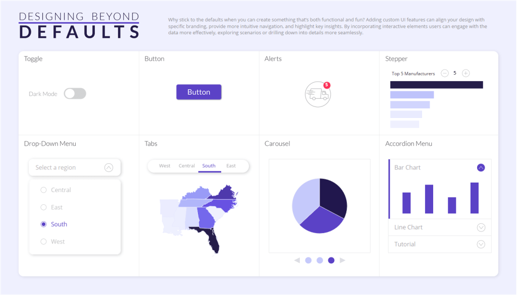
I decided to redesign it for my TC26 presentaiton (you can find the workbook here). I did this for a few reasons:
- I wanted to make it more presentation-friendly (bigger text, more breathing room, and a layout that let me focus on one UI element at a time) for TC.
- I wanted to show you can build something that looks good almost entirely in Tableau (no background images) with just blank objects and (finally!!!) rounded corners.
- I wanted to keep the focus on the elements that followed the 5-step process, and the buttons and alerts in the original viz didn’t do that.
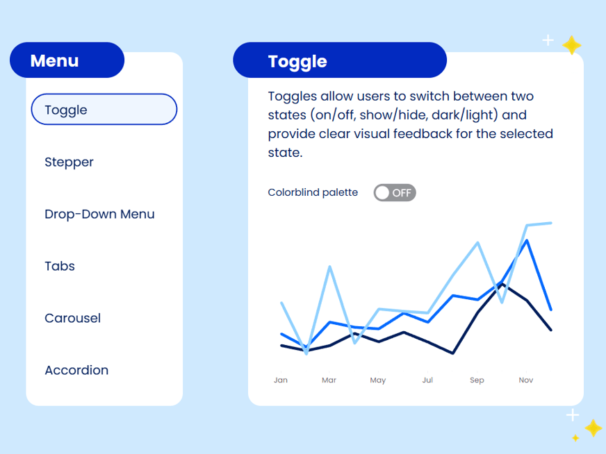
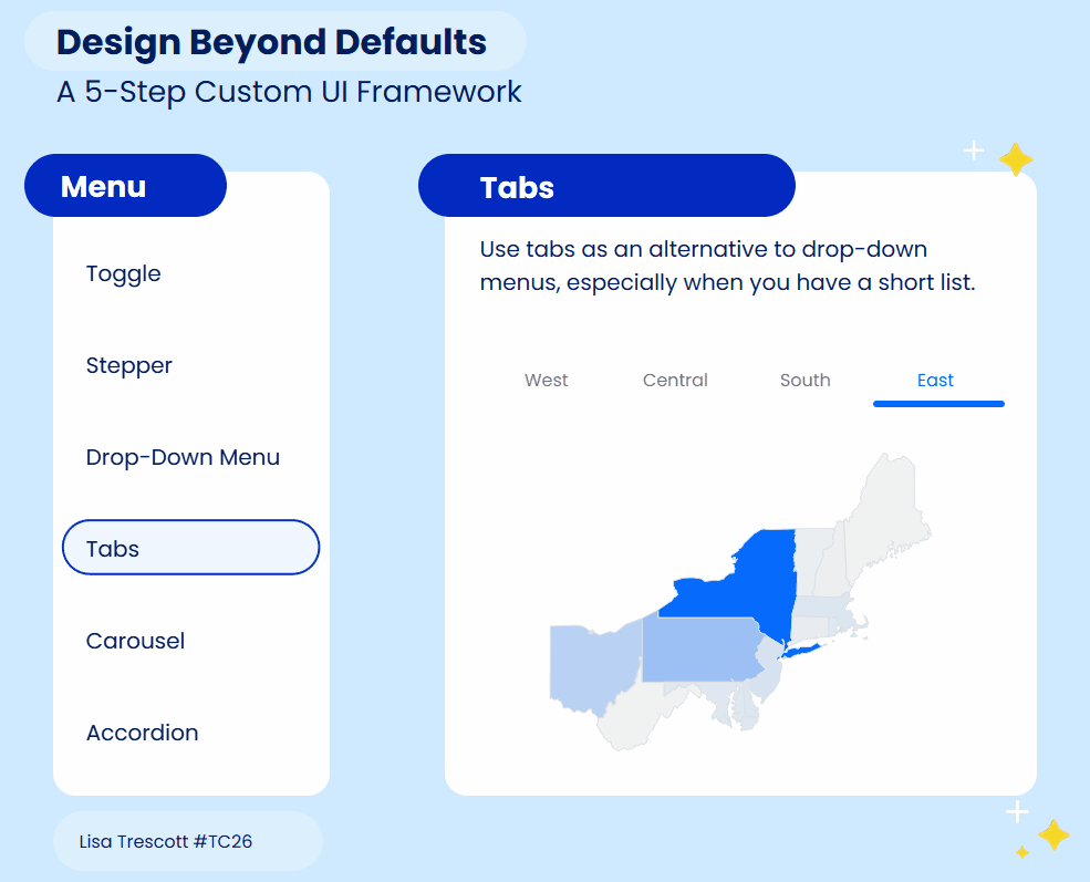
And with this redesign came a new UI element: a navigation menu!
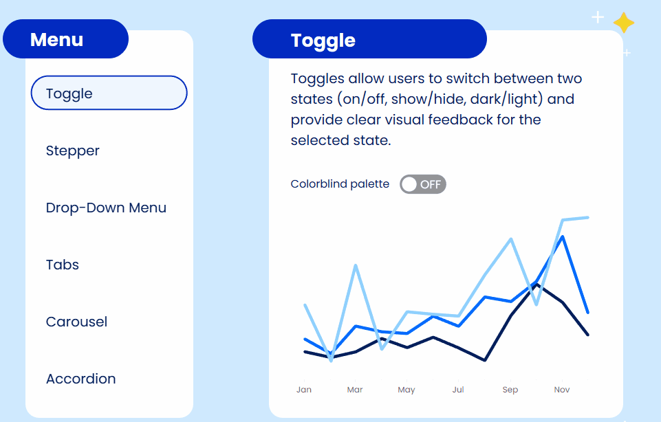
I use these menus all the time in dashboards because they create a clean way to move through content. Instead of default tabs or jumping between dashboards, a navigation menu just feels more designed and gives your users a much nicer experience.
To build this menu, I used the same 5-step process from my original Design Beyond Defaults blog post and TC26 session:
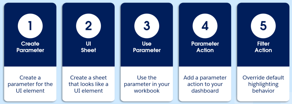
- Create a parameter for your UI element
- Create a sheet that looks like a UI element
- Use your parameter in your workbook
- Add parameter action(s) to your dashboards
- Apply a filter action to remove highlighting
So let’s get into it! For this menu, I used an Excel sheet as my data source that looked like this:
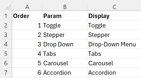
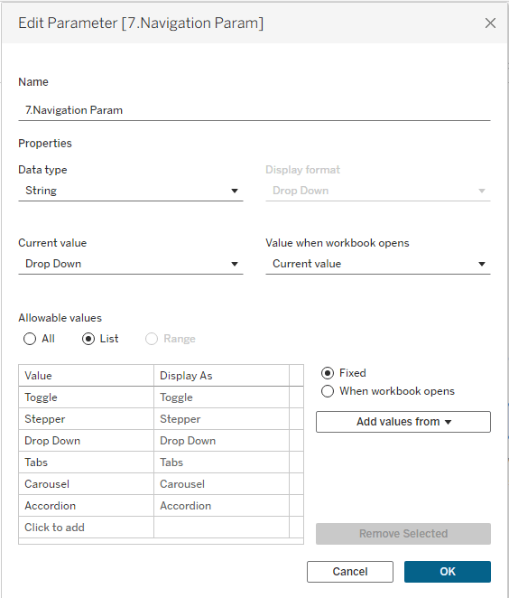
1. Create a parameter for your UI element
I created a Navigation Param with all the items in my navigation menu (i.e., the values in the “Param” field of my data):
Create a sheet that looks like a UI elements
I always start this step by looking for inspiration. So I took to Pinterest and found several inspo images:
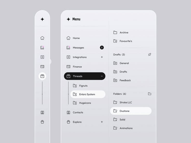
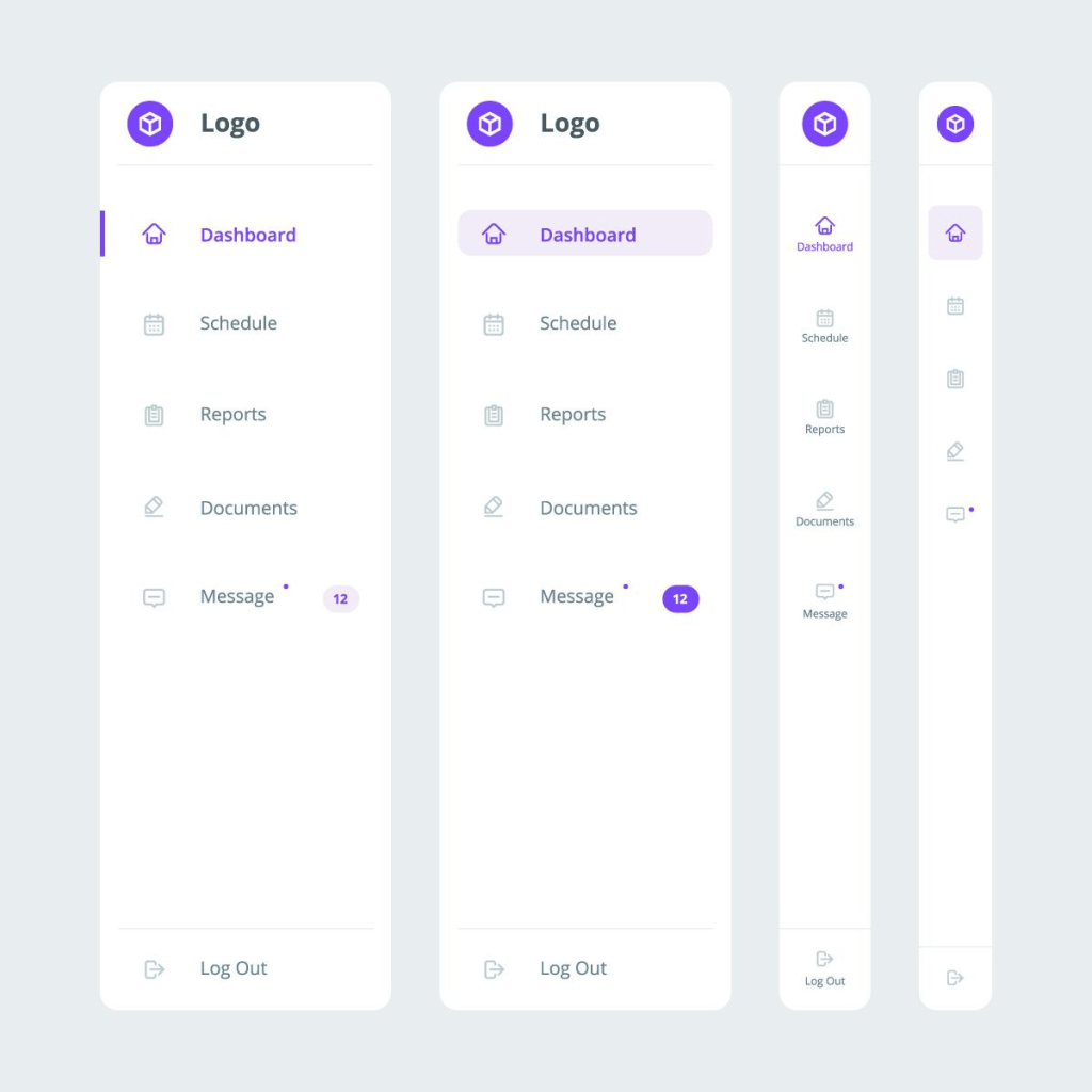
I wanted this menu to fit the style of the viz, which meant I wanted something with rounded corners. I ended up using a combo of inspiration from the first image above, and the style of this button, with a dark outline and light fill.
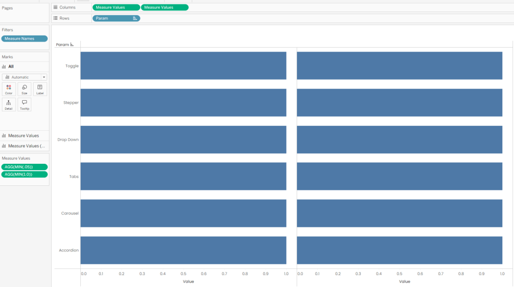
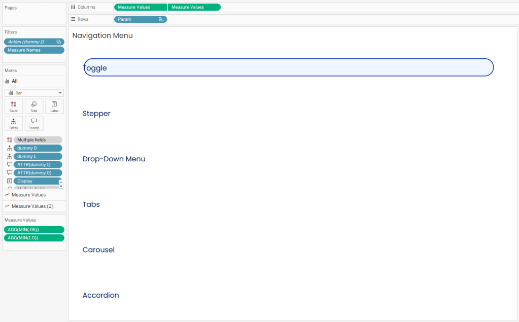
To build the chart:
- Drag “Param” to Rows (sorted by “Order”)
- Drag Measure Values to Columns x2.
- You’re building a dual axis chart:
- Chart 1 = dark outline
- Chart 2 = lighter fill
- You’re building a dual axis chart:
- Define Measure Values as MIN(.05) and MIN(1.0). I used these values so I could offset the lines slightly on an axis from 0.0 to 1.05.
- It should look like this:
- Set the mark type of both charts to Line and put Measure Names on Path:
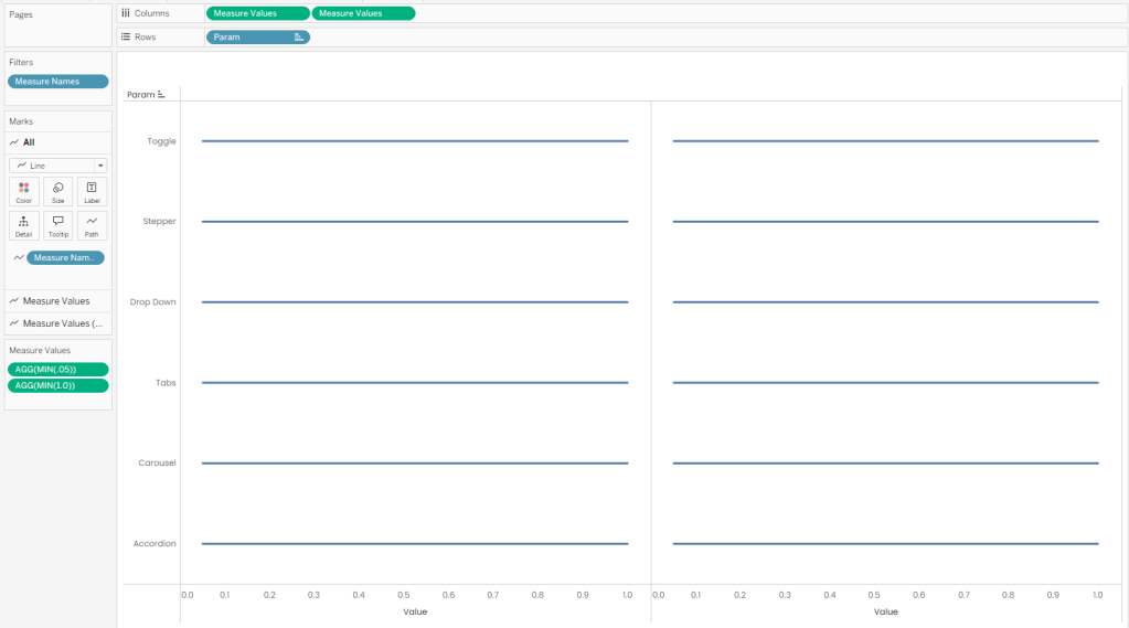
- Make it a dual axis chart and synchronize axes.
- The Size slider alone won’t get your lines thick enough to look like buttons. So you’ll need to add MIN(1) to Size in order to adjust the size to what you want. Double click in the blank space of your Marks card, type MIN(1), hit enter, then drag it to Size.
- ⚠️IMPORTANT: Don’t add MIN(1) to the “All” Marks card or you won’t be able to format the size of each chart independently (which will be necessary to get the outline effect when you start adding color). Add MIN(1) to each of your charts separately:
- Let’s add some color! Your base chart will act as the darker outline of the “button”. Put the following field onto Color:
//This will return a TRUE or FALSE based on whether the Param is selected by 7.Navigation Param.
p.Nav Param
[Param]=[7.Navigation Param]
- Assign a dark color to TRUE and white to FALSE:
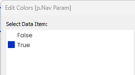
- Your second chart will be the lighter fill color. Put the following field onto Color:
//This will return a TRUE or FALSE based on whether the Param is selected by 7.Navigation Param.
p.Nav Param (light)
[Param]=[7.Navigation Param]
- Assign a lighter shade to TRUE and white to FALSE:
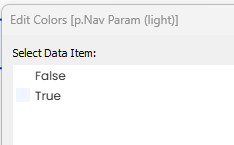
- Adjust the size on this chart to be slightly smaller than the base chart (otherwise you won’t see the outline color below).
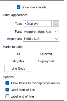
- Add “Display” to the Label on your second chart. This will show the names of the items in your list. Use the following formatting:
- Alignment = Middle Left
- Note: I added some blank spaces before “Display” to make it align properly. Do this by clicking the elipses next to Text: <Display>
- Marks to Label = Line Ends
- Options = Label start of line
- Alignment = Middle Left
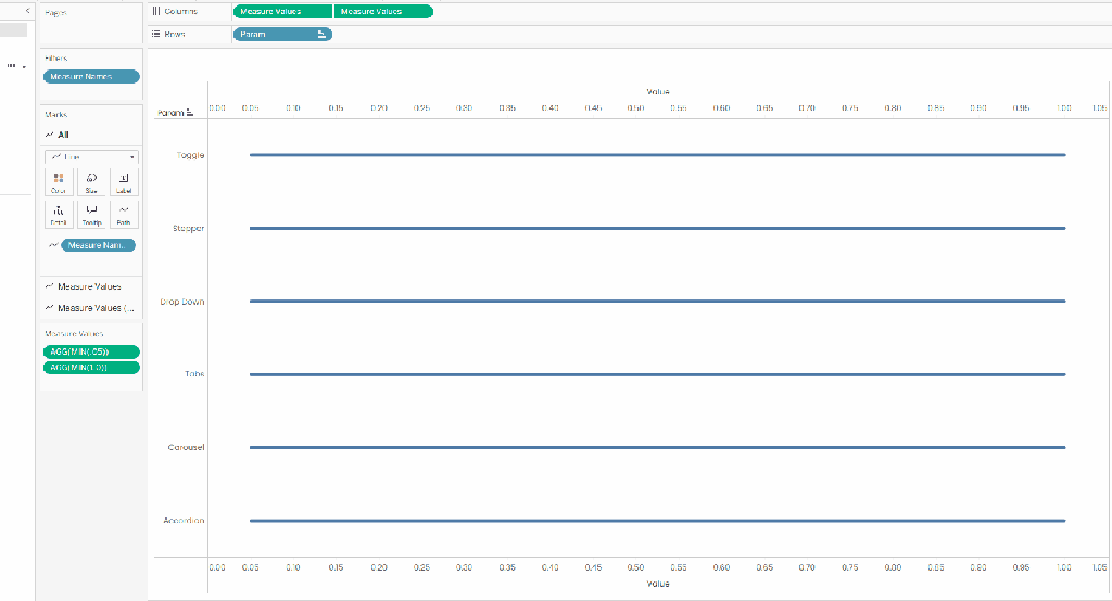
- Now it’s time to put the finishing touches by hiding all your headers and removing row and column borders.
- You should have something that looks like this:
But there’s a problem! Because this is a line chart, Tableau highlights the endpoints when you hover, which ends up covering your labels. Not ideal.
To fix this, I made an “Overlay” chart that I layered on top of this sheet on the dashboard. This sheet is much simpler than the navigation menu, and is just a set of invisible bars that make the menu clickable without that weird interactive effect from the line chart.
- Put Param on Rows (sorted by Order)
- Put MIN(1.0) on Columns
- Set the Mark type to Bar
- Set the color to White and color opacity to 0%
On your dashboard, place this overlay on top of the Navigation Menu you created for a seemless interface.
Note: if you style your navigation menu in a different way (one that doesn’t use line charts), you won’t need this overlay. You could also build it a different way in one sheet with Map Layers, but I wanted to keep things simple and approachable for all skill levels. Bottom line, there’s always more than one way to skin a cat in Tableau (just ask the Flerlage Twins).
Use your parameter in your workbook
The navigation menu works together with dynamic zone visibility to control what content shows up based on what the user selects.
For each menu item, I placed the corresponding content inside its own container on the dashboard. Then I used dynamic zone visibility to show or hide each container depending on the selected value in my parameter.
Since I have 6 menu items, that means 6 containers, and 6 calculated fields to control visibility. Think of these calculations like little light switches: each one turns a section on when it’s selected, and off when it’s not.
p.Nav Accordion
[7.Navigation Param]=’Accordion’
p.Nav Carousel
[7.Navigation Param]=’Carousel’
p.Nav Drop Down
[7.Navigation Param]=’Drop Down’
p.Nav Stepper
[7.Navigation Param]=’Stepper’
p.Nav Tabs
[7.Navigation Param]=’Tabs’
p.Nav Toggle
[7.Navigation Param]=’Toggle’
Notice how all the content for Tabs is in one container, and its visibility is controlled with p.Nav Tabs:
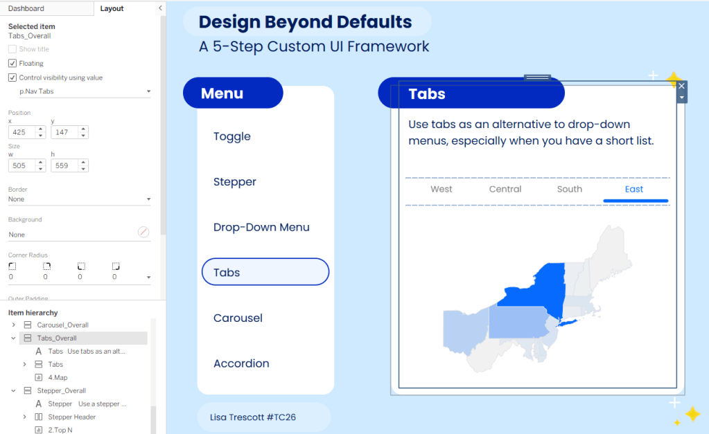
Pro Tip: Stay organized! Notice how all of my containers are labeled in the item hierarchy. This will help you immensley when keeping track of things.
Add a parameter action to your dashboard
Now let’s make it all interactive! Add a parameter action to the Navigation Overlay sheet that sends the Param value to your Navigation Parameter when a user clicks on it.
Reminder: if you built your menu a different way (i.e., not using line charts) and didn’t need the overlay, you’ll apply this action directly to your navigation menu sheet instead.
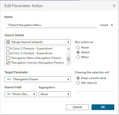
Once this is set up, clicking a menu item updates the parameter, and everything else responds from there.
Apply a filter action to remove highlighting
Tableau is going to highlight any mark you select, which will result in your menu looking like this when a user interacts with it:
This is where the filter action hack comes into play.
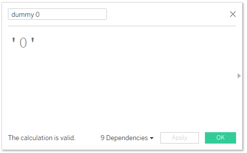
- Create two dummy calculations. It doesn’t matter what value you put in these calculations as long as they are different. I typically use dummy 0 and dummy 1:

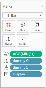
- Add the two dummy calculations to the Detail shelf of your Navigation Menu Overlay sheet.
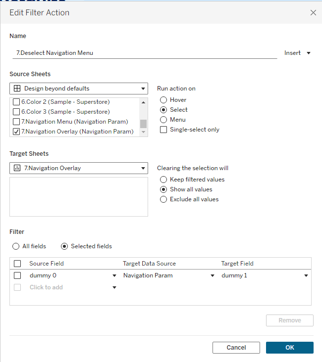
- On the dashboard add a filter action where the Overlay sheet filters itself along the selected fields of dummy 0 and dummy 1. Make sure to select “Show all values” under “Clearing the selection will” (if you don’t select this, your menu will disappear when the user clicks it).
This hack overrides the dafult highlighting and allows for a single click of the menu and no wonky highlighting:
Wrap Up
And that’s it! With just a parameter, a couple of creative chart builds, and some dashboard actions, you’ve turned Tableau into something that feels a lot more like a custom-designed application than a standard dashboard.
What I love most about this approach is how flexible it is. You’re not locked into this exact style! You can use bars, Gantts, shapes, lines, polygons, etc. and build a completely different menu. No matter how you design it, the core idea stays the same: use parameters + clever chart design to create your own UI.
Happy building!
 Lisa Trescott
Leave a comment