
The “Match Mark Color” feature in Tableau might not be the newest trick in the book, but it’s certainly one of the most underrated in my opinion. Introduced all the way back in version 9.2, this feature allows you to automatically match the color of your text labels to the color of the marks they’re associated with. It’s a tiny checkbox that most people either overlook or forget exists, which is a shame because it can save you from creating a bunch of unnecessary calculations and doing formatting gymnastics.
And if you’ve seen any of my sessions or presentations, you know I’m always looking for ways to make Tableau do more work so I don’t have to! Let’s take a look at a few ways you can put this feature to work. Follow along with this workbook on Tableau Public.
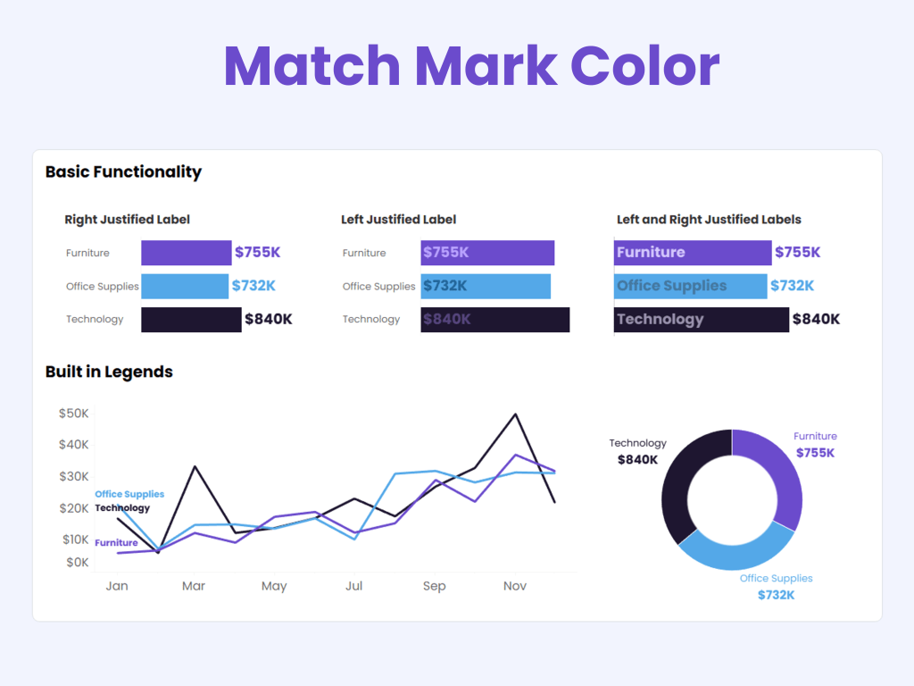
Basic Functionality
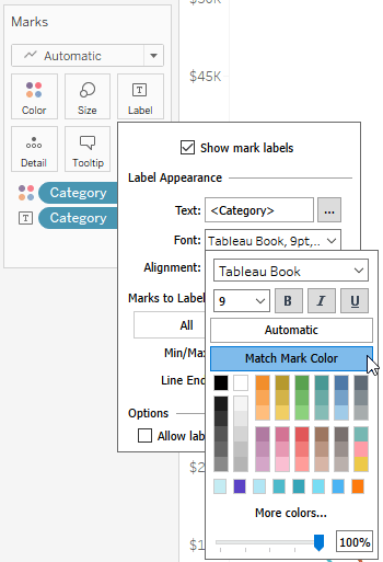
To use Match Mark Colors, go to Label on the Marks card, select Font, and check Match Mark Color.
That’s it. No calculations. No parameter actions. No sacrifices to the Tableau gods.
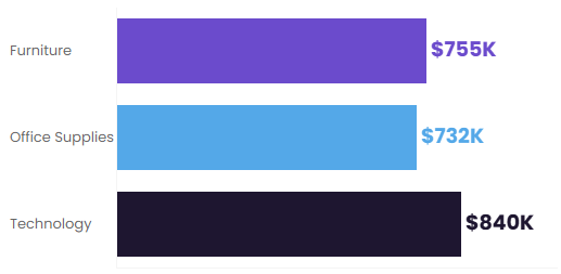
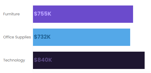
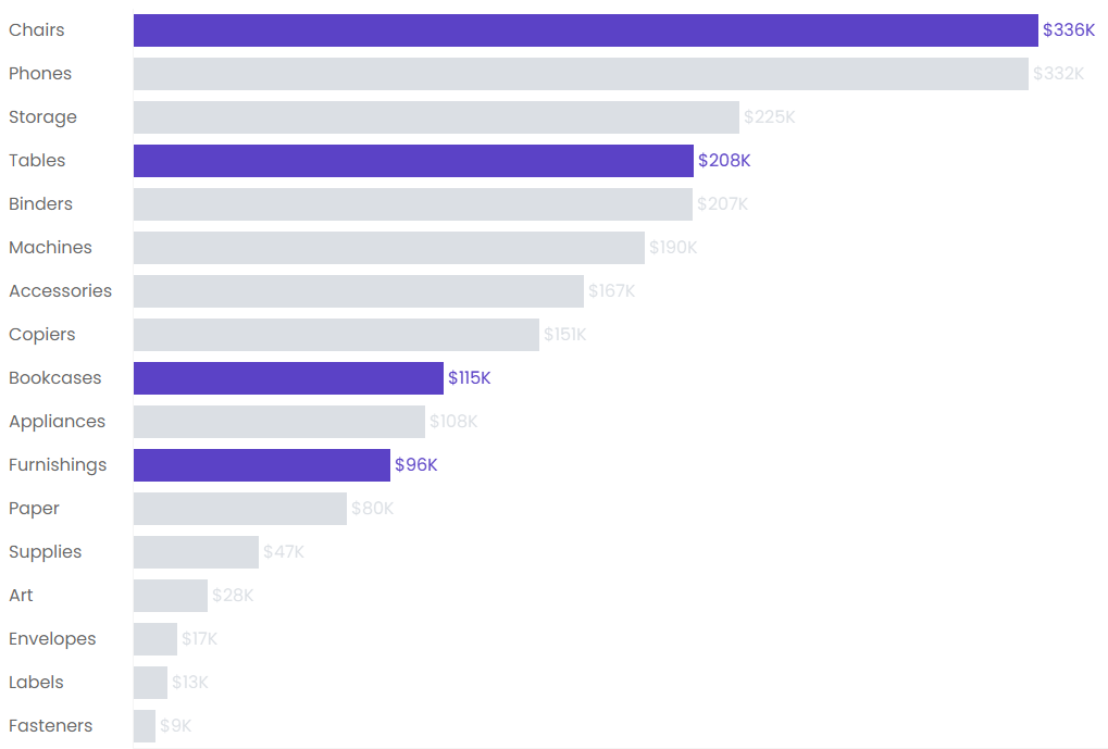
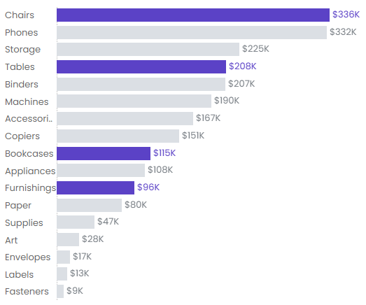
Here’s a bar chart showing the feature applied to right-aligned labels:
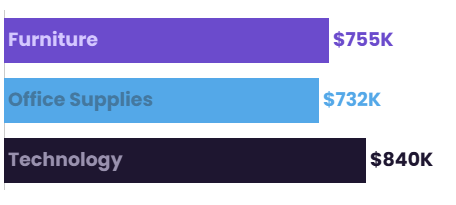
If you left justify your labels so they are inside the bars, the color will still “match”, but will automatically adjust to a slightly different shade (some colors are more accesible than others, so make sure you’re paying attention to the contrast).
You can also combine both approaches with a dual-axis chart. In the example below, I reduced the opacity of the bars to improve contrast for the interior labels.
Legends
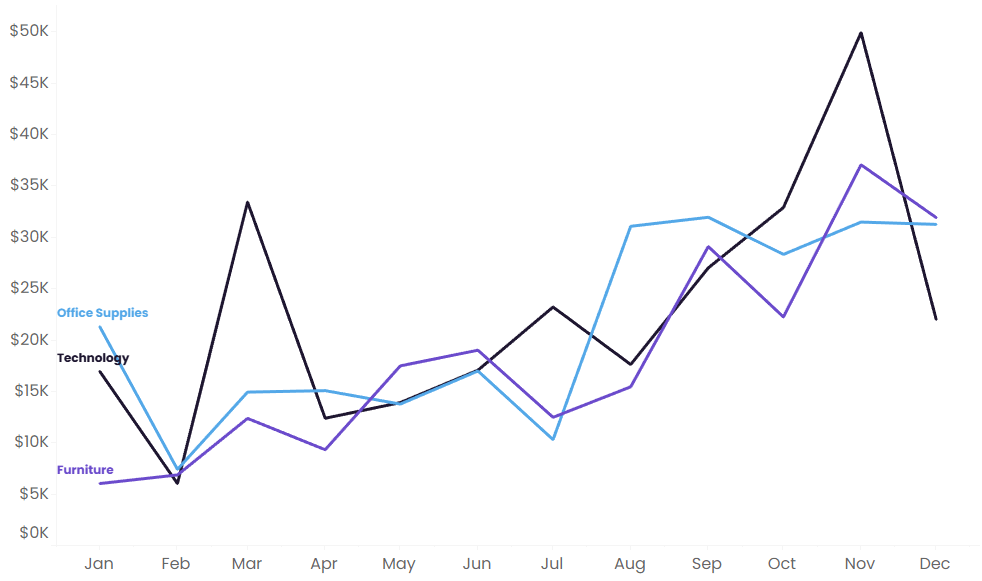
One of my favorite uses for Match Mark Colors is eliminating legends altogether, beacuse it cuts down on clutter and cognitive load. In the line chart below, I’ve labeled the end of each line and used Match Mark Colors to color-code the labels. Users can immediately connect each label to its corresponding line without constantly bouncing their eyes back and forth to a legend.
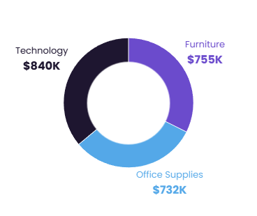
The same idea works beautifully with donut charts:
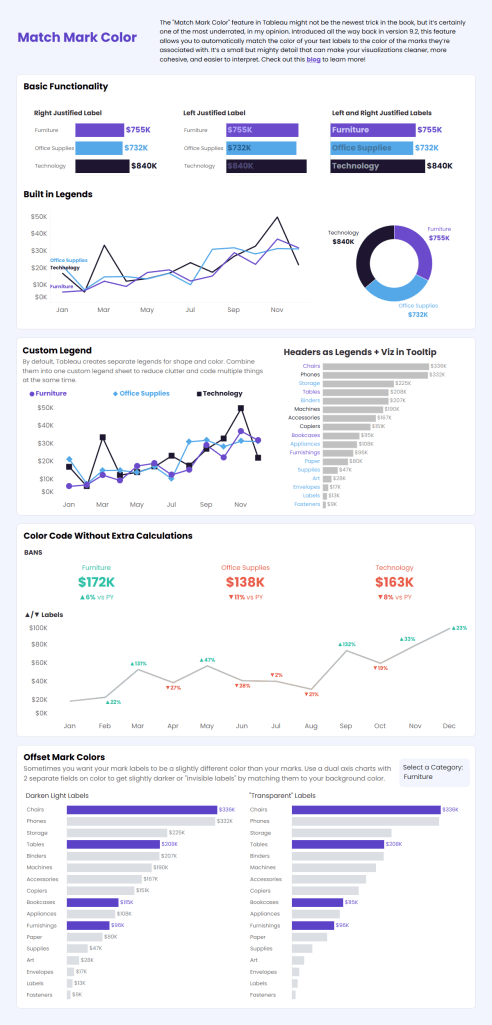
Two Legends in One
Double encoding is a best practice, especially when designing with accessibility in mind. But Tableau rewards this good design choices with…extra legends! In this example, both color and shape are used to identify category, but your user now needs to rely on 2 legends to understand the viz:
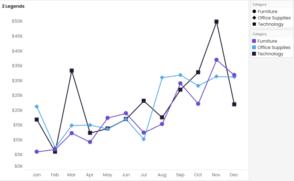
Don’t accept this! Two legends will add extra clutter. Instead, create a dedicated legend sheet that combines both encodings into a single legend. And by using Match Mark Colors, the text labels automatically inherit the same colors as the marks, helping the legend feel more intuitive and polished.

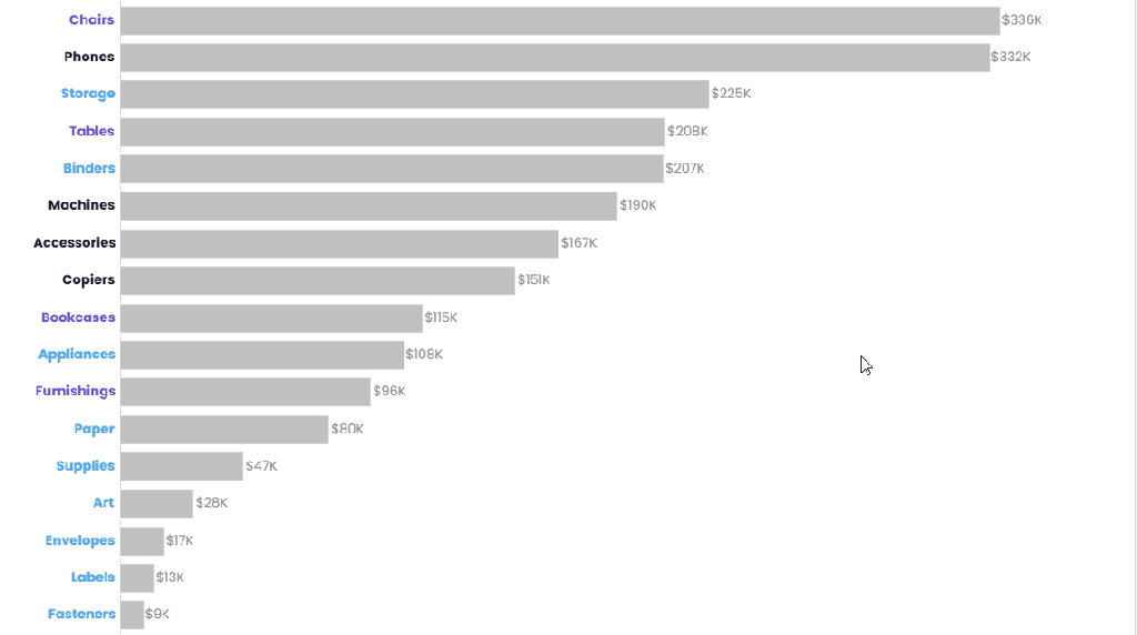
Headers as Legends
Sometimes the best color is less color! Rather than coloring every bar in a chart, consider coloring the headers and leaving the bars neutral. The result is a clean, more label-driven design where the category names carry the meaning and the bars quietly do their job in the background.
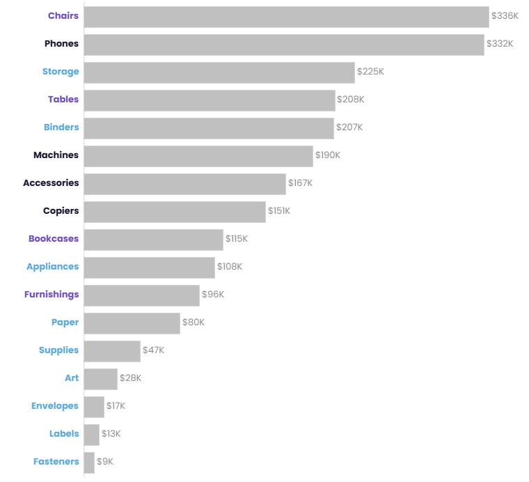
To build this:
- Create a dual-axis chart using MIN(0) and your measure.
- Set MIN(0) to a Gantt Bar.
- Place Category on Label and left-align it.
- Enable Match Mark Colors.
- Use your measure on the Bar mark type.
The categories become the legend, which means you don’t need a separate legend at all.
Bonus! Color-Coded Viz in Tooltip
You can go a step further and create a separate sheet to use in your tooltips, apply Match Mark Color, and bad-a-bing bad-a-boom, you’ve got tooltips with text that automatically changes color without requiring additional calculations.
Ditch Multiple Calculations and Formatting
Have you ever used calculated fields just to color-code your labels? For example, maybe you want to show whether a metric is trending up, trending down, or staying flat:
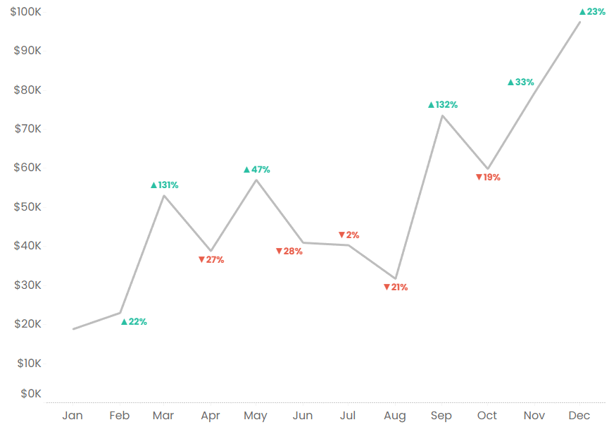
To do this, you might build separate calculated fields for each scenario: one for increases, one for decreases, and one for zero change. Then you’d place those calculations on the label and manually format each condition. I’m tired just talking about all those steps!
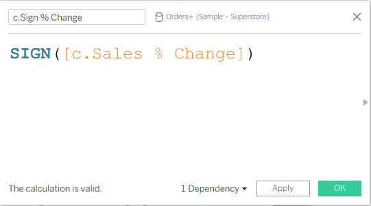
Instead, use SIGN() and Match Mark Colors! SIGN() returns:
- 0 for no change
- 1 for positive values
- -1 for negative values
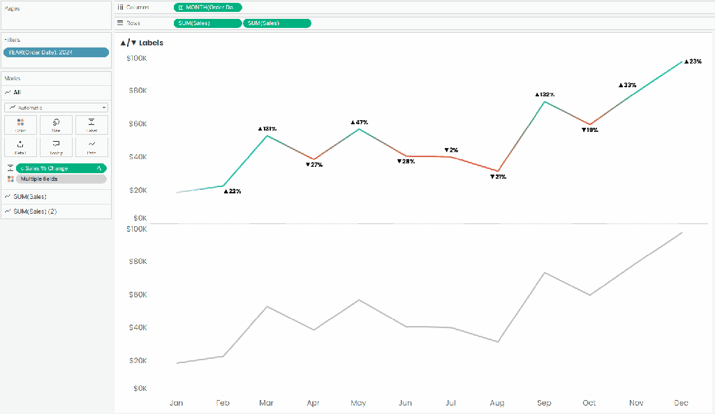
Then create a dual-axis chart using two line charts:
- A solid gray line on top.
- A colored line underneath using SIGN() on Color.
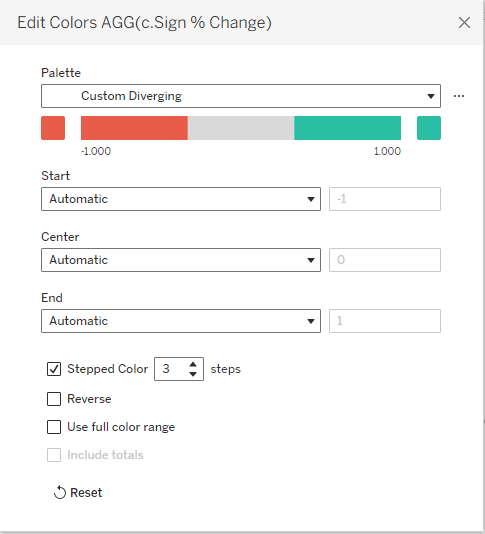
- Apply a custom diverging color palette and adjust it to a three-step legend (positive, neutral, and negative).
- Put the % Change field on Label and enable Match Mark Color. The labels automatically inherit the color palette you applied to SIGN().
Make your chart a dual axis chart with a synchronized axis, and you now have color-coded marks without lots of extra calculated fields or formatting work.
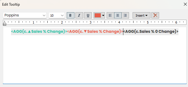
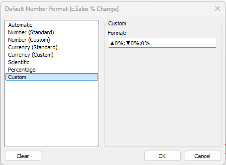
TIP: To make the direction even clearer, you can customize the number format of your % change field to include symbols like ▲ for positive values and ▼ for negative values.
Transparent Shapes
If you attended my Design Beyond Defaults session at TC26, you may remember the tab navigation that changed color based on the parameter selection. That effect was powered by one of my favorite Tableau hacks: transparent shapes!
Transparent shapes have countless uses in Tableau (check out this blog by the Flerlage Twins for examples), but in this case, we’re taking advantage of the fact you can assign colors to a transparent shape while the shape remains “invisible”…BUT those colors can still be passed to labels using Match Mark Colors.
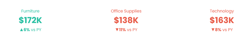
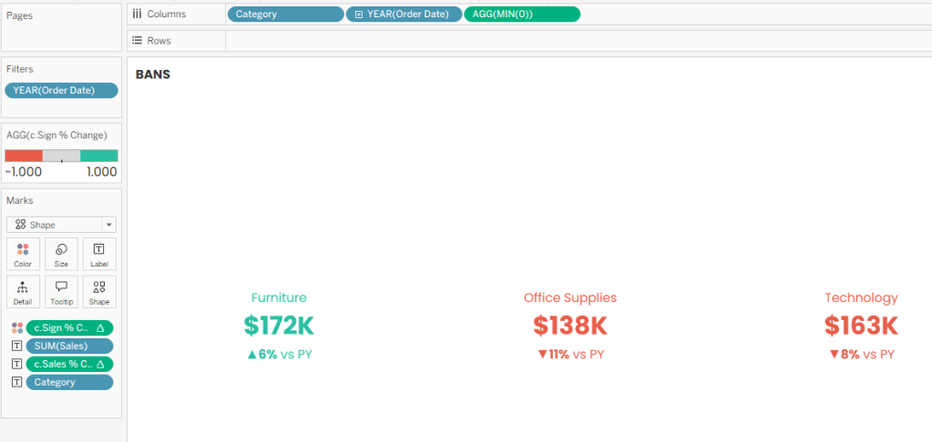
In the example below, the BANs are color-coded based on whether sales increased or decreased compared to the previous year. The entire effect is driven by Match Mark Colors on a transparent shape.
To build this:
- Create your BAN using a Shape mark.
- Assign a transparent shape.
- Place c.Sign % Change on Color (or whatever field is driving your color-coding).
- Apply the same three-step diverging color palette used in the previous example.
- Format your labels as desired.
- Enable Match Mark Colors.
That’s it! Now you have dynamically color-coded BANs:
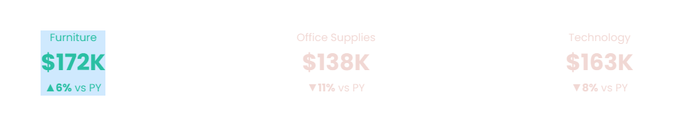
Why not just use a Text mark? I’m glad you asked! Because Tableau likes to highlight selected text marks in bright blue when users click them (and nothing says “carefully designed dashboard” quite like a random blue rectangle showing up unexpectedly). Transparent shapes avoid that issue entirely.
A few other examples of how you can use transparent shapes with Match Mark Labels:
- I used this technique to make the labels of my Picture-Perfect Pie Charts switch between white and black depending on the size of a pie slice.
- Autumn Battani explains how to use this to color-code text labels as white or black on a map in this video.
Offset Label Colors
Fixing Light Colored Labels
Sometimes Match Mark Colors works a little too well. For example, if one of your category colors is very light, your labels can become nearly impossible to read.
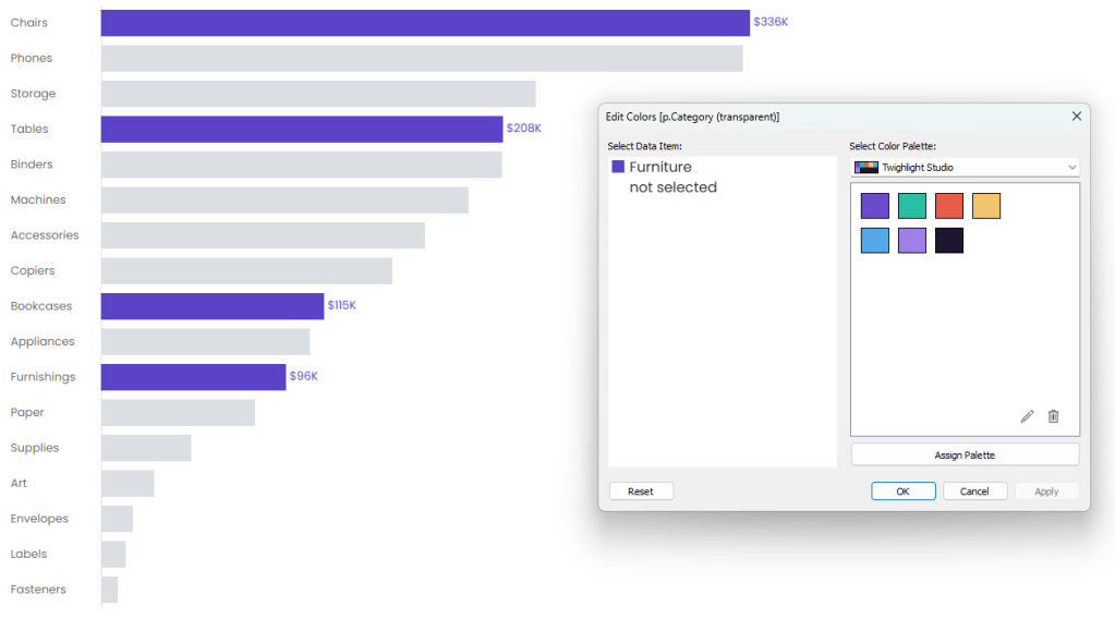
The easiest solution is to duplicate the field you’re using on Color and apply a darker version of the palette to the copy. Do yourself a favor and don’t leave it as “Variable Name (copy)”. Remind yourself why you copied this field. In my case, I called the variable “p.Category (dark)” to remind myself I duplicated this field for a darker color palette.
Build a dual-axis chart, hide the labels on the lighter version, and let the darker palette handle the text with Match Mark Color.
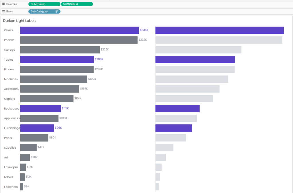
Same-ish colors. Better readability. Much less squinting.
“Transparent” Labels
Here’s another fun trick. Let’s say you only want labels to appear for selected marks. Instead of creating a calculation to show and hide labels, simply assign the background color to the labels you want hidden.
For example, if your dashboard background is white, make the unselected labels white too.
Technically the labels are still there, they’re just camoflauged.
Wrap Up
Match Mark Colors looks like a simple formatting option, but it can do a lot more than most people realize. It can replace legends, simplify calculations, power custom UI elements, and generally help you build cleaner dashboards with less effort. And if there’s one thing I love, it’s convincing Tableau to do extra work on my behalf!
If you’ve found other creative uses for Match Mark Colors, let me know! I’m always looking for new ways to abuse…I mean, thoughtfully leverage…Tableau features.

Leave a comment